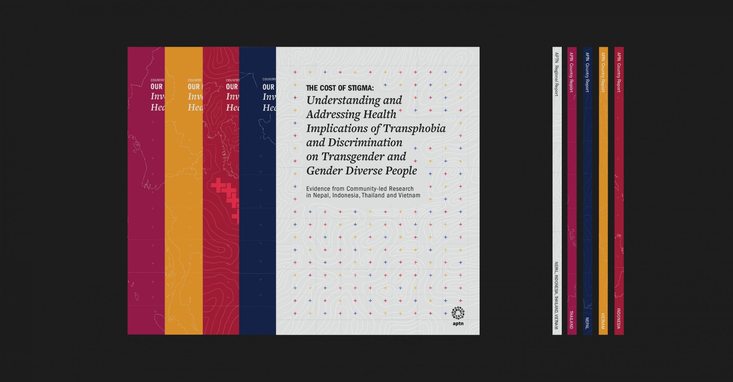
Each country brief had one defining color inspired from their country flag. The common element running through each report was the typography, the layout structure and the visual language for the data visualisation
PUBLICATION DESIGN
The Asia Pacific Transgender Network was formed to champion the health, legal and social rights of trans women. The brief was to design a set of four country reports and a regional report addressing the health implications of Transphobia and discrimination prevalent in South East Asia. A visual system was created across the reports to make the data rich content easier to read and understand.
Process behind this case study
Each country brief had one defining color inspired from their country flag. The common element running through each report was the typography, the layout structure and the visual language for the data visualisation
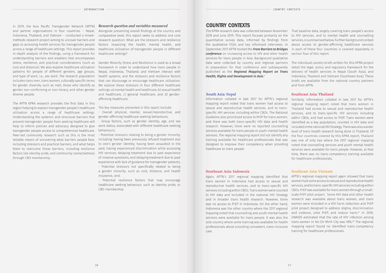
The regional brief was a 100 page report, serving as a summary for all the four country brief. The use of the color and type system was carried forward here with neutral blacks and whites serving as a base.
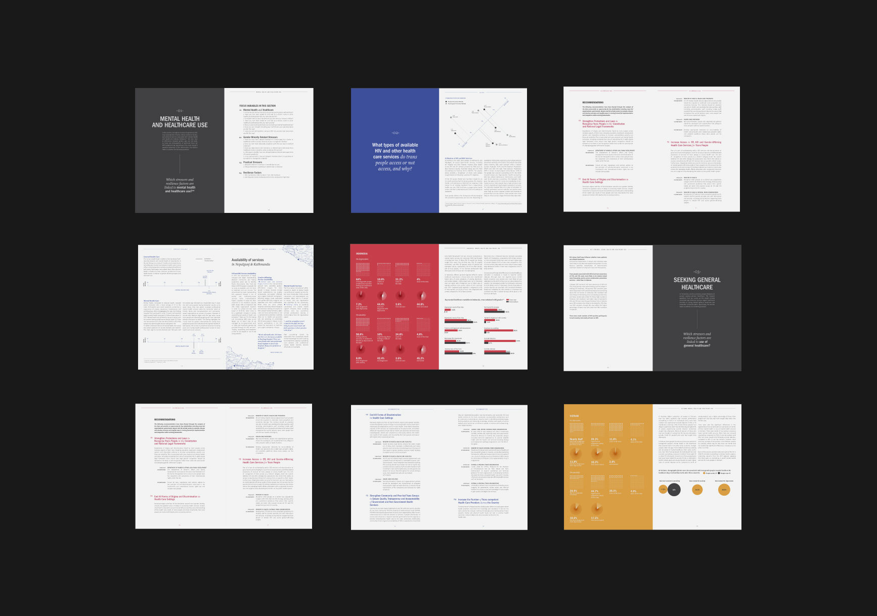
The five briefs were very information heavy and a document of this size could easily get difficult to read. A new system had to be created to make them all look like a family but at the same time have an element of surprise with each page. Page count and target audience (policy makers, shareholders) had to be kept in mind and the sombre tone of the report had to be maintained and carried forward.
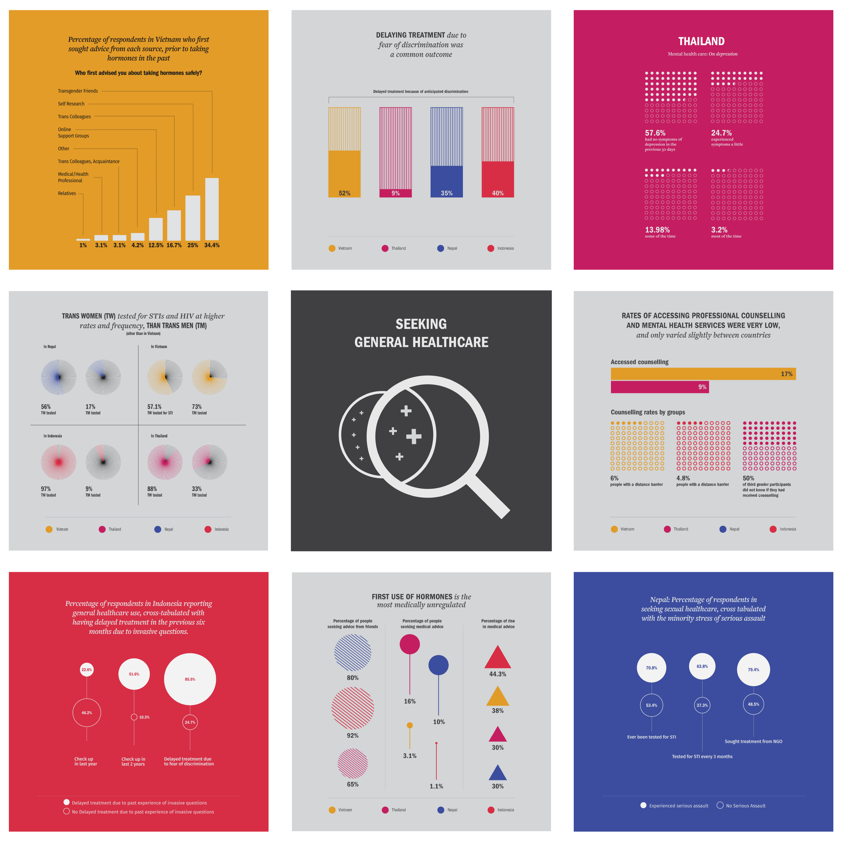
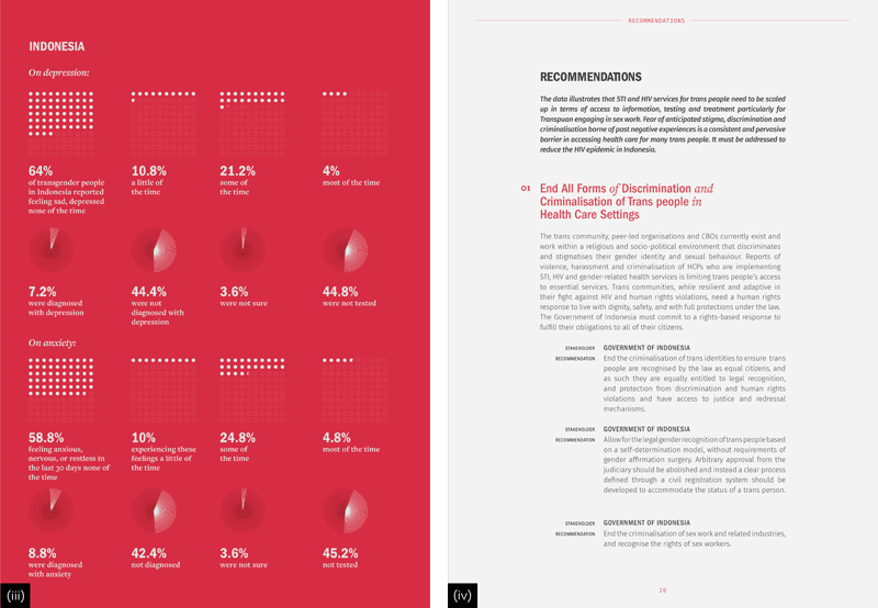
Since the data across the briefs was similar in nature, the point of difference would have to be color and the various kinds of data visualization.
At the same time they had to look like a set of briefs that would go out together. The briefs also had to work both digitally and physically.
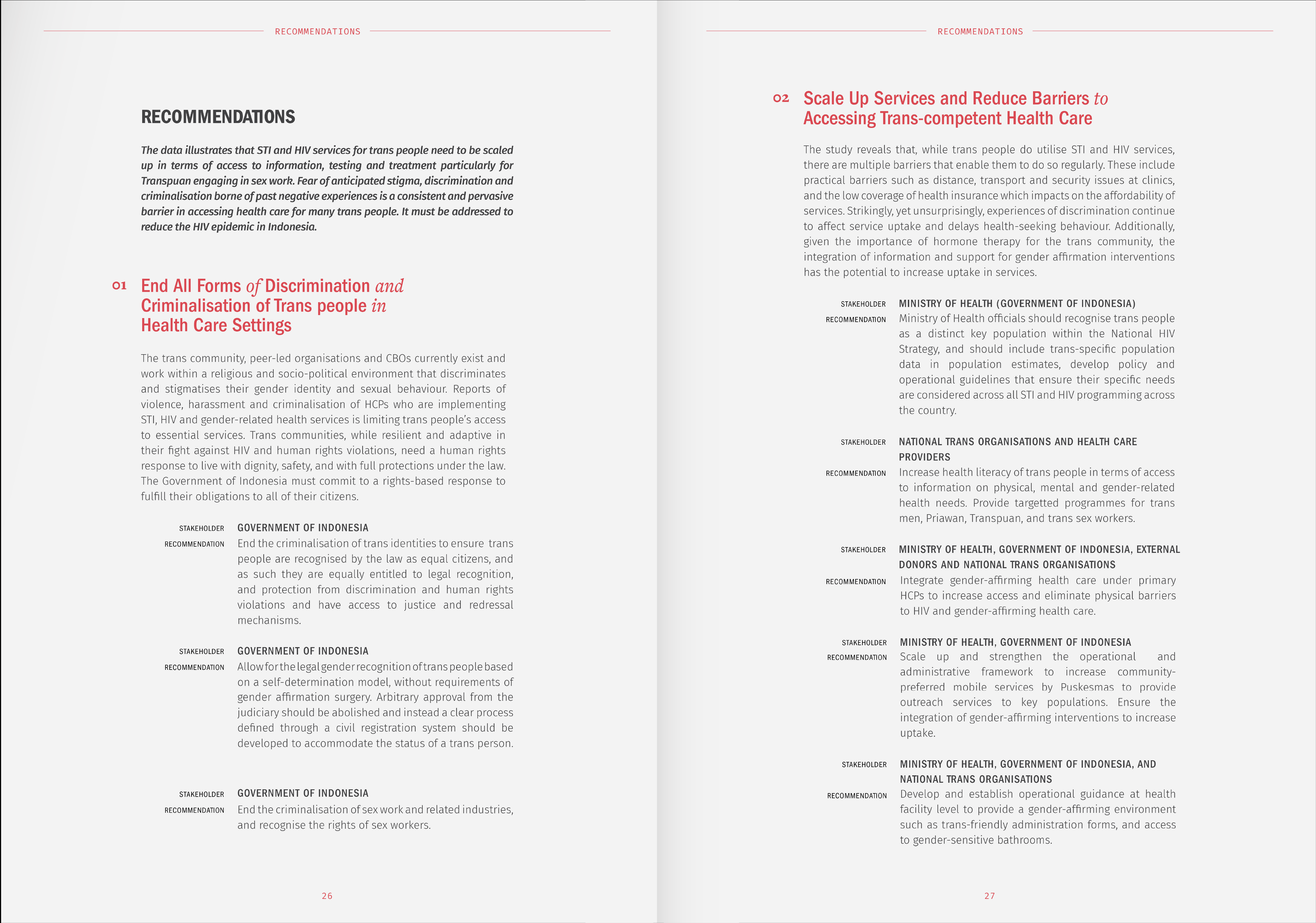
Two different typefaces were chosen to create hierarchy within the wide variety of text. Section dividers were added to break the large chunks of text and colored pull quotes were used to highlight and make the content easier to skim through, even at a glance.
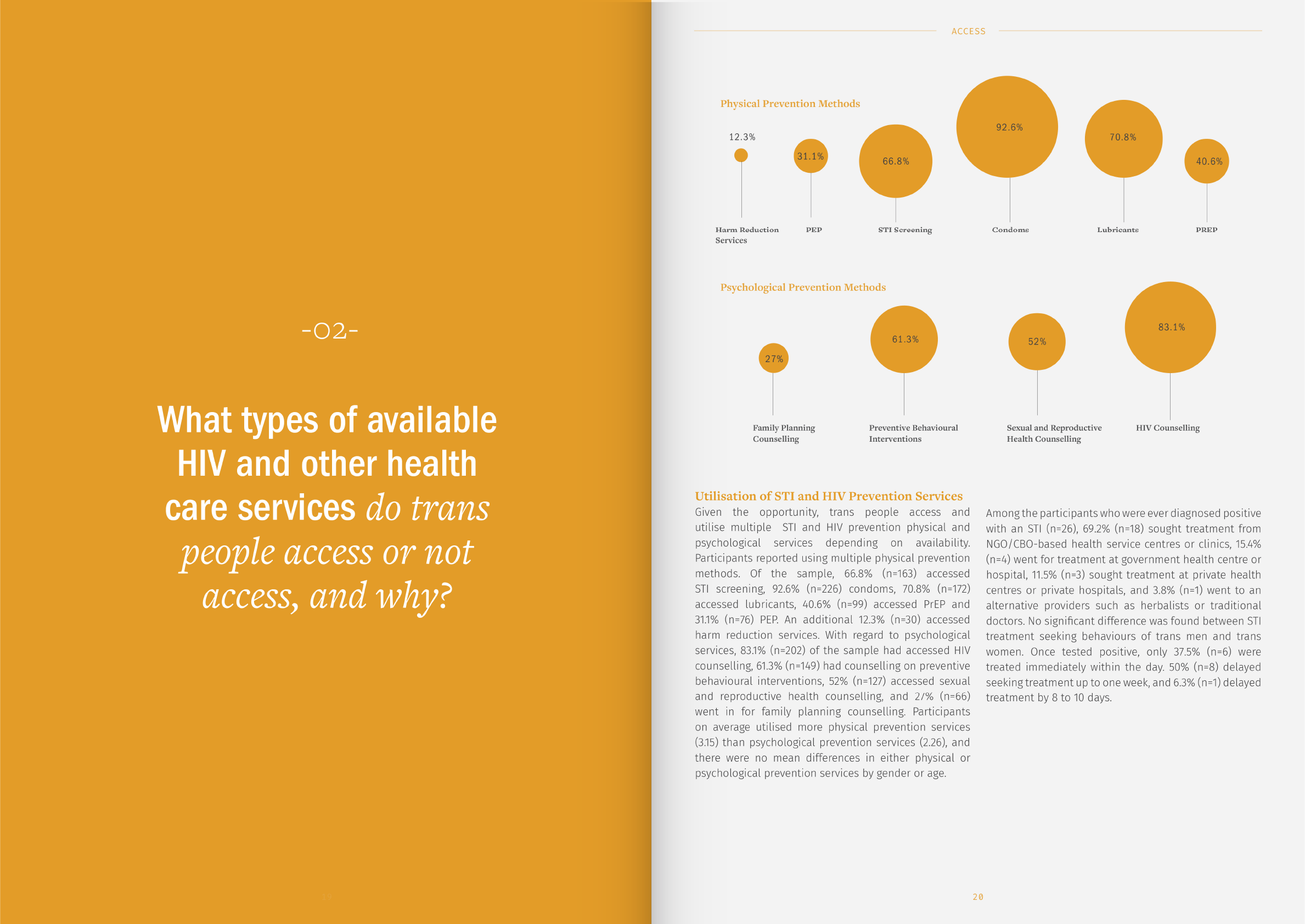
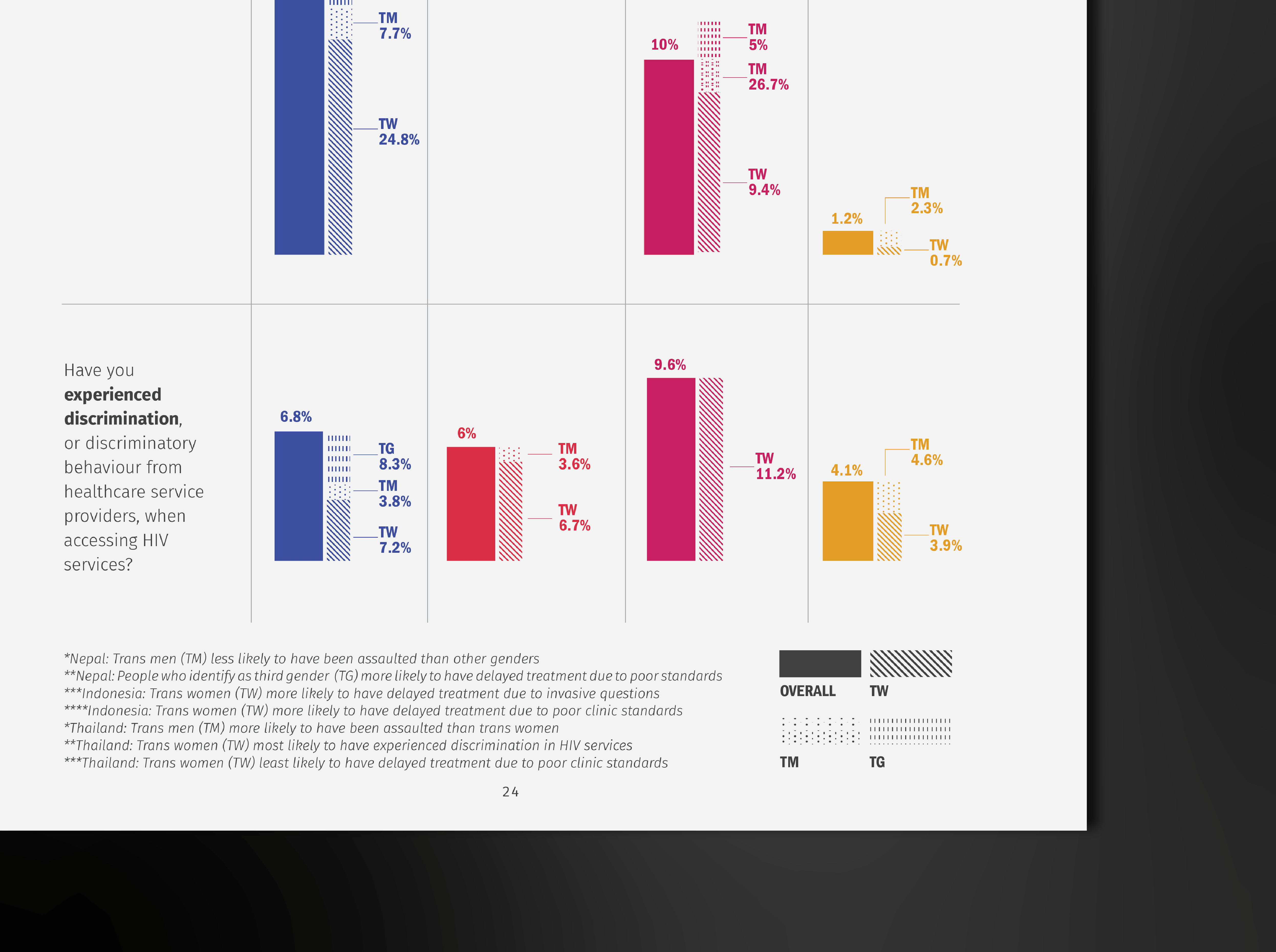
Communication was the driving force for data visualisation and simple shape oriented graphics were used to design these due to space constraints and effectiveness.
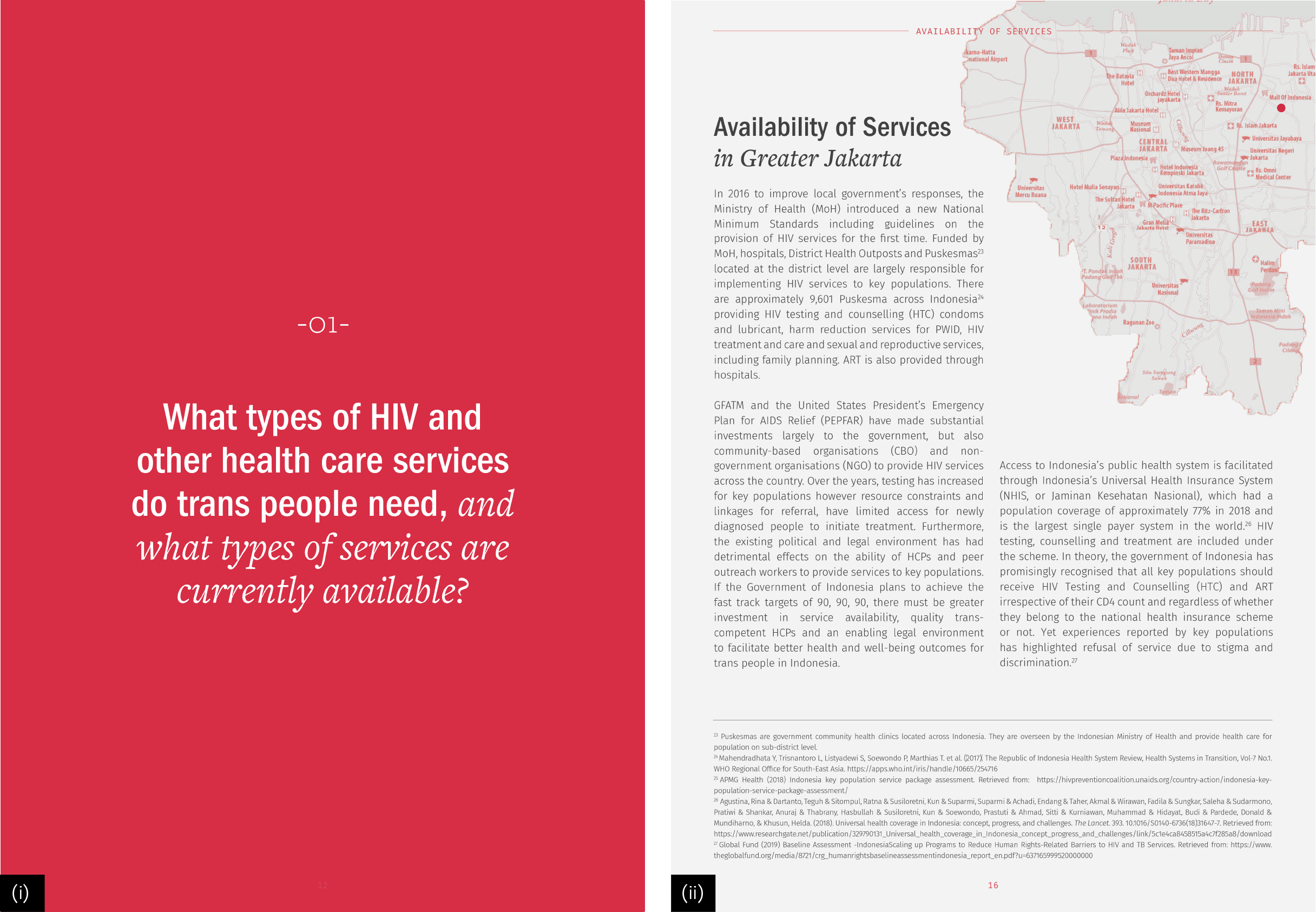
1. Decluttering information
The information was broken down into 4 main questions that acted as section dividers for the otherwise heavy chunks of text. Each of these was further broken down into data visualisation and columns to make it easier to read.
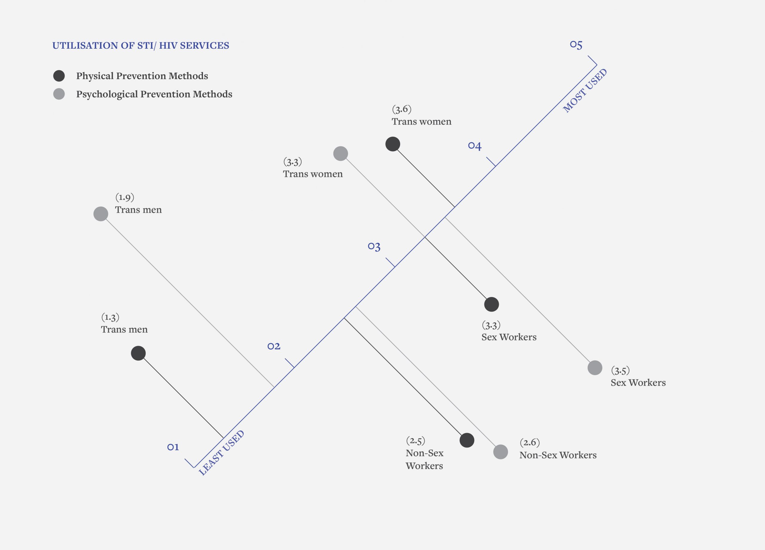
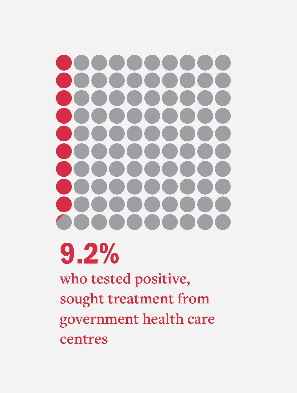
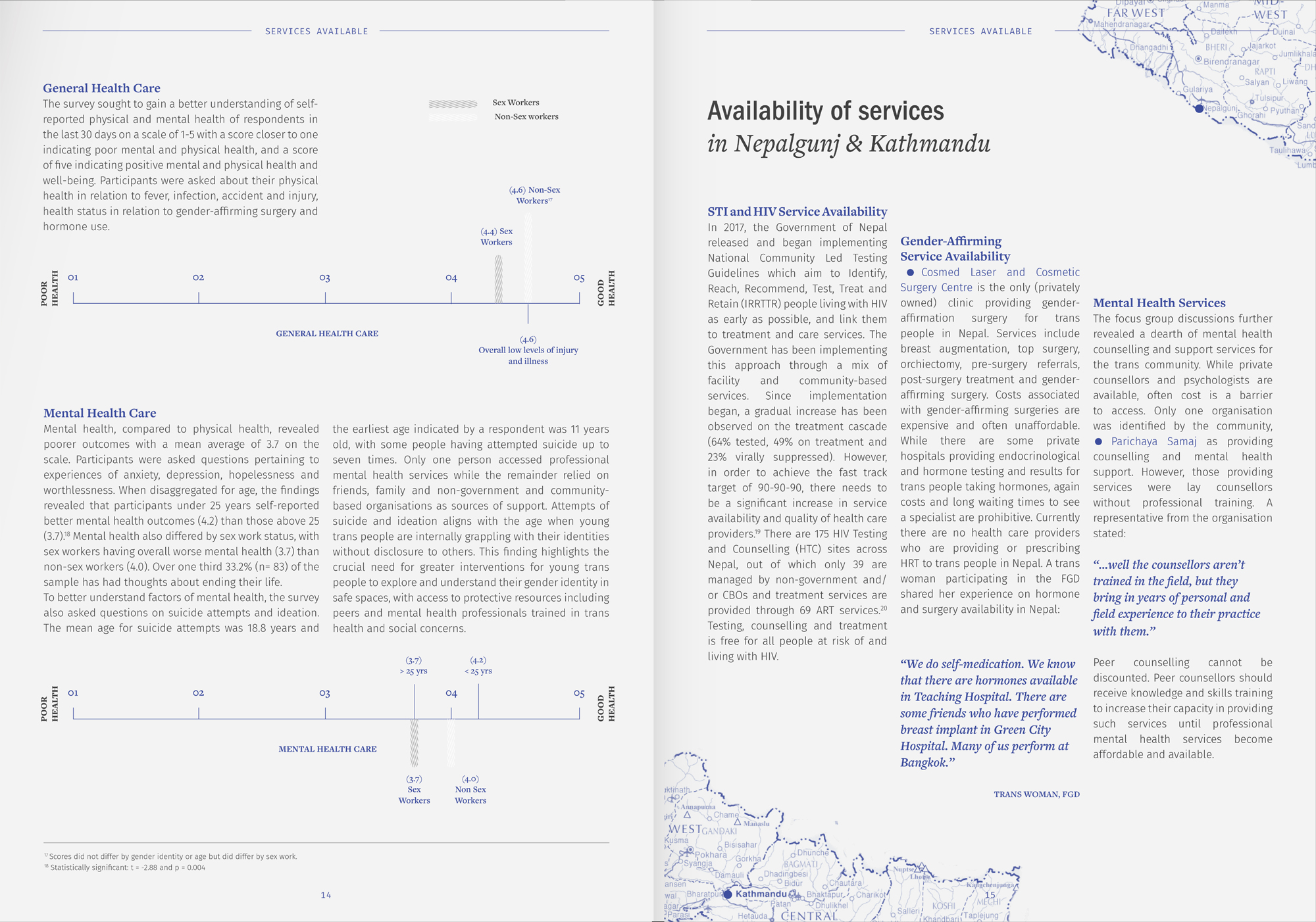
2. Designing Data
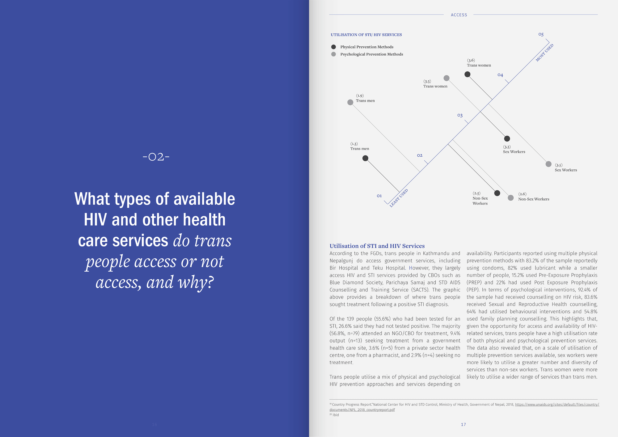
Tabular data was depicted via simple line diagrams or easier to read shape oriented graphs that made the data easier to understand. The visual treatment of data was also a response to the kind of statistics at play. These were further supported with legends if the data demanded it.
3. Role of typography
A mix of Franklin Gothic and Freight Text was used to achieve a serious balance that could be easily extended to different kinds of text and create a sense of harmony.
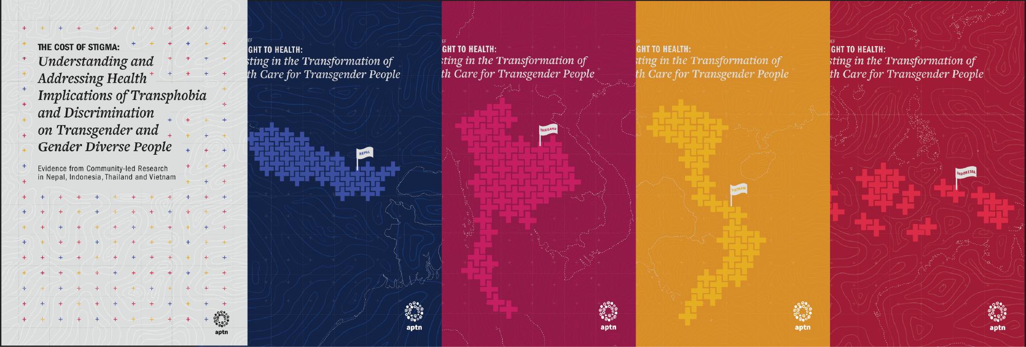
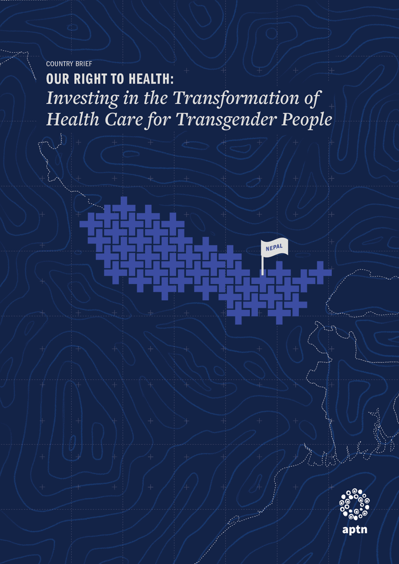
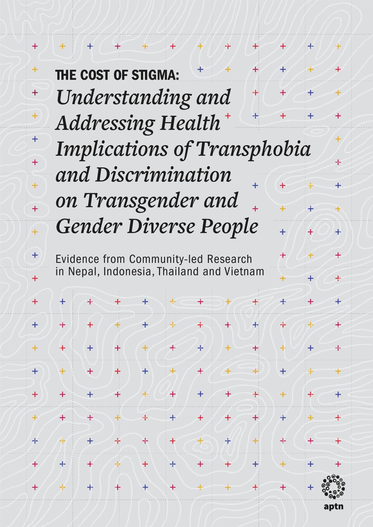
4. Cover
Each brief was addressing the relation between Healthcare access for the transgender community. The medical cross was used as a symbol to define each country’s map and a topographic background was used to ground the illustration. A more typographic and neutral approach was taken for the regional report, putting the typography in focus.