BRAND IDENTITY // WEBSITE DESIGN
BLUFF SNACKS
Bluff snacks is a healthy snacking brand based out of India. Their main agenda is to ‘call the bluff’ on packaged food. They are here to provide a healthy alternative to an otherwise junk driven market and do so with their punchy, silly and honest tone of voice. We came in to this project post the packaging design and fleshed out their visual identity, tone of voice and digital presence.
Discover
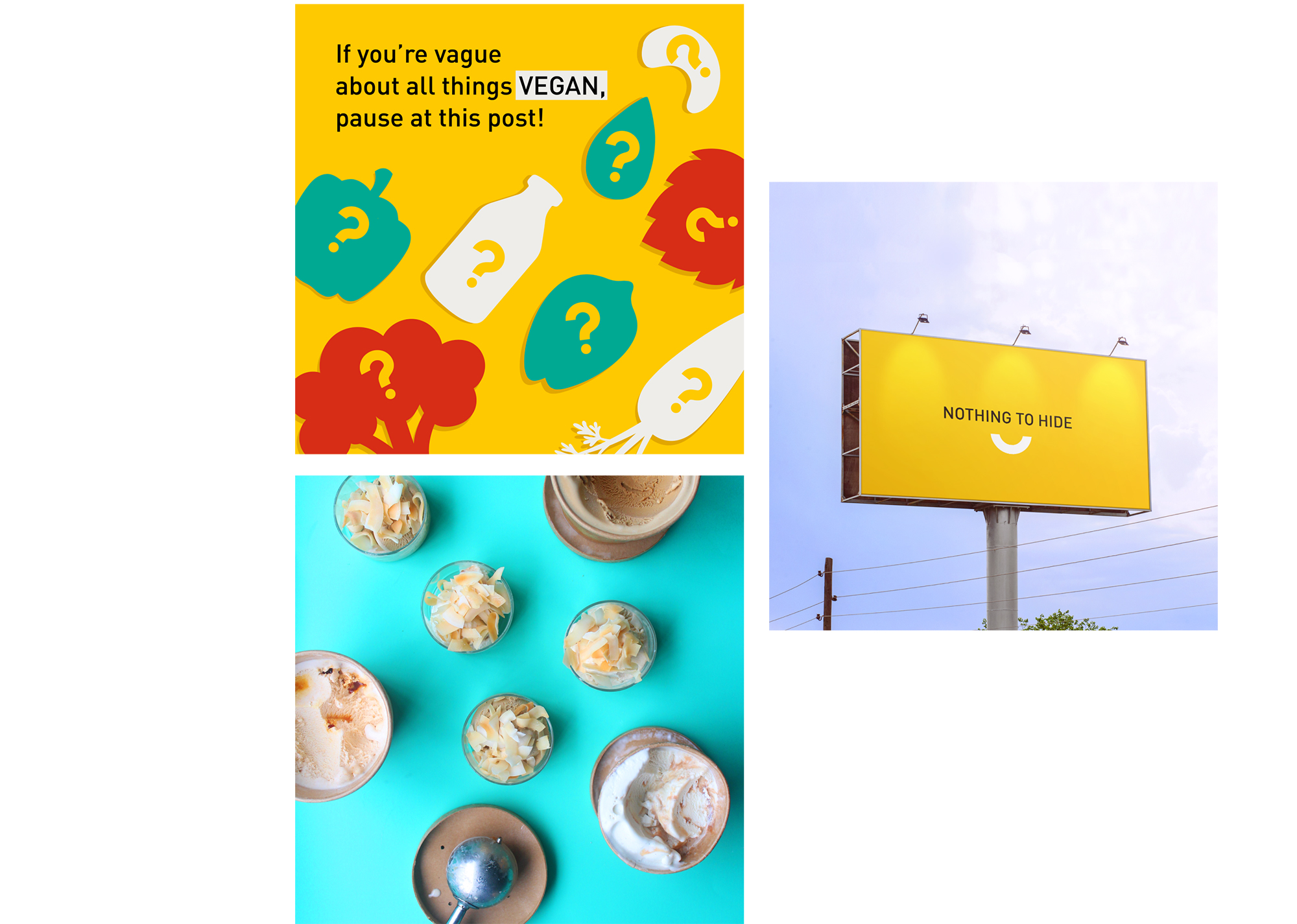
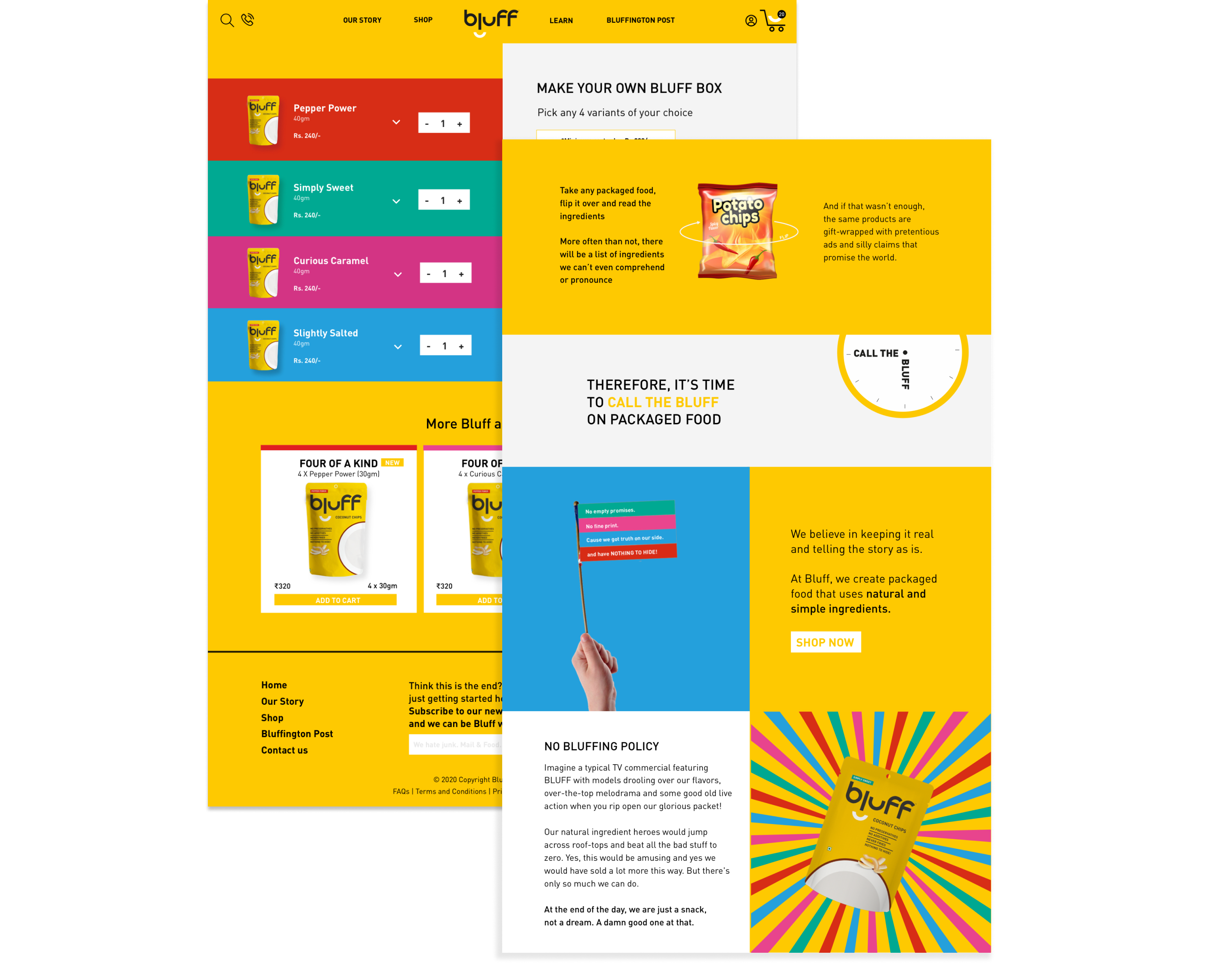
Bluff wanted to stand out in the market as the healthy-no nonsense alternative to healthy snacking. The brand’s call to action was ‘call the bluff’ on packaged food. They were taking on the big food companies and needed a honest and simple approach to this.
With a name like ‘Bluff’ things could have easily been confusing for the consumer but the idea was to use this to our advantage and make this work in favour of the brand.
Define
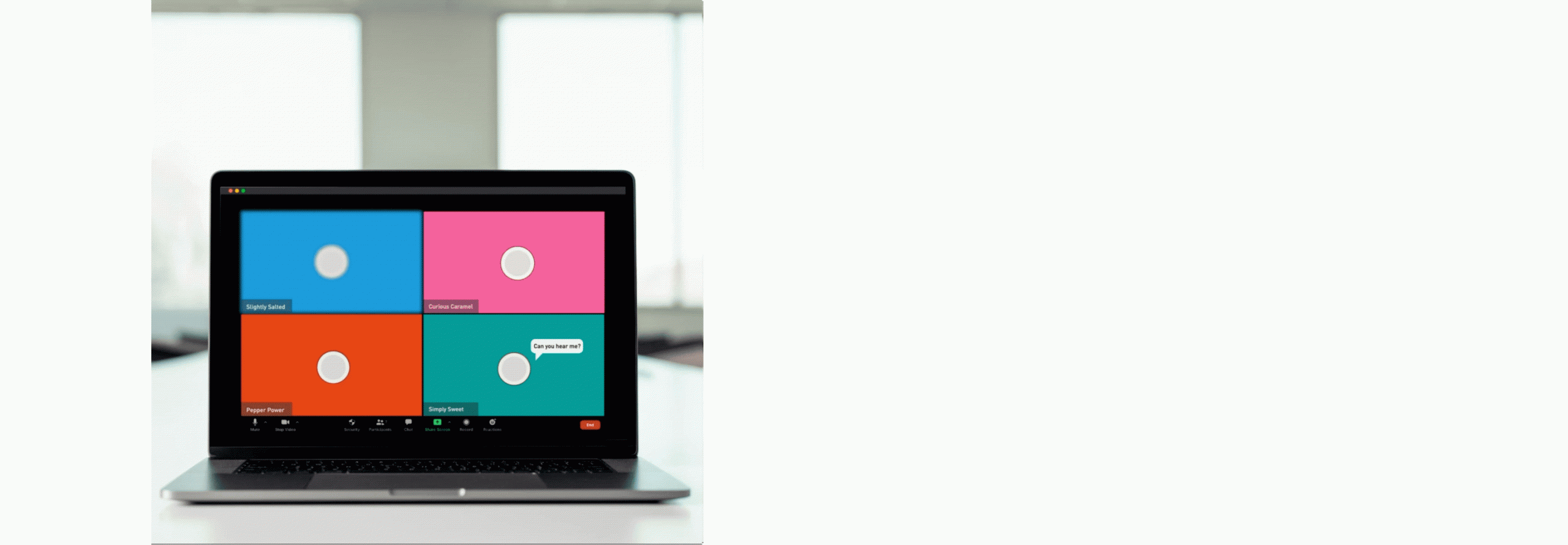
Bluff’s products were fully clean label and the tone of voice was defined in three ways- informative, fun and honest.
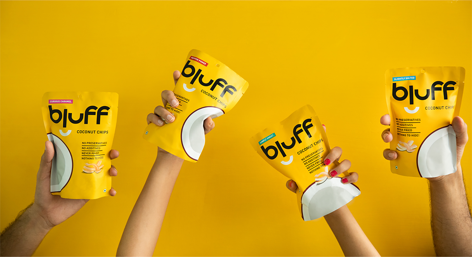
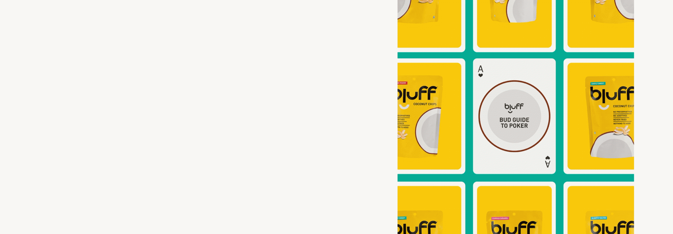
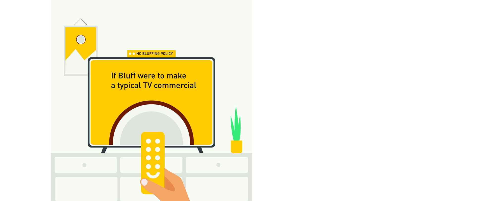
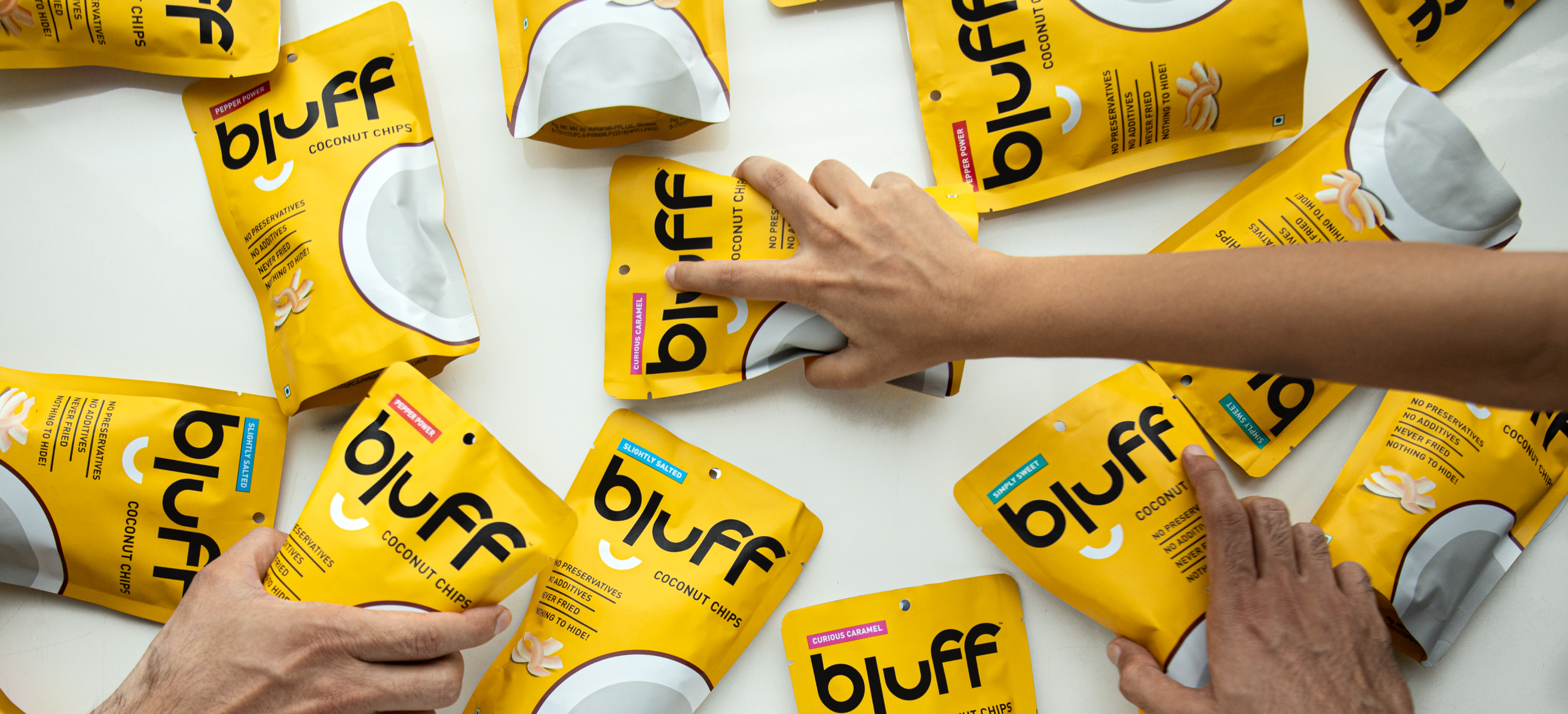
A playful approach was taken where the colors from the packaging were used extensively and the brand color ‘yellow’ would be the main point of recall.
Design
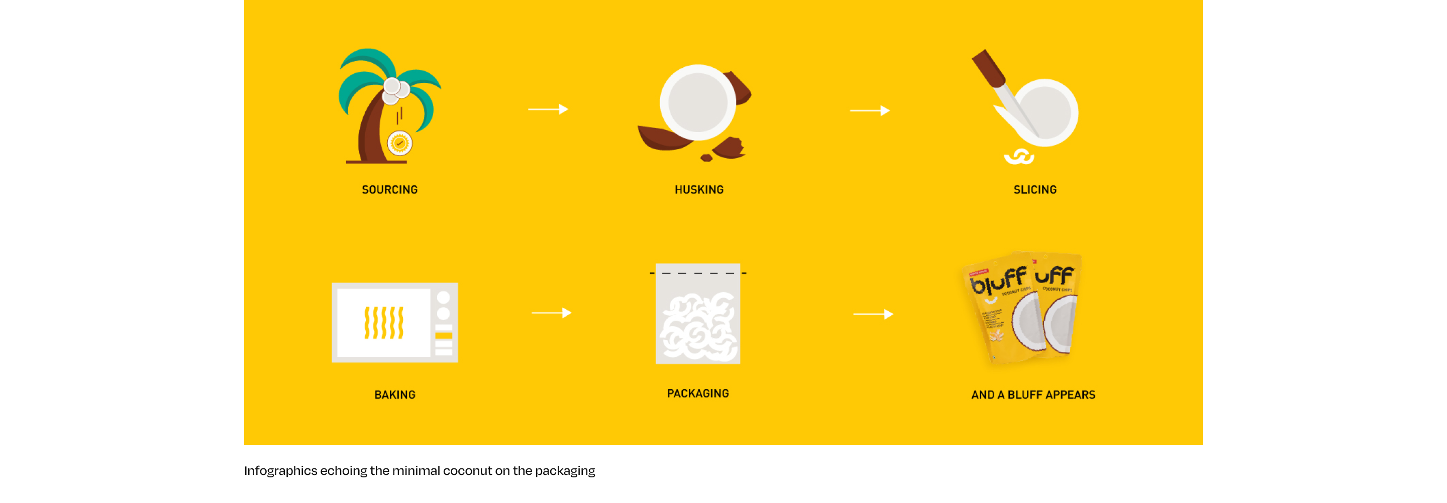
Simple and clean, similar to the brand’s core values were the driving forces in the visual language. The Bluff yellow was used in abundance for the brand to truly own this color.
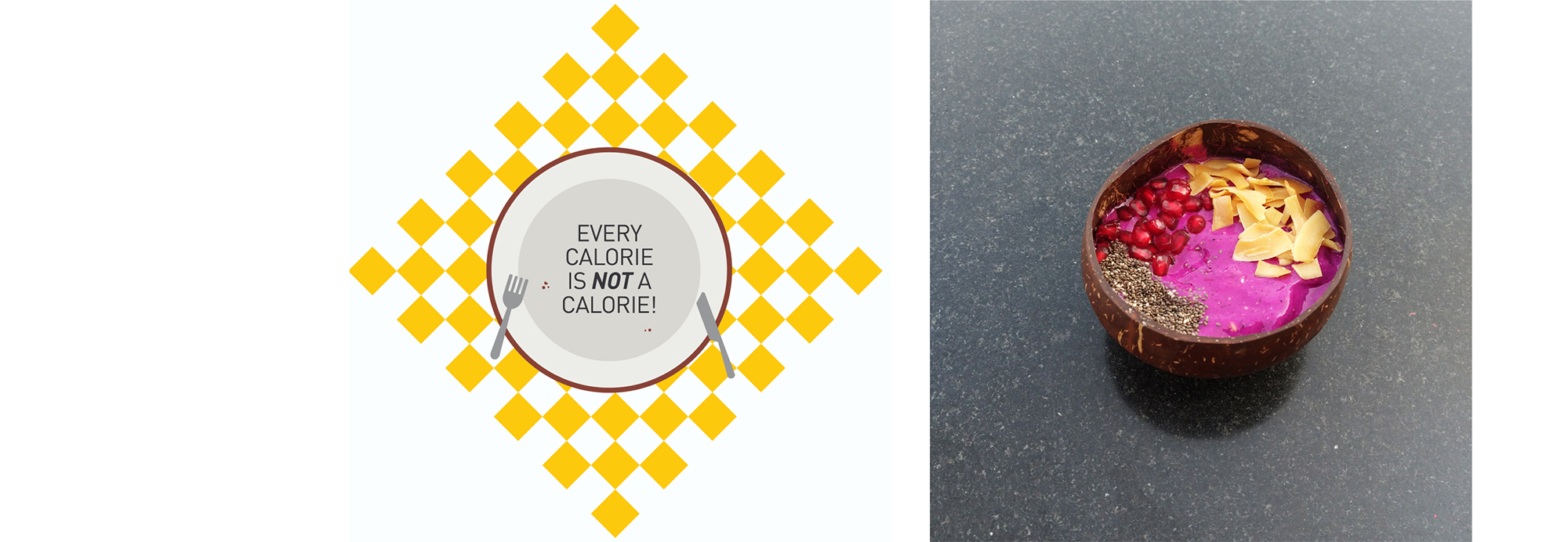
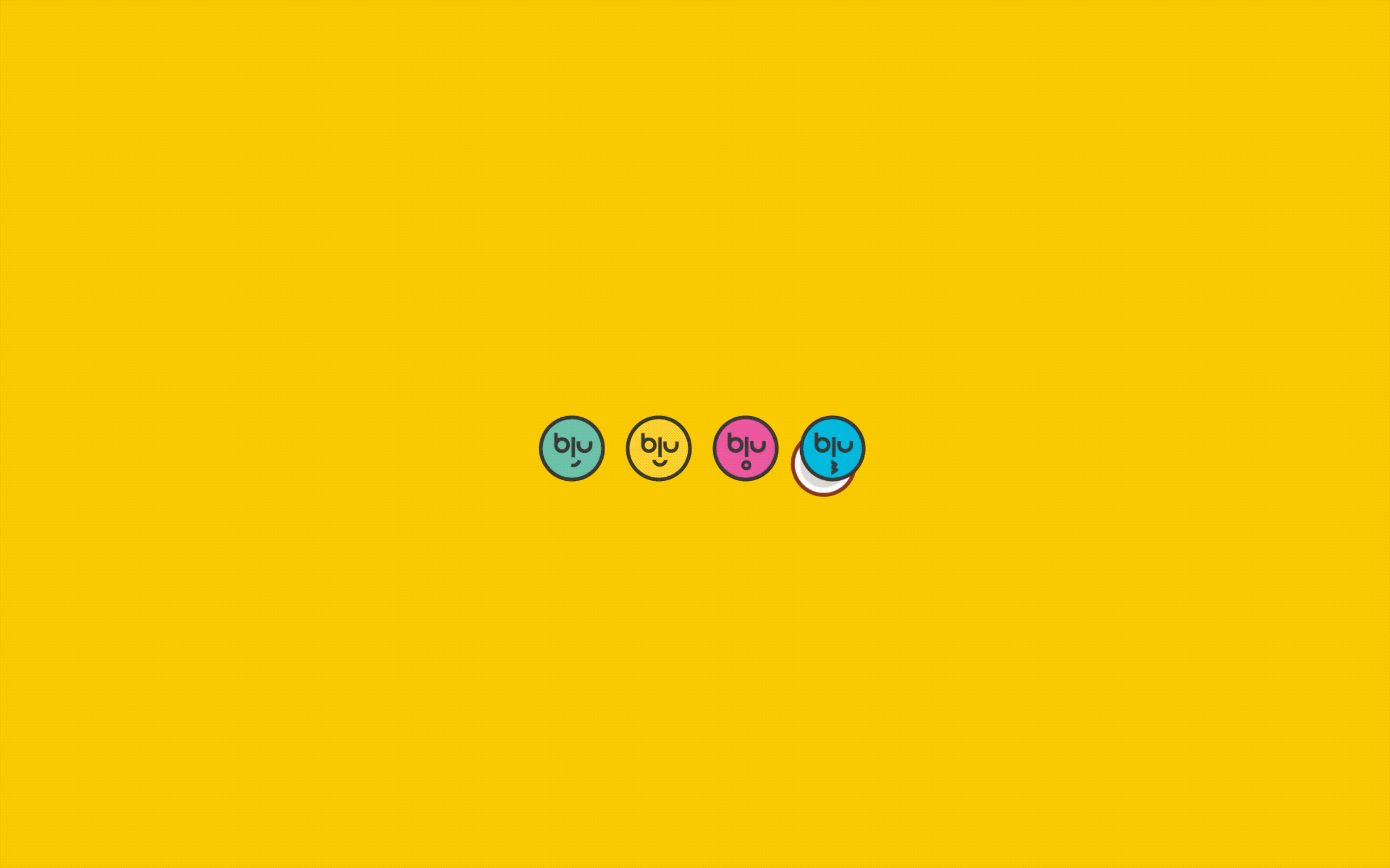
The coconut became a playful recurring symbol within the brand, animated and in print formats. The digital presence and tone of voice also took on it’s shape inspired from this playful (but always informative) approach.