IDENTITY DESIGN // PACKAGING DESIGN
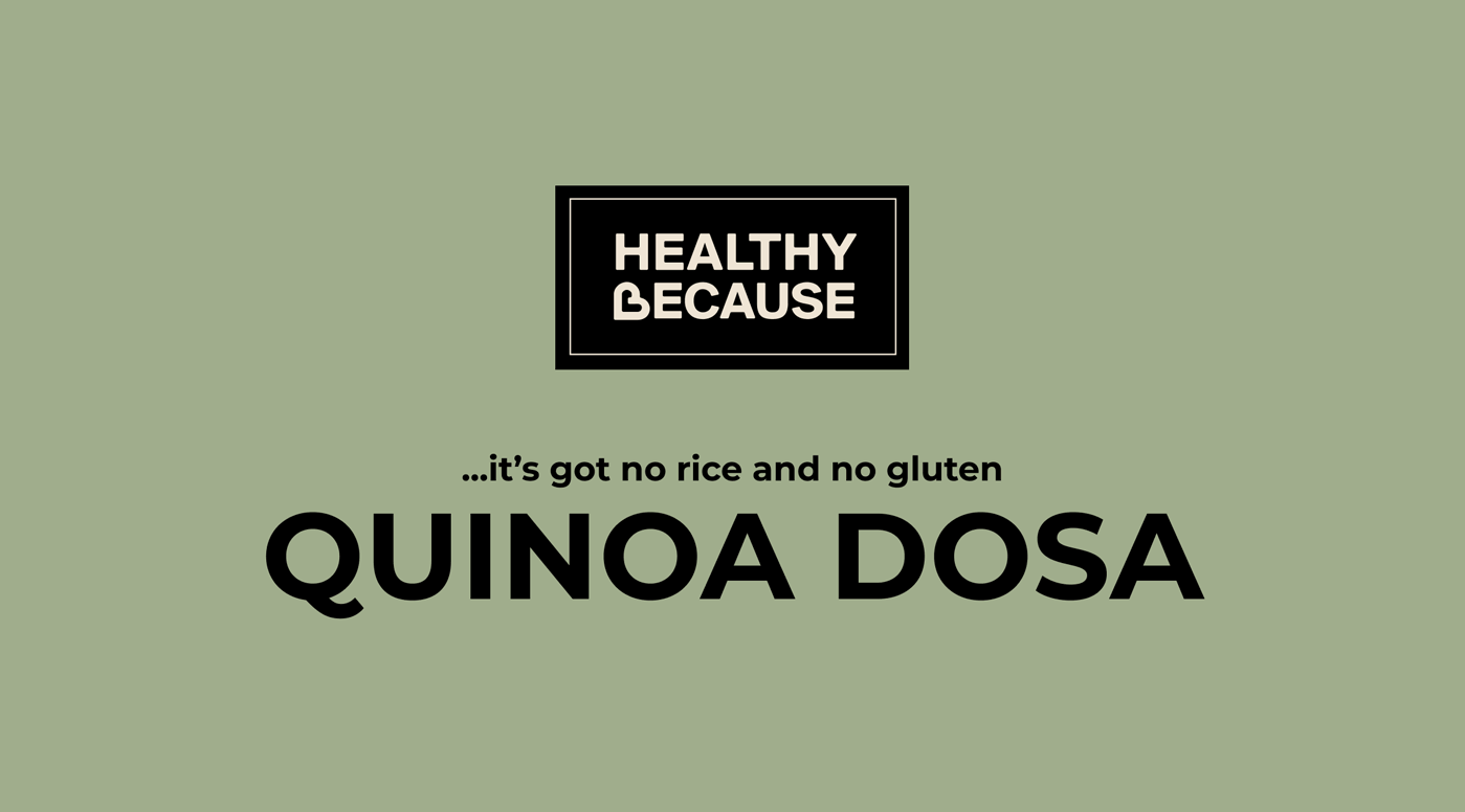
Healthy Because
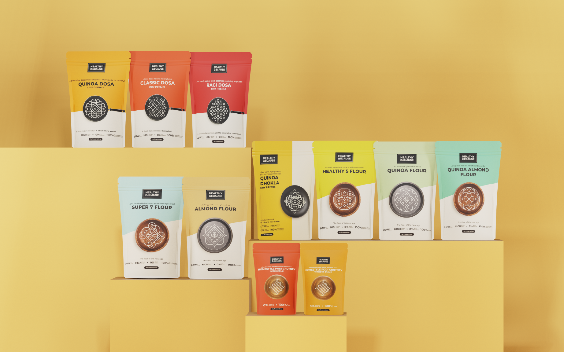
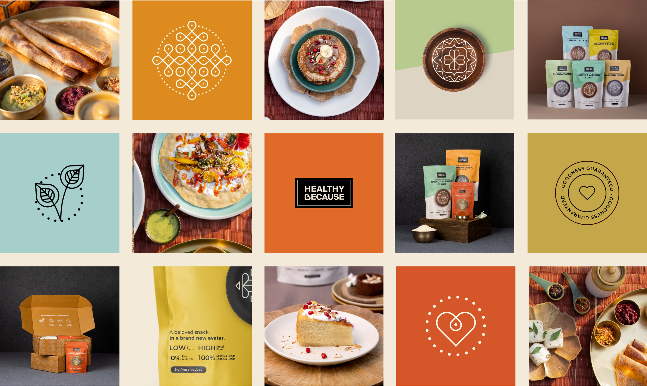
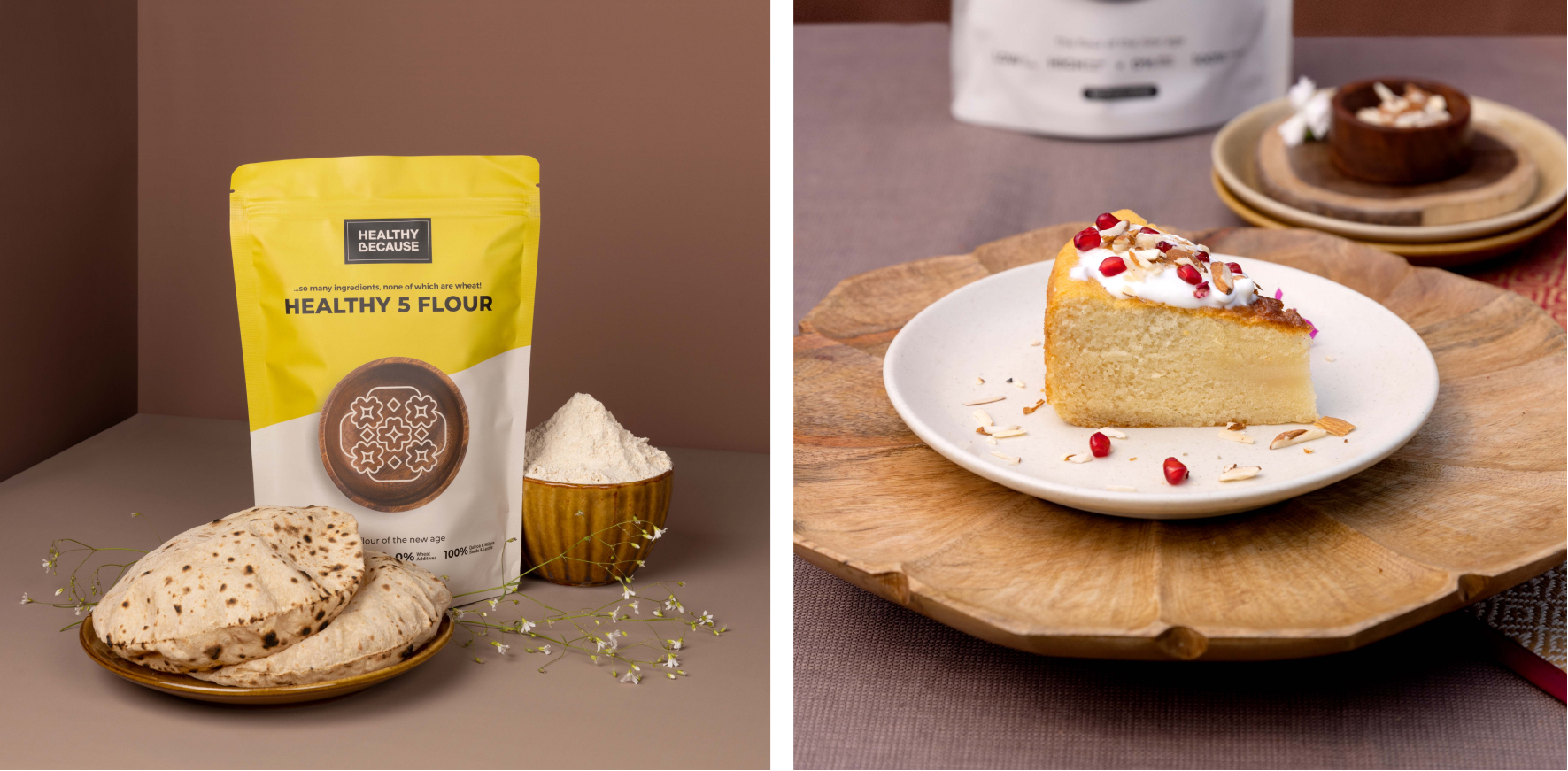
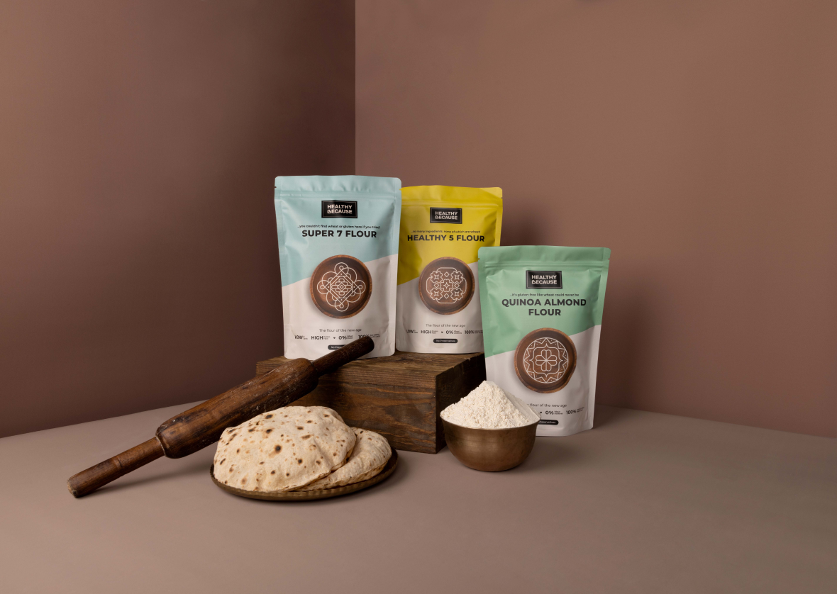
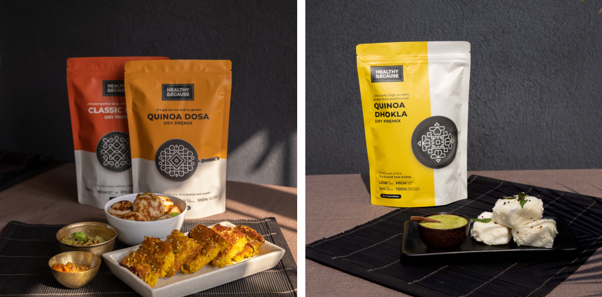
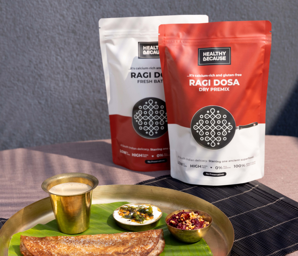
Healthy Because is a family-run food startup that creates alternate versions of beloved food items. Their product range includes classic staples like Dosa Batters, Flours and Dhoklas with a modern twist of new age ingredients like quinoa and almond flour.
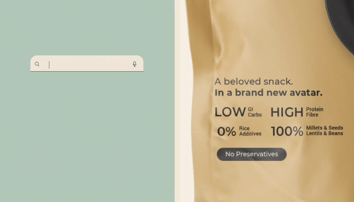
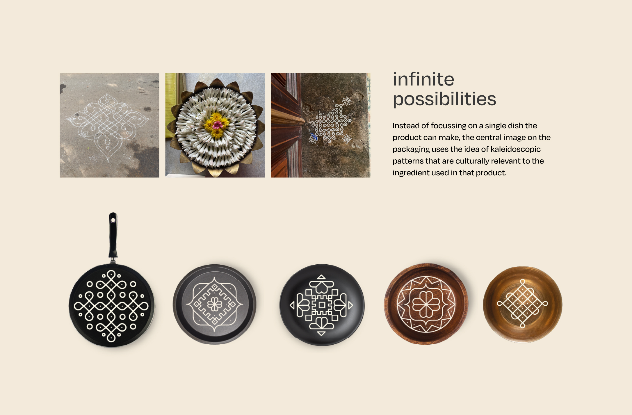
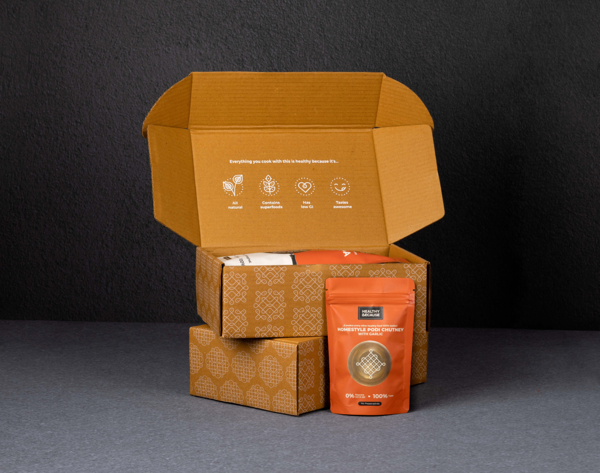
Formerly known as Healthy Batters, we collaborated with them to rebrand into Healthy Because, putting their agenda of ‘why’ their product is better upfront and centre. The new packaging shifted the focus on ‘ready to make’ by using ktichen utensils and intricate patterns encouraging customers to make cook multiple things with one product.
Design: Ping Pong x 9133 Design Studio
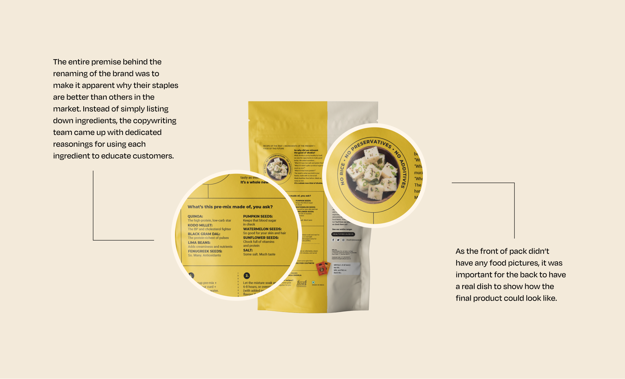
Copywriter: Rough Paper
Mockups: Yash Gupte
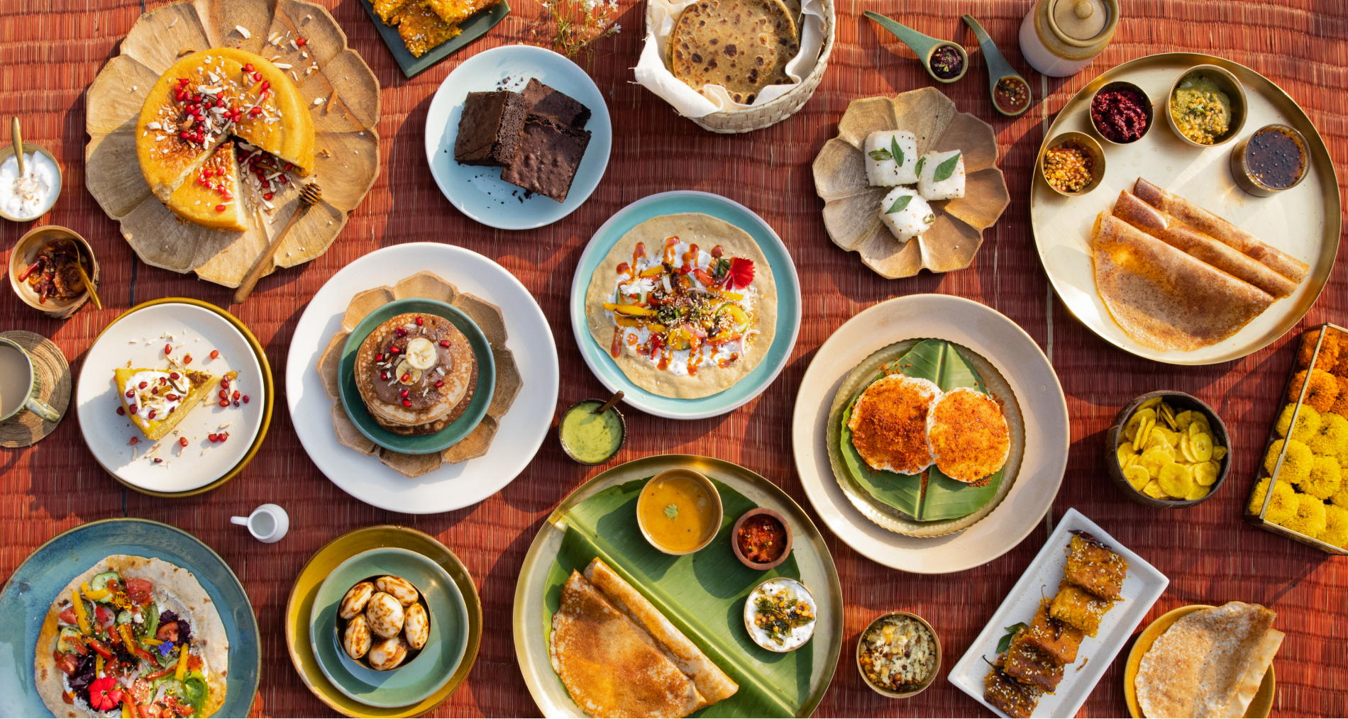
Photography: Destellodust


Discover
Healthy Because is a family-run business that started with the idea of providing healthy alternatives to regular staples for a better lifestyle. Originally named Healthy Batters, the brand’s vision was to expand to other products, all made with natural and wholesome ingredients. With a customer base already in place, they wanted to establish themselves as a small business and shed the image of a home kitchen experiment.
Define
Healthy Because’s main challenge lay in not only changing consumers’ lifestyle patterns but offering justification and value for the premium they would be paying for regular staples. The name ‘Healthy Batters’ also did not encompass the growing range of products and a memorable word was needed to offset the generic term ‘Healthy’. The products’ main strength was their versatility, where each staple could have multiple utilities and different use cases in a consumer’s life.
Design
The name ‘Healthy Because’ brought the brand’s value proposition front and centre. Each packet had a byline that explained why that product was superior to a regular product. We shifted the focus on ‘ready to make’ rather than ‘ready to eat’ with utensils and kaleidoscopic patterns to indicate how each product could make anything they imagine.
Check out our fun BTS video from the photoshoot here.