THE SECRET SAUCE
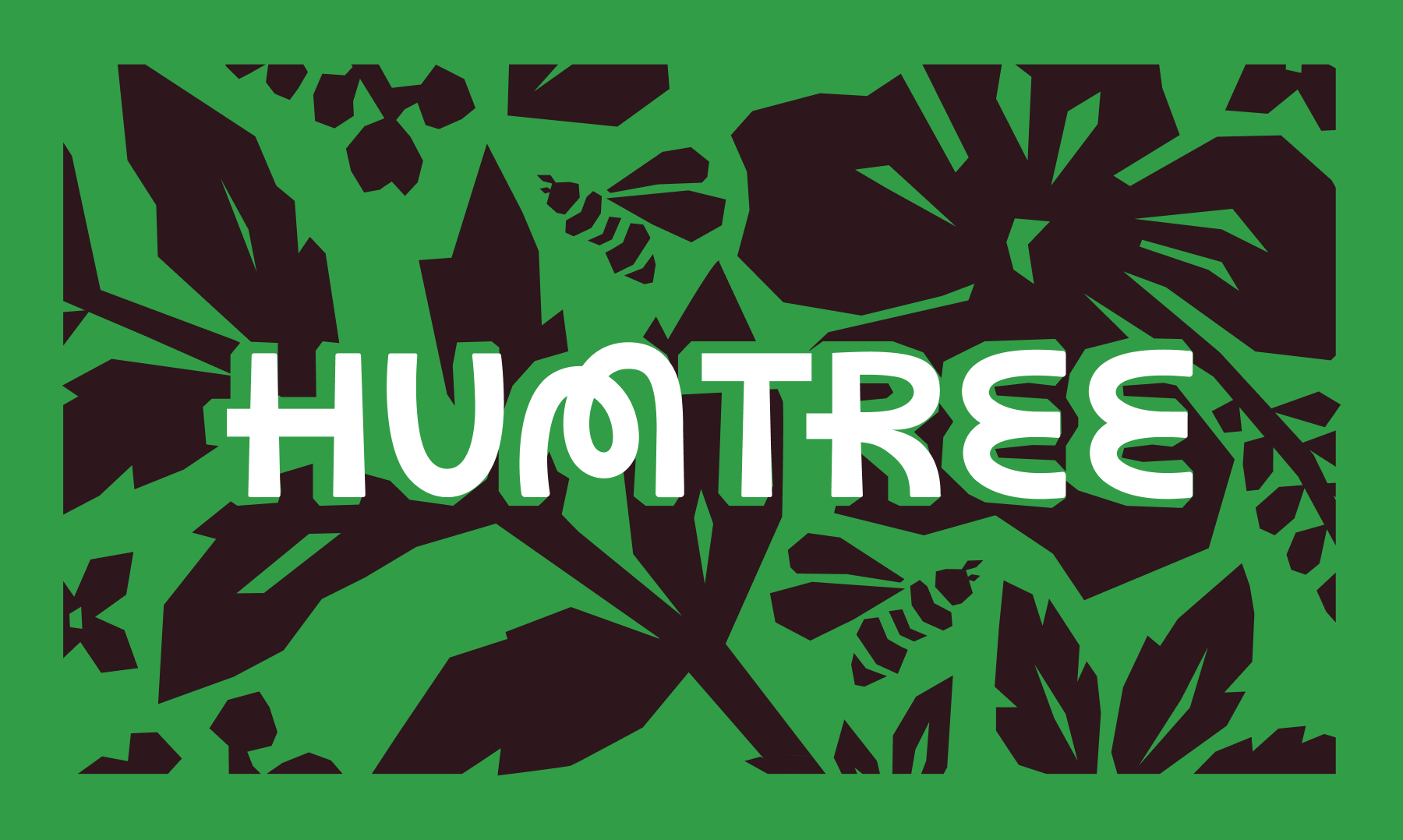
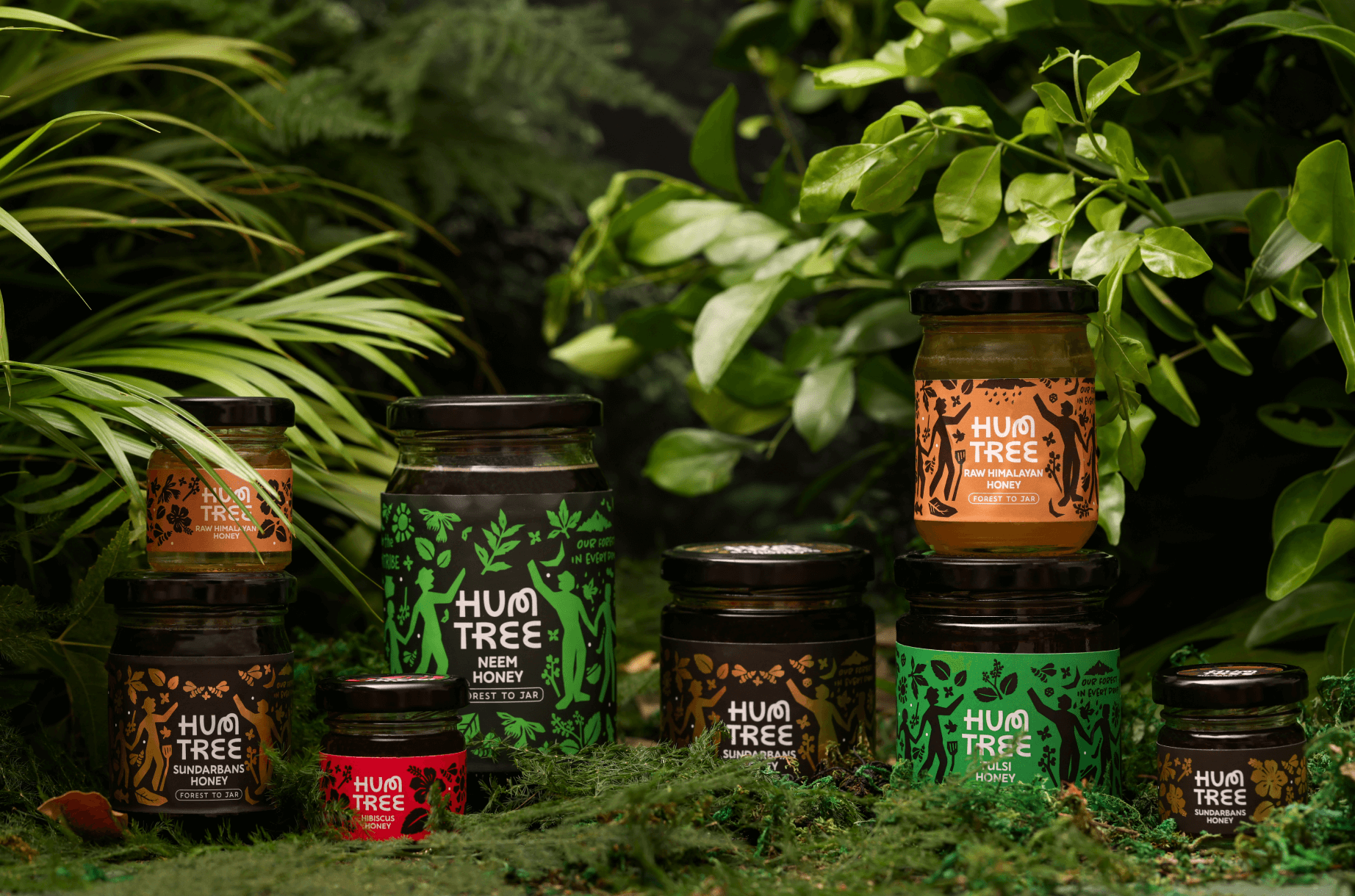
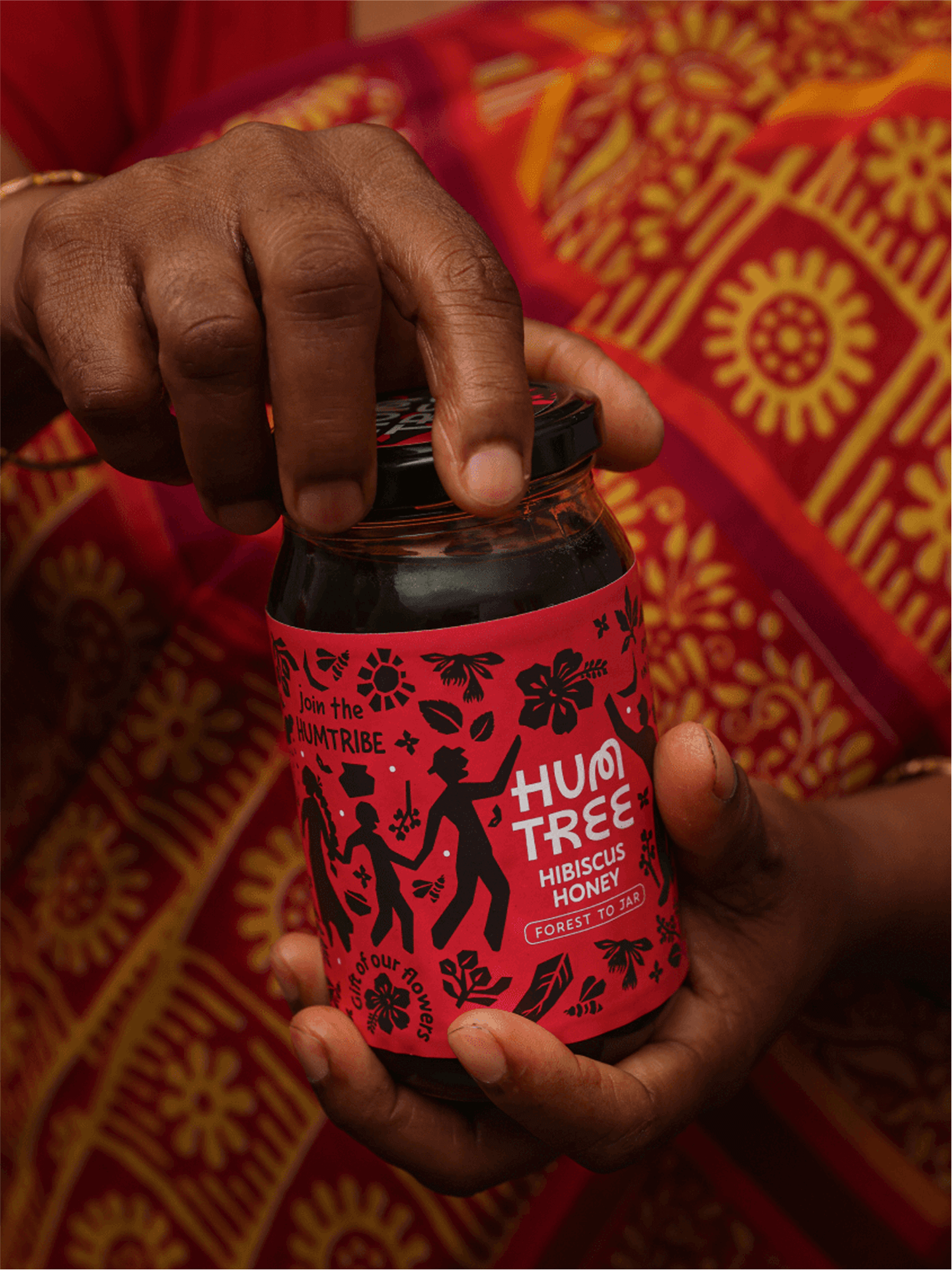
The illustrations are inspired from tree carvings and folk art for a product that came from nature
The illustrations are inspired from tree carvings and folk art for a product that came from nature
HumTree is a small batch fair trade brand based in Calcutta, India. Out to prove that affordable doesn’t have to mean low-quality, they have two aims: offering high-quality at accessible prices and giving back to the local forest workers by generating employment opportunities.
We created the brand name, brand identity, and packaging for their honey, helping to bring their story to life. HumTree works with indigenous communities of the Sundarbans using forest-friendly practices. This sense of harmony and community was highlighted in the naming and branding. Hum, from the Hindi word for ‘us’ and the sound of bees, and Tree, reflecting its commitment to natural practices.
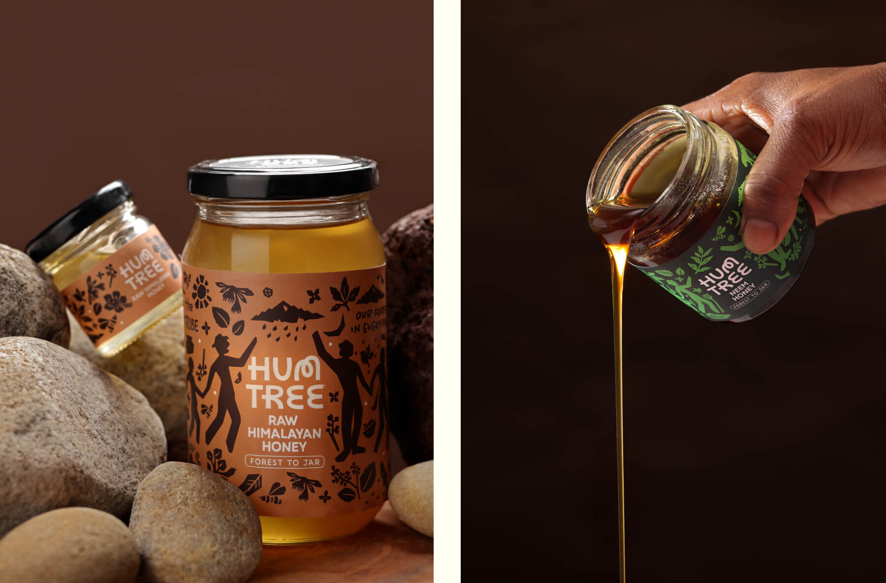
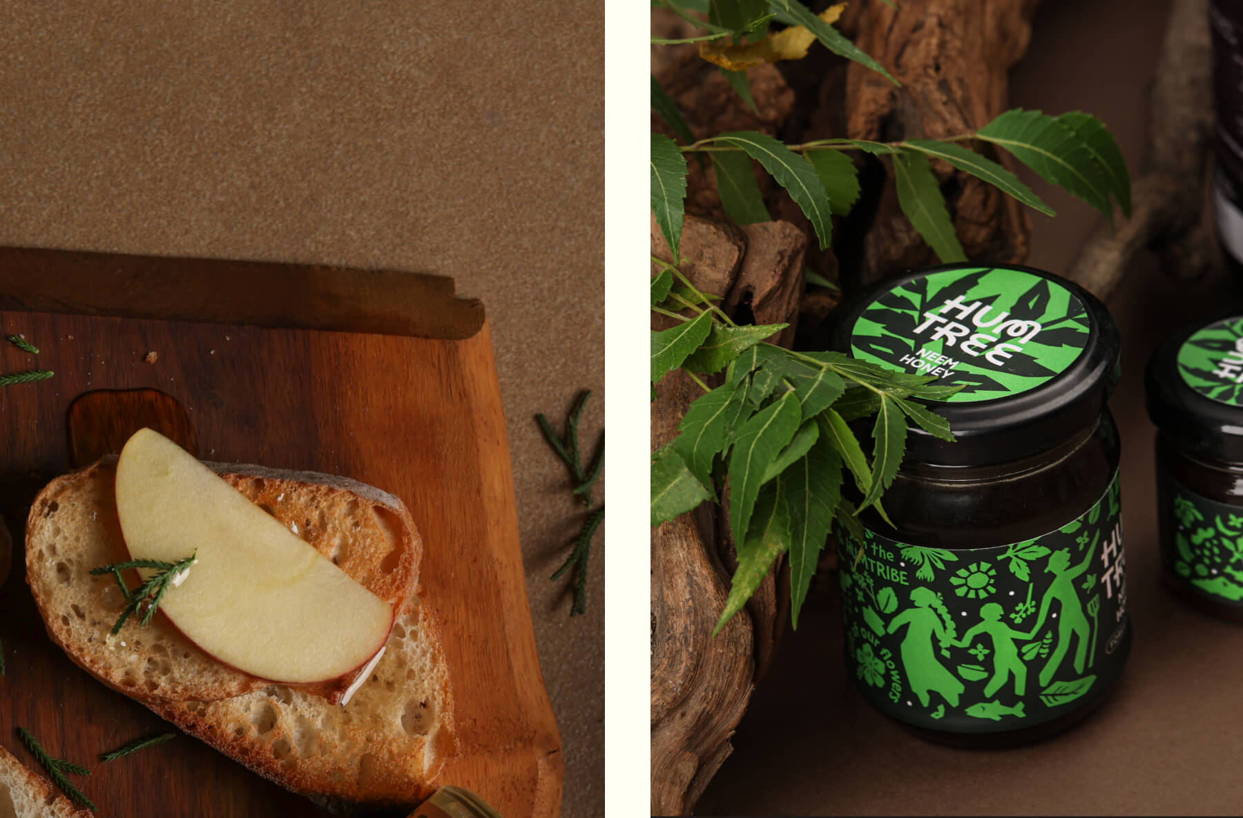
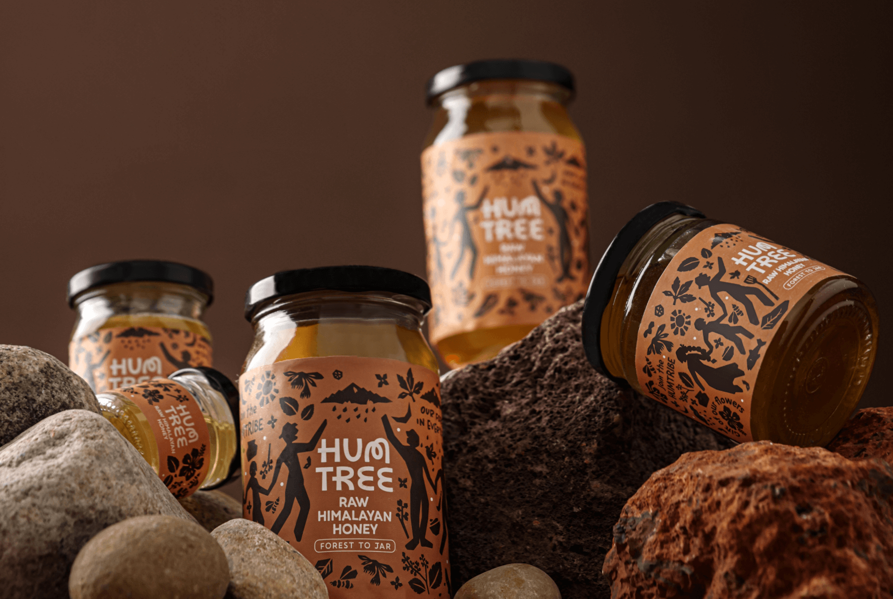
The visual design was made using linocut-style hand-drawn motifs and illustrations inspired by imagery from nature, evoking the harmony of flora and fauna that the brand stood for.
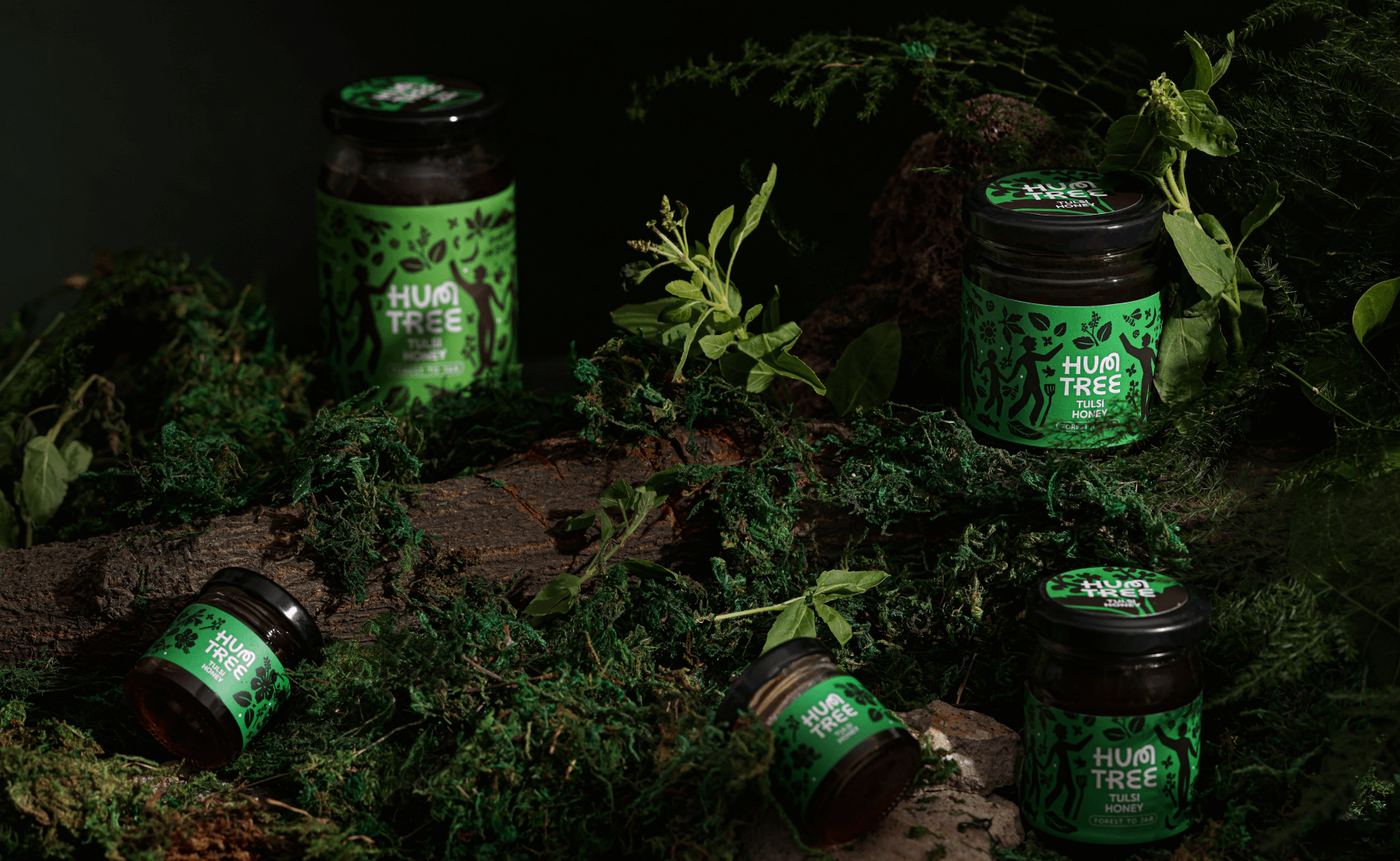
HumTree is a small batch fair trade brand based in Calcutta, with products sourced from the Sundarbans, India. The brand works largely with women in the Sundarbans to create forest-friendly products while giving back to the community.
As a new brand, they had to establish their story of a sustainable, fair trade practice and also introduce a variety of flavoured honey to the public. HumTree had to be traceable to its roots in the indigenous communities in Sundarbans and had to look like a brand that was suitable and accessible for children and families.
HumTree’s brand name combined two words that echoed the brand’s vision. The Hindi word, ‘Hum’ for ‘us/everyone,’ reflects the brand’s commitment to supports users and makers alike, while also referring to the sound of bees. The word ‘Tree’ reflects its goal to do so in harmony with nature.
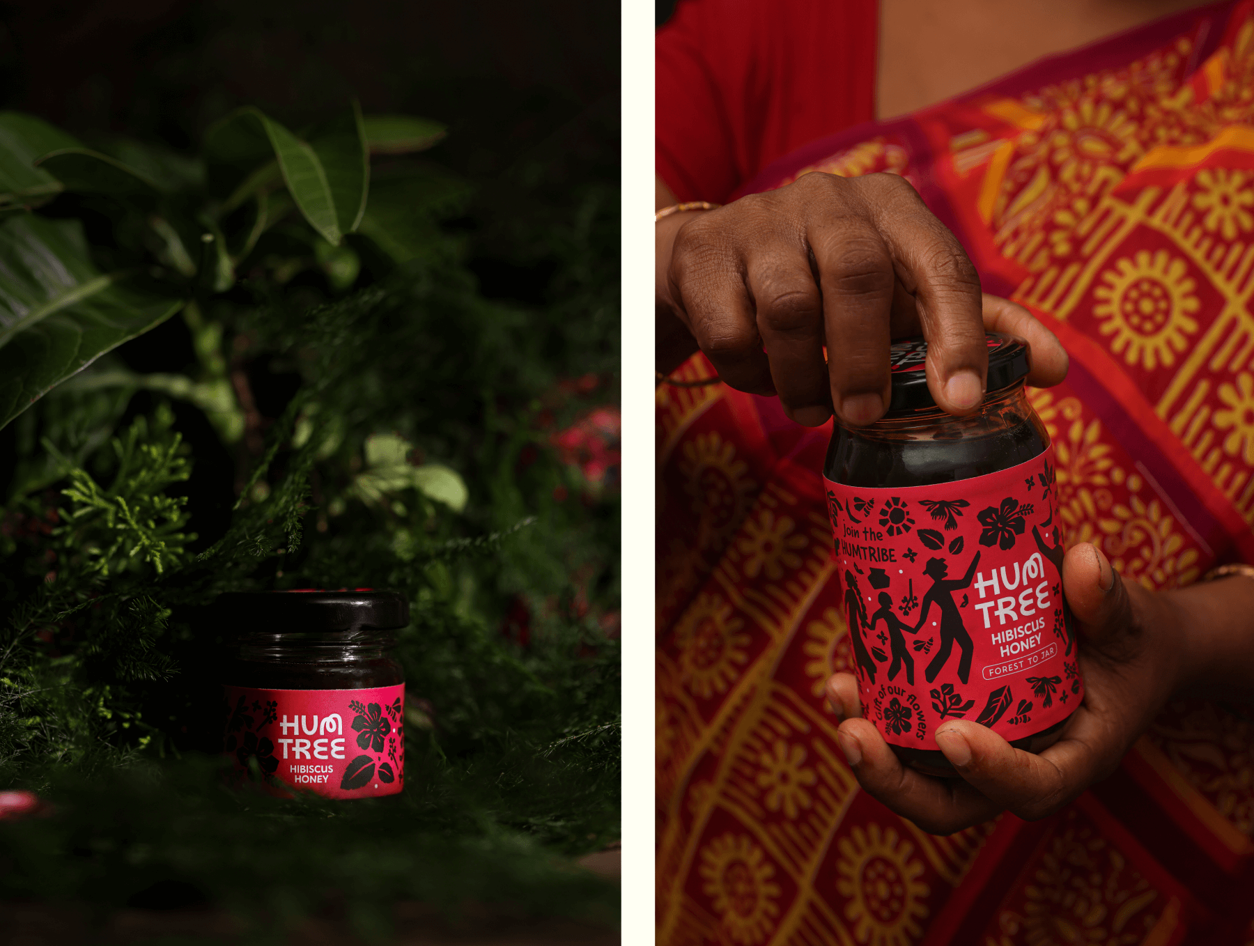
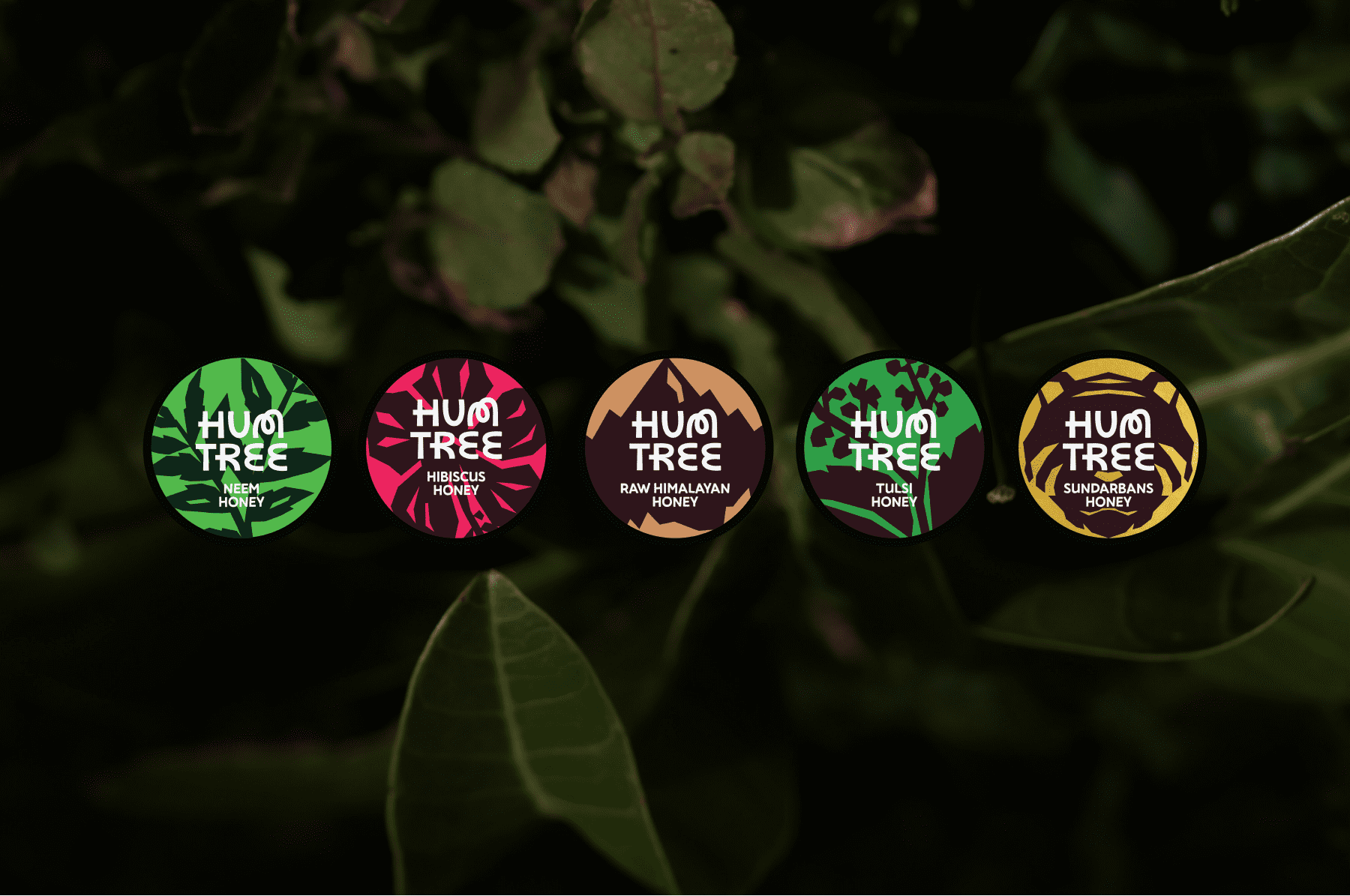
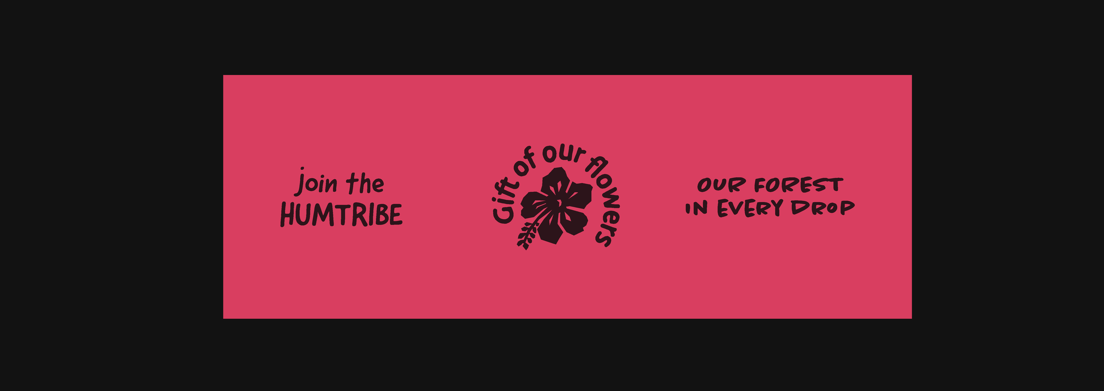
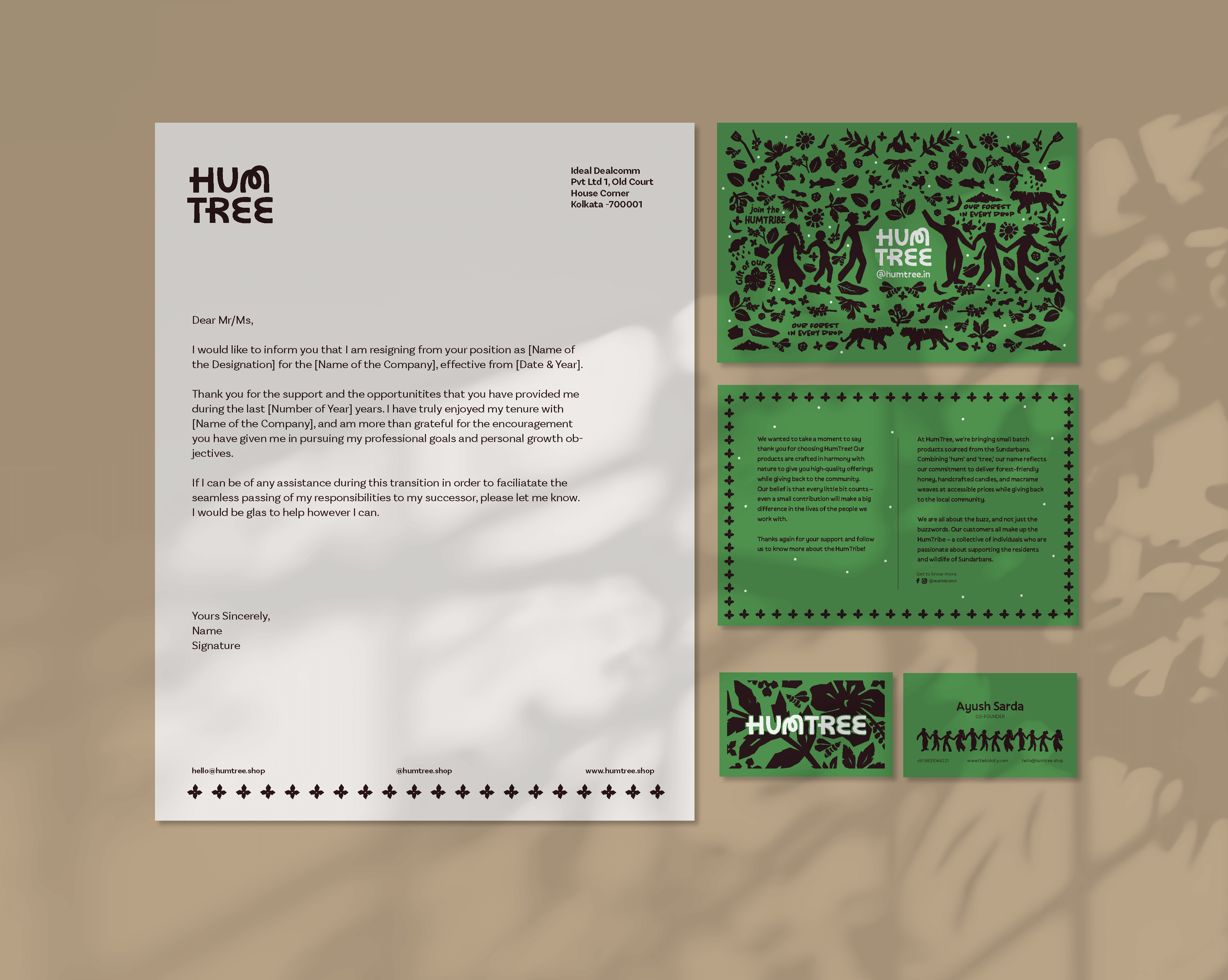
The branding and identity focussed on creating a sense of community with the consumers, inviting them to be a part of a collective, known as the HumTribe.
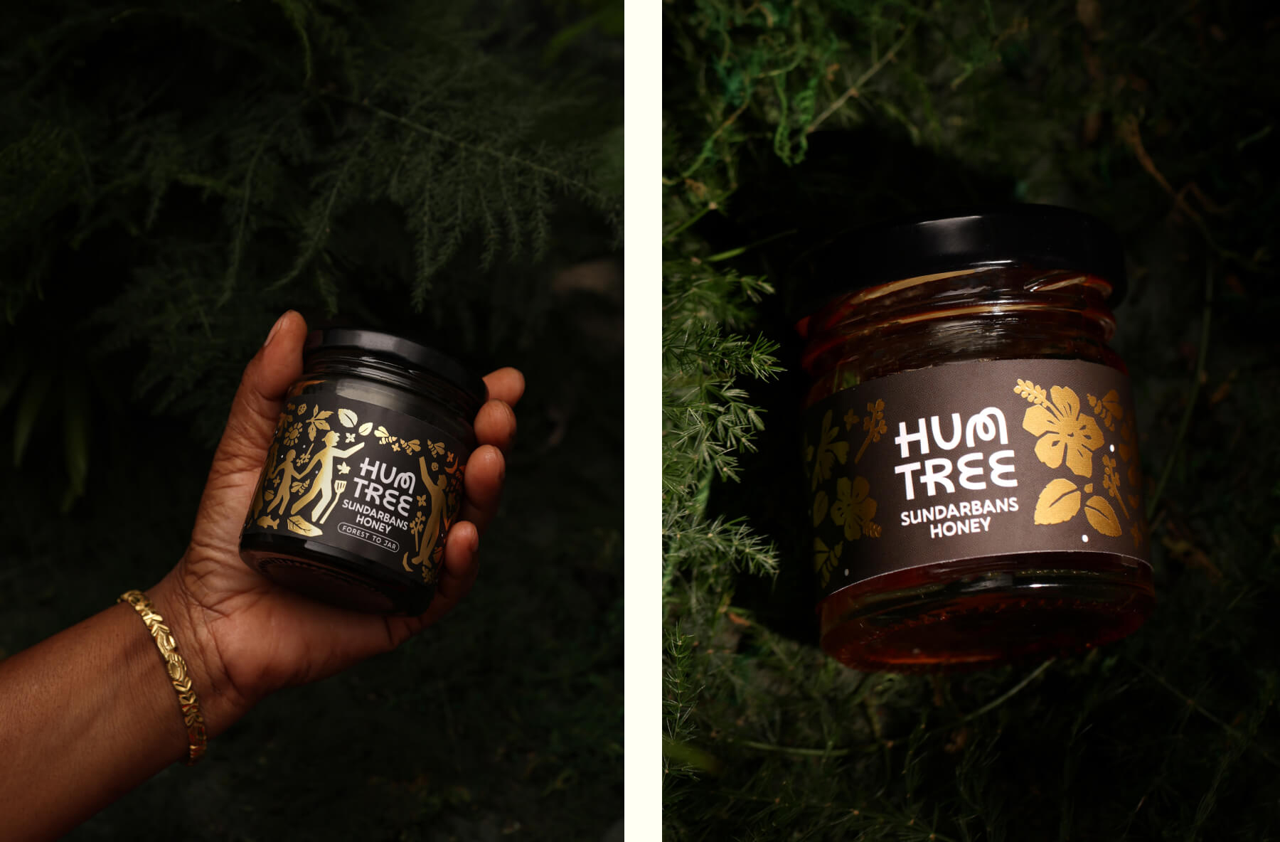
The logo was created using custom type, borrowing from vernacular alphabets (M) of the region. The colour palette was kept to earthy greens and browns, evoking the forests where the products were made.
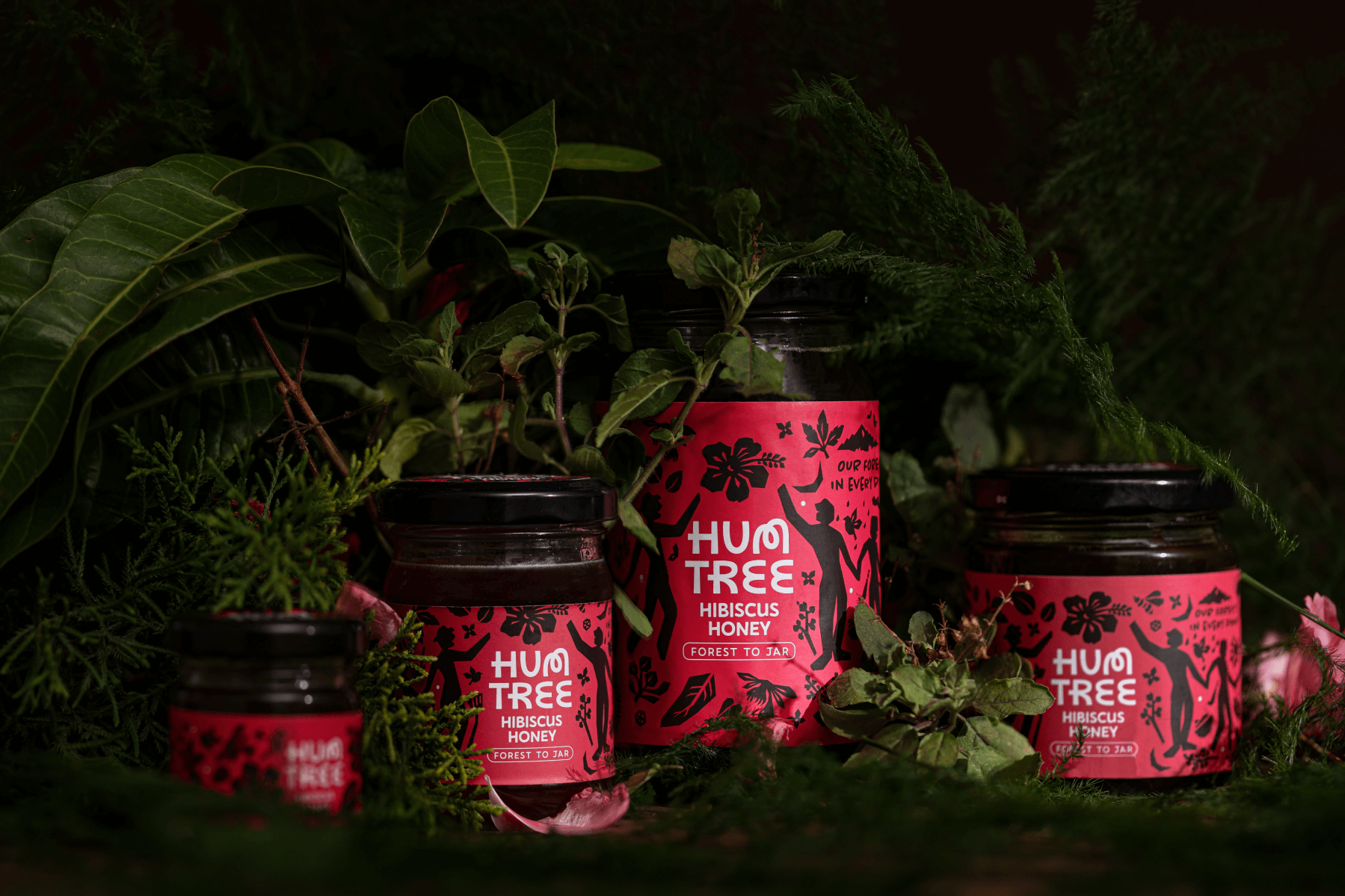
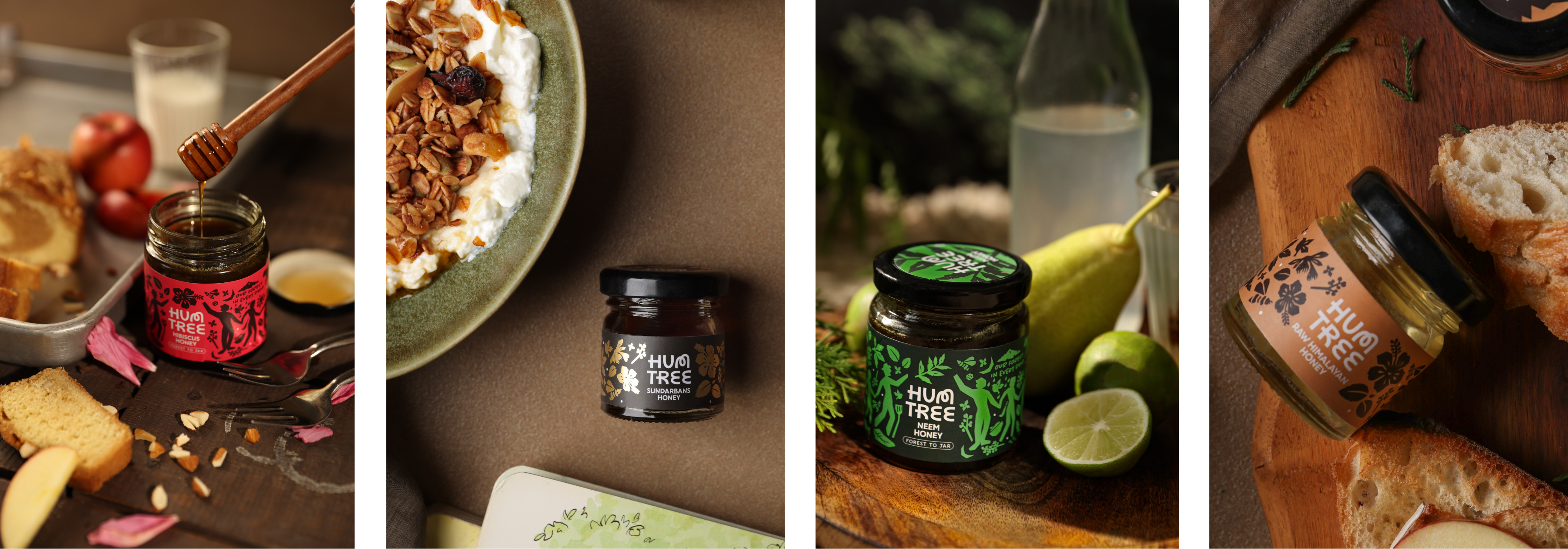
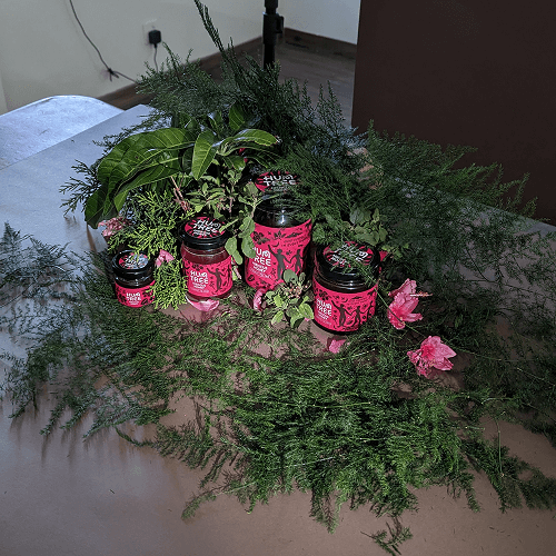
Linocut inspired motifs of flora and fauna were hand-drawn to capture the organic, handcrafted nature of the products The packaging relied on heavy use of deep brown-the colour of the honey, along with flavour based tones of magenta, green and gold. Usecases were added to the packaging itself – bringing out the unique characteristics and benefits of each of the variants.
Shoot day
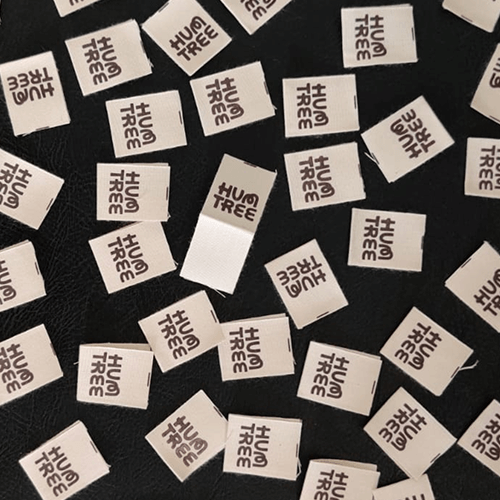
Labels for new products
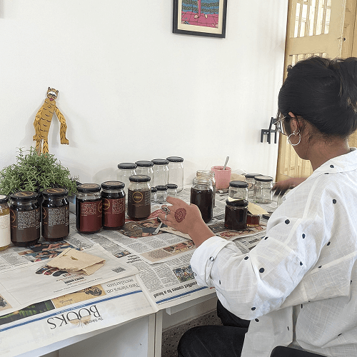
Designers AKA label putters