BRAND IDENTITY // IDENTITY DESIGN // PACKAGING DESIGN
Little Lot
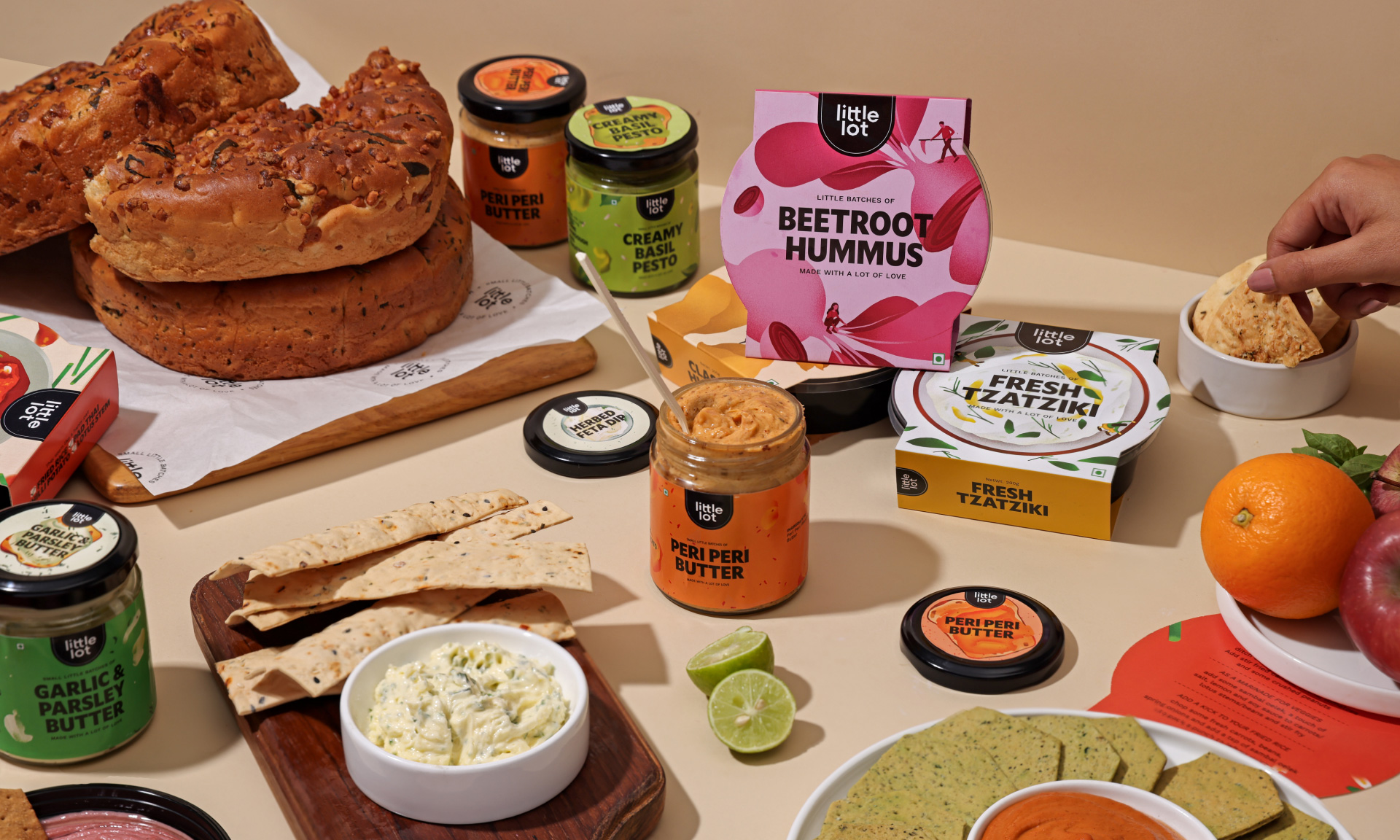
Little Lot is a private label brand by Fresh Aisle, a gourmet grocery chain in Calcutta, India. With the aim of making gourmet food accessible, Little Lot offers a range of world cuisine in bite sizes for personal use, casual gatherings, and big celebrations.
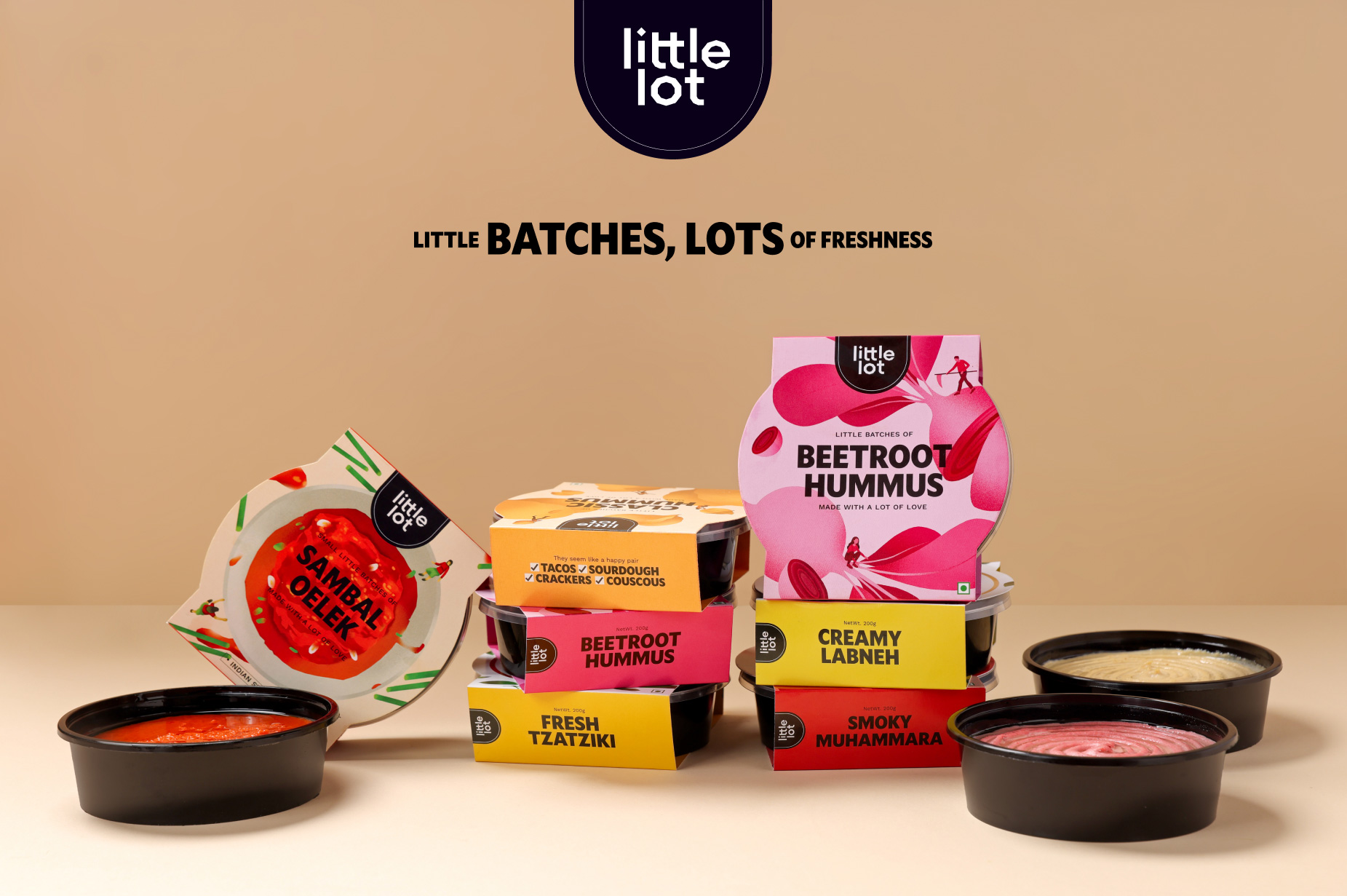
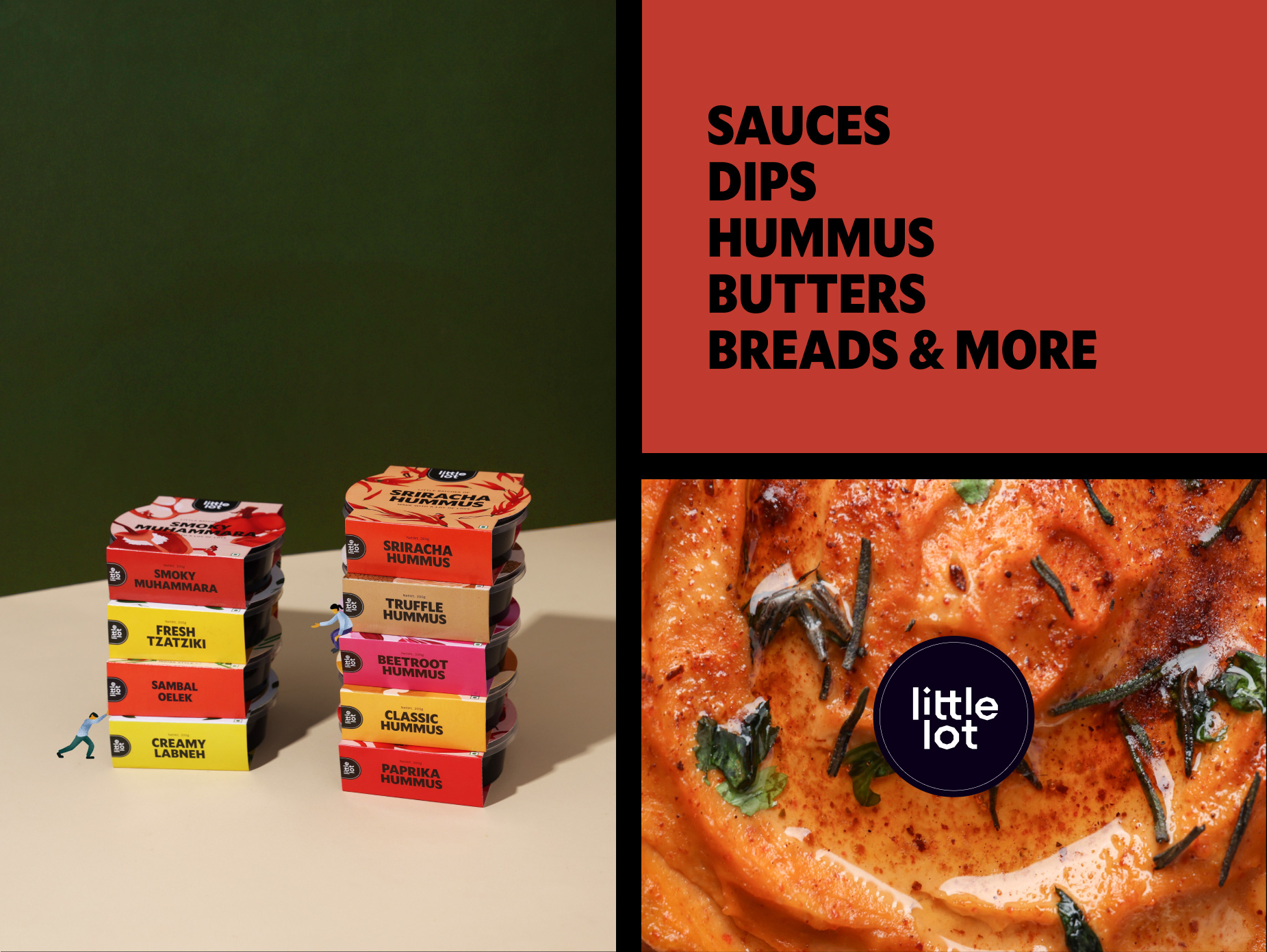
We collaborated with them to create their brand name, identity, and packaging, helping to showcase their wide array of products. Little Lot’s biggest unique selling proposition (USP) is its small batch fresh food. The brand name reflects this concept, and the identity further emphasises the hero ingredients and the individuals responsible for making these products. Little Lot’s primary objective is to make gourmet food for everyone. Each product provides instructions on how to incorporate them into everyday cooking and suggests suitable pairings.
Discover
Fresh Aisle is a popular grocery chain in Calcutta, India. Little Lot, as a private label brand from Fresh Aisle, had to uphold the brand name, evoke wholesomeness, and give the consumer a taste of the gourmet world. Little Lot mainly had two challenges- to make audiences try out new flavours or products from world cuisine and to make small batch fresh food readily available.
Little Lot’s branding had to focus a lot more on the products than the brand itself, where the consumer engaged with the packaging online and offline. The brand also had to compete with other brands sold in Fresh Aisle, using the freshness as its USP across categories.
Define
Little Lot’s brand name came about from the idea of small batch- high value products. As there were several food categories like sauces, dips, hummus, butters and breads, the brand had to work across mediums and contexts.
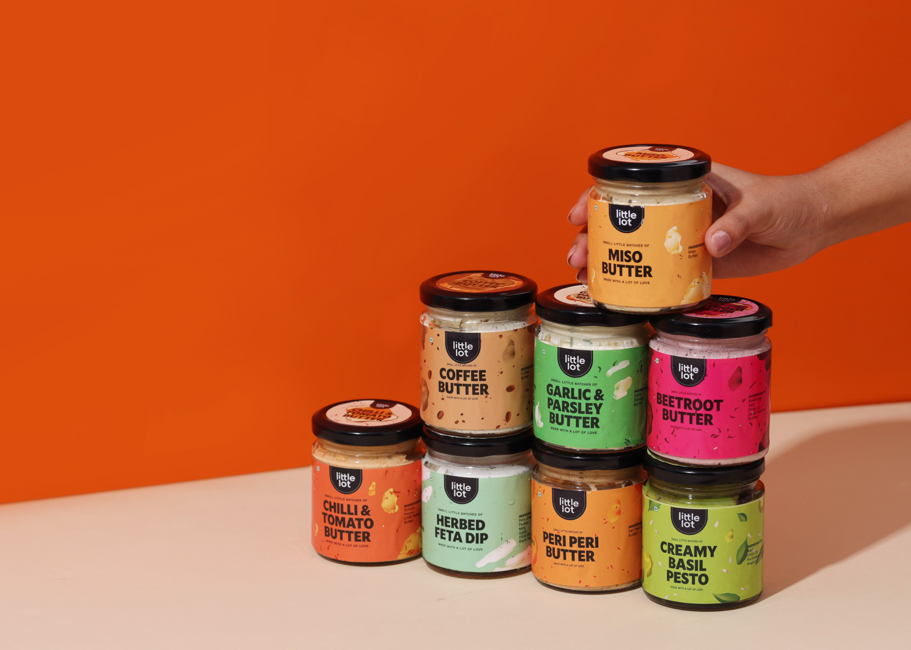
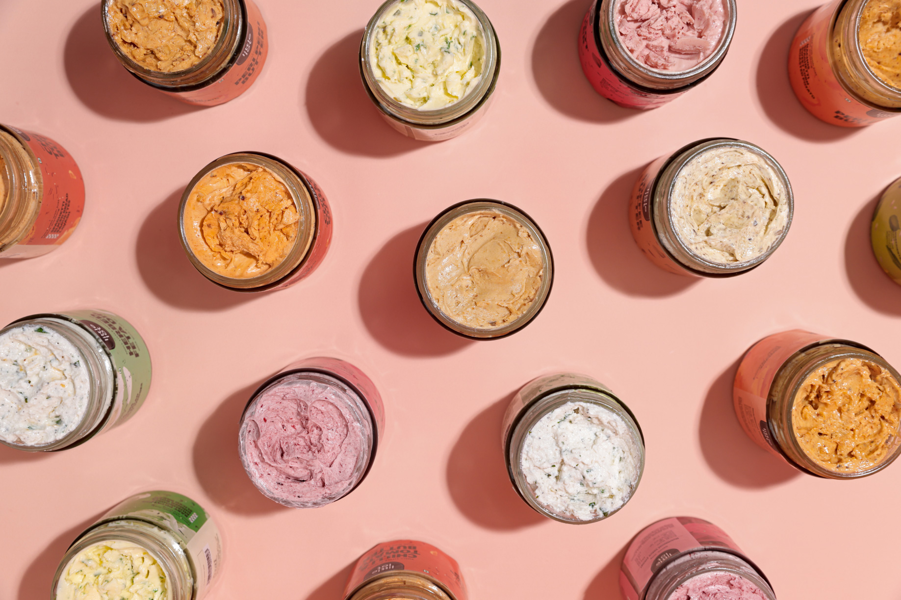
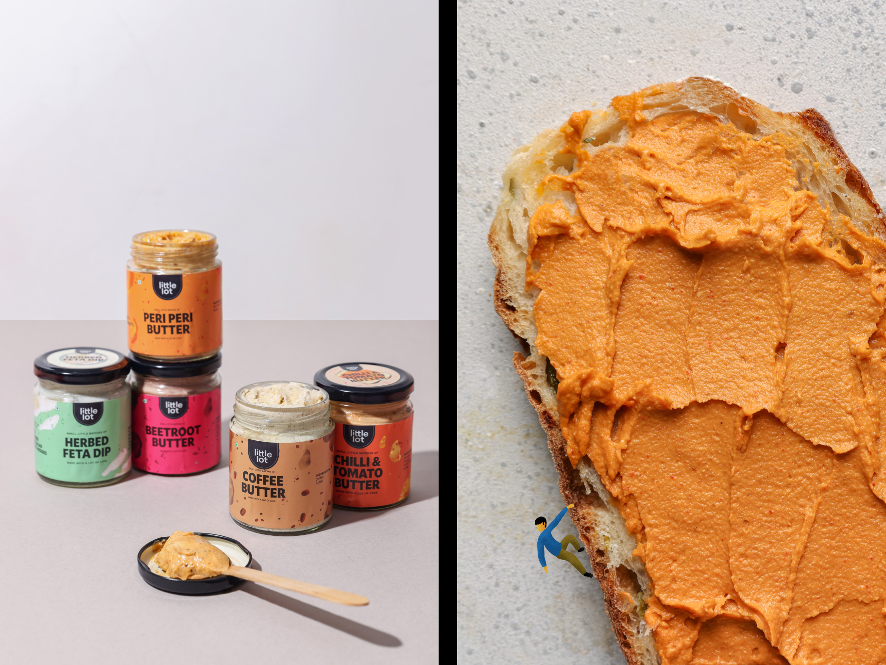
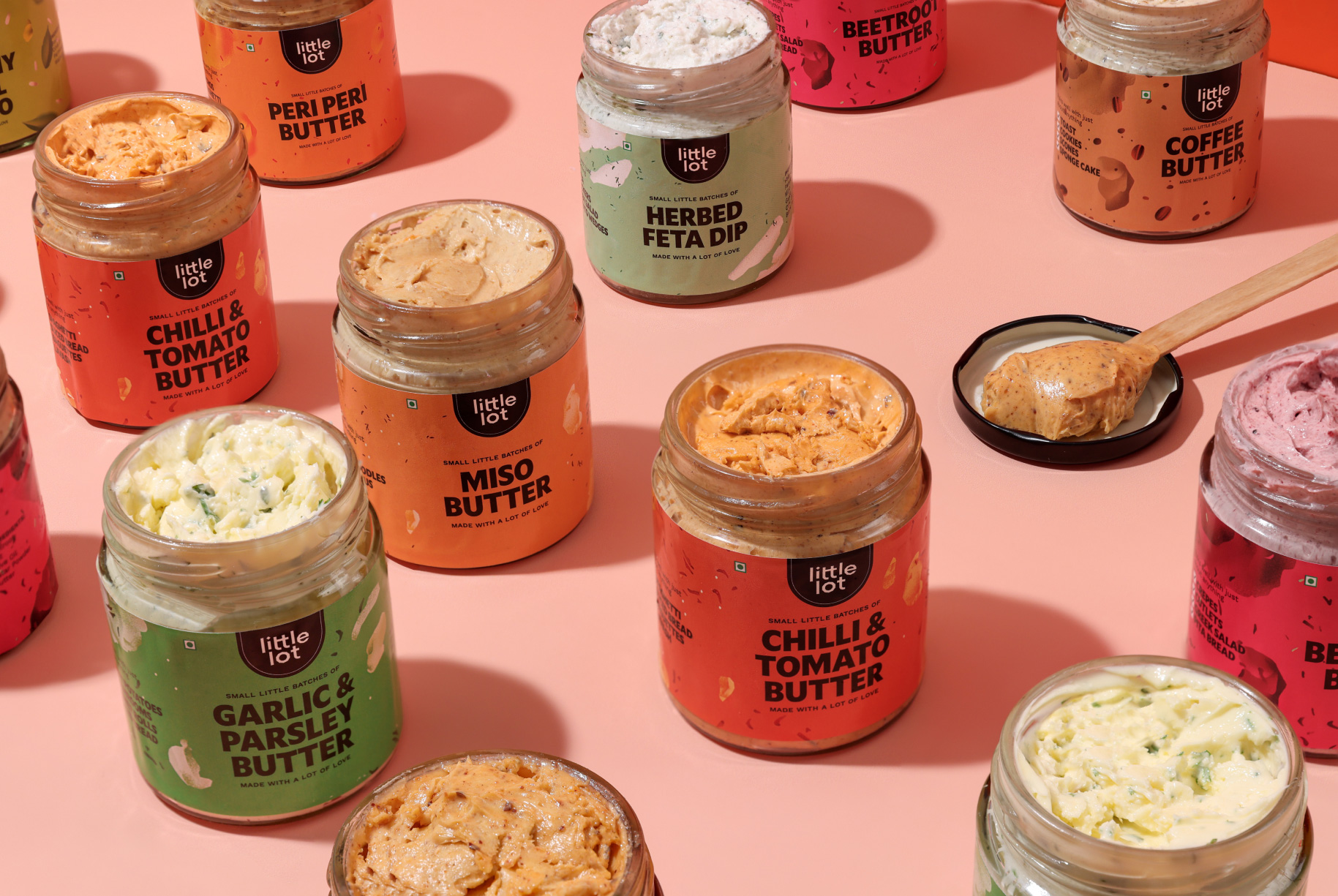
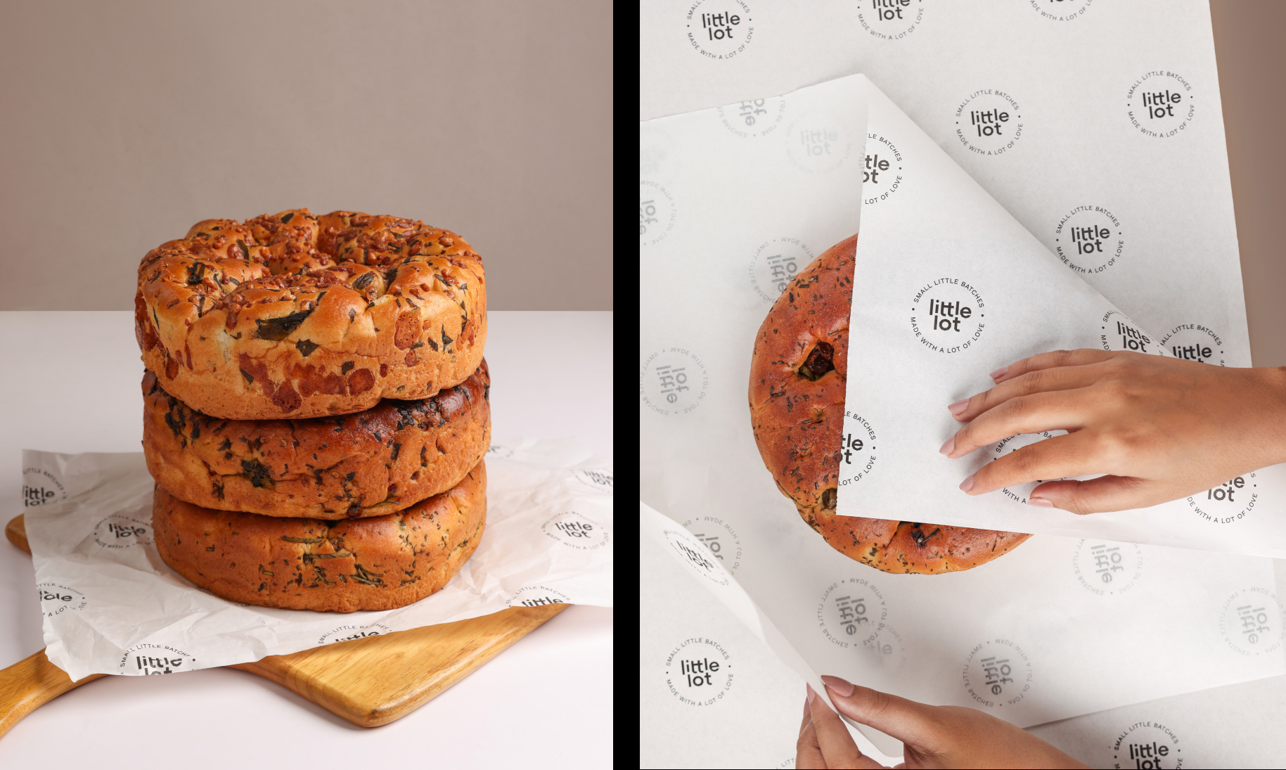
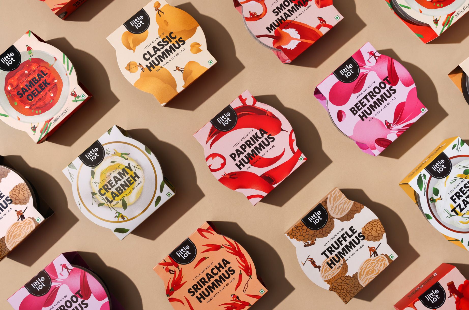
The packaging was done to let the ingredients and product take centre stage and convey that all the products are freshly made.
Design
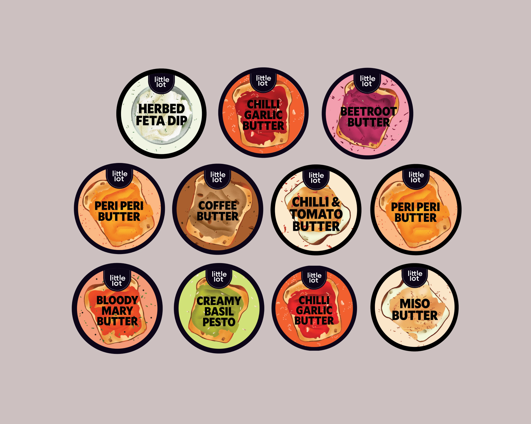
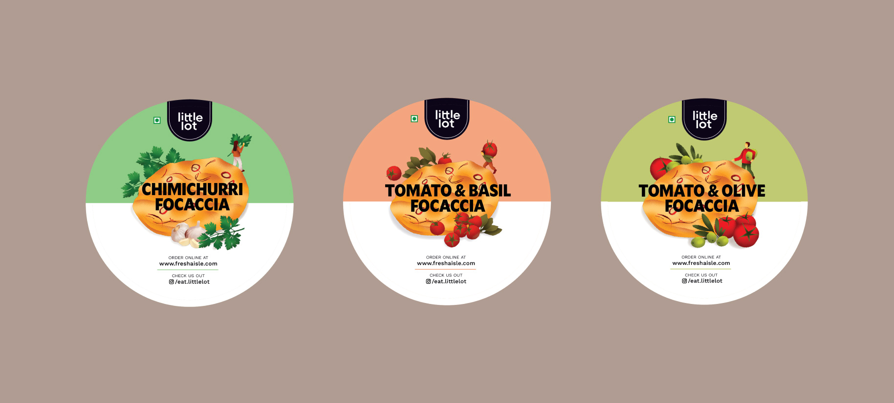
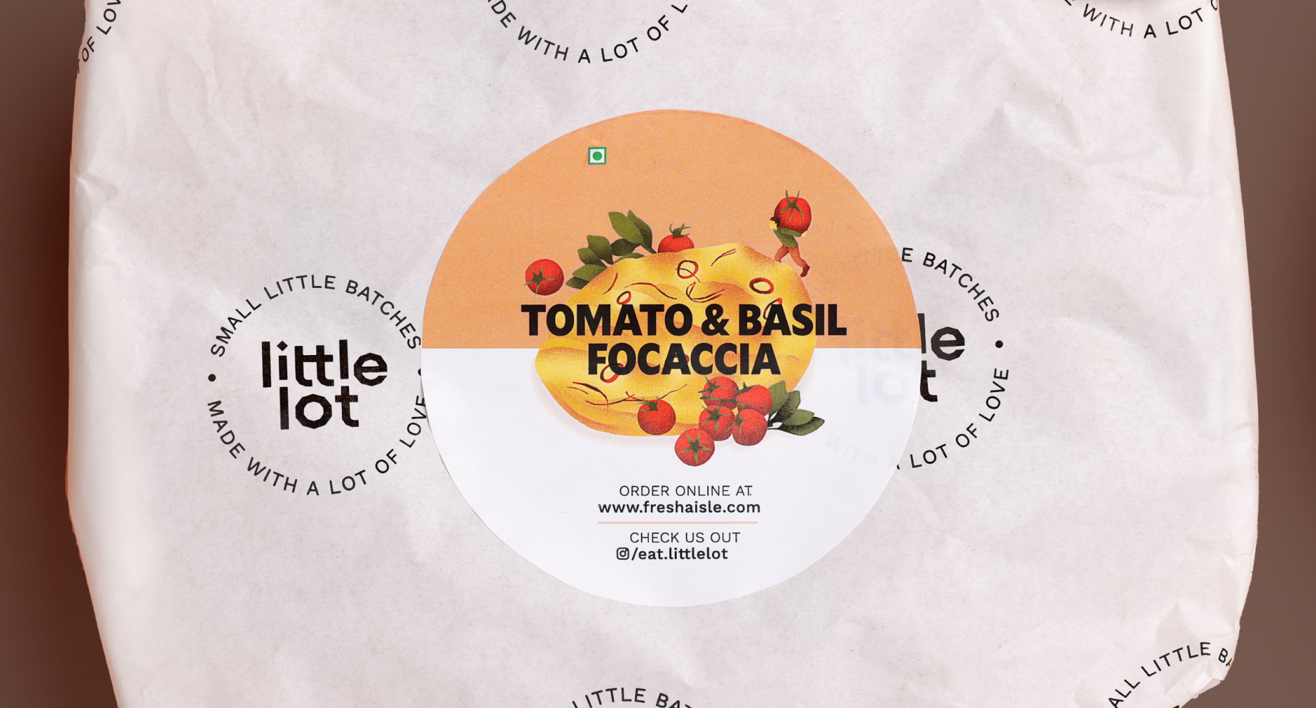
The products featured bold, colourful, appetising food illustrations that would indicate what’s inside the boxes and jars. These were deliberately made extra saturated to stand out on shelves and look extra delicious.
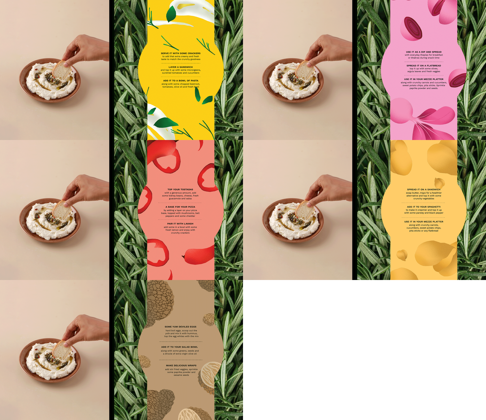
Each product also came with recipes that served as guides for consumers and pairings that would lead them to other items in the store.
