ERGOYOU
Ergo You is a direct to consumer brand which provides office and work accessory solutions. It aims to solve all workstation problems with better design.
The brand identity is a no fuss approach to effectively introduce the Indian audience to the new world of Ergonomics and the importance of it.
Discover
Ergoyou came into being when ‘work from home’ and taking care of your health became the new normal and a basic neccesity for most people. Ergoyou wanted to provide quality and affordable products that made your everyday just a little better for you.
Define
While a lot of big companies had product ranges of ergonomical products, very few were actually educating the consumers and providing them with super niche products.
Naming the brand ‘Ergoyou’ incited curiousity and also highlighted the importance of involving the science of ergonomics in your everyday life.
Design
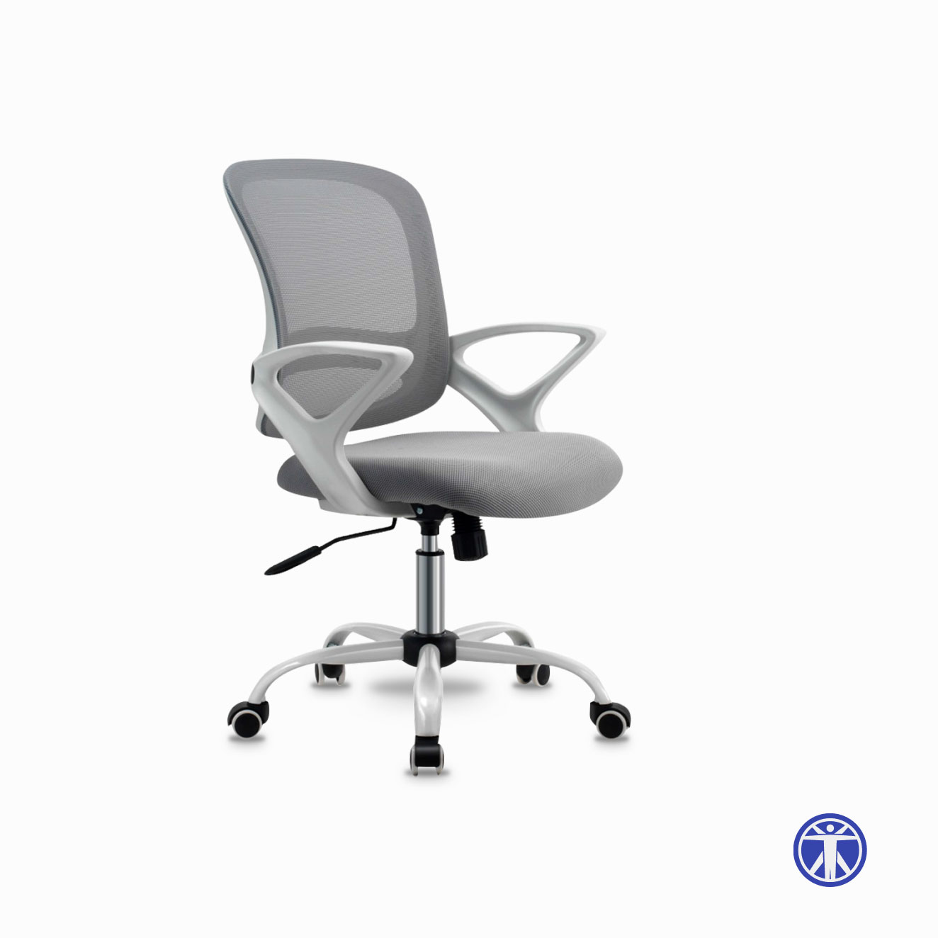
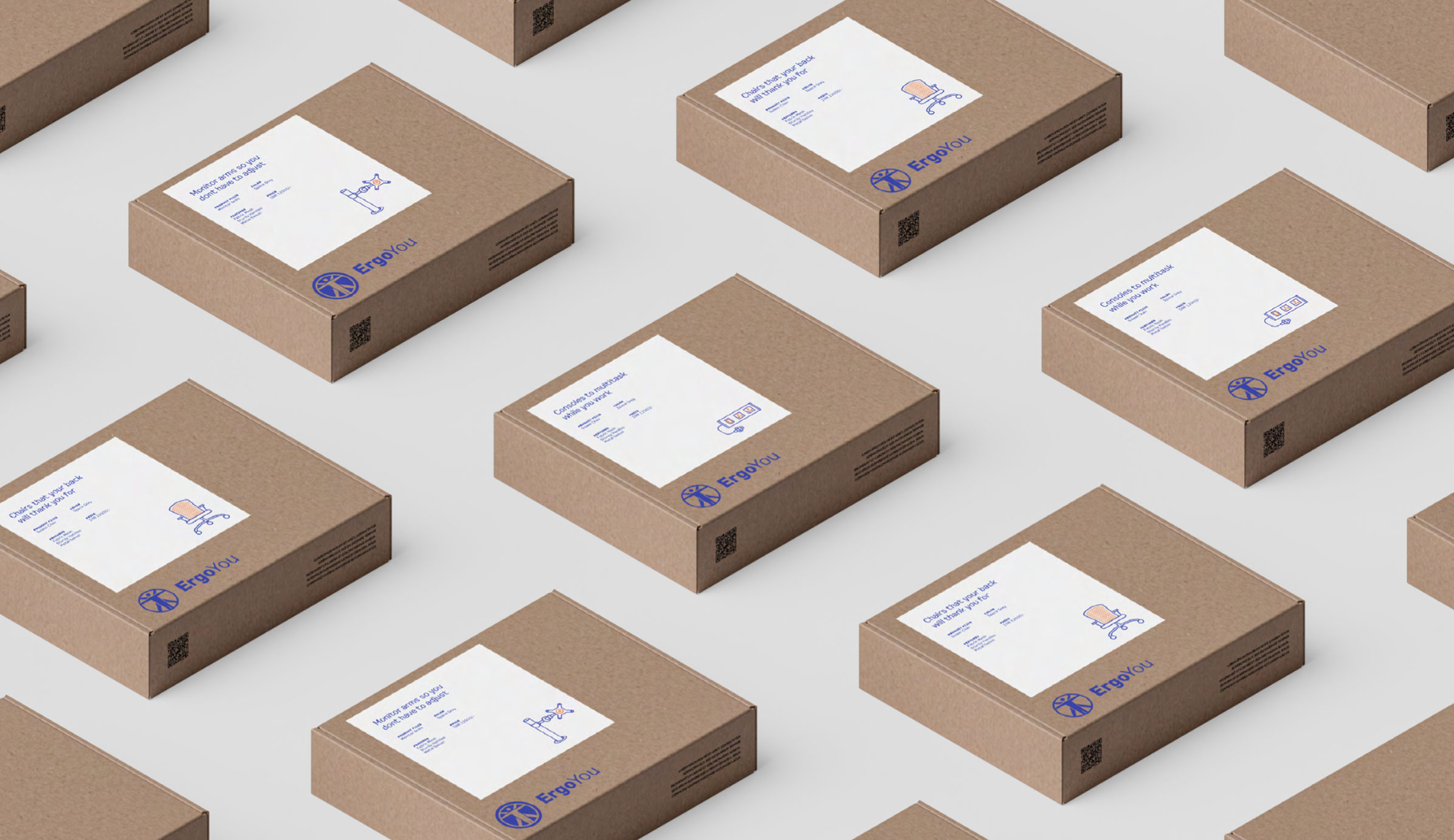
Ergonomics aims to modify products to the user, eliminating discomfort and injury. The branding system took this idea of symmetry, angles and function forward and created a practical approach to educating the consumers. Minimal use of colors and an industrial typeface complemented the mechanisms of ergo products. Technical diagrams also served as information of the ‘whats and hows’ of the product mechanisms.
4. Cover
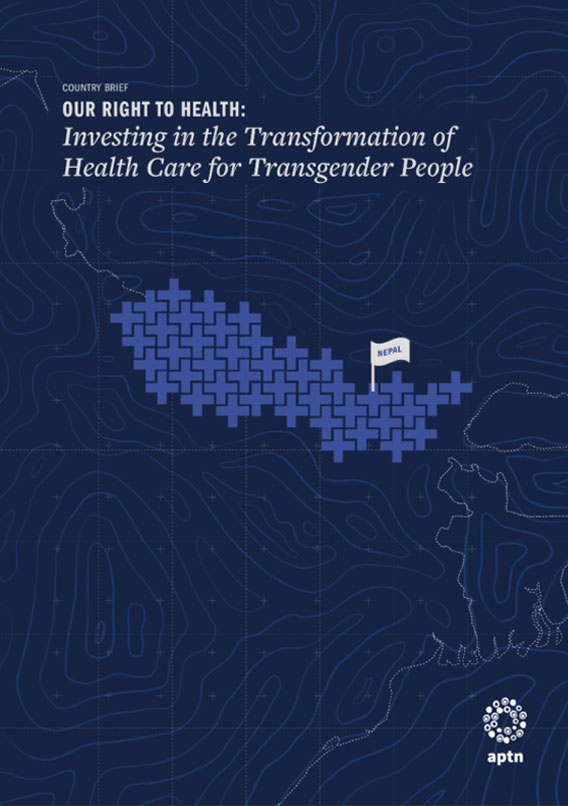
Each brief was addressing the relation between Healthcare access for the transgender community. The medical cross was used as a symbol to define each country’s map and a topographic background was used to ground the illustration. A more typographic and neutral approach was taken for the regional report, putting the typography in focus.
Each country brief had one defining color inspired from their country flag.
The common element running through each report was the typography, the layout structure and the visual language for the data visualisation
Each country brief had one defining color inspired from their country flag.
The common element running through each report was the typography, the layout structure and the visual language for the data visualisation
Campaign Video
The campaign video highlighted 3 instances of heightened patriarchy during the Covid-19 lockdown and aimed to clapback against these. The illustrations took on the style of an explainer video to emphasize the facts.
Animated by Rae Zachariah
Discover
Ergoyou came into being when ‘work from home’ and taking care of your health became the new normal and a basic neccesity for most people. Ergoyou wanted to provide quality and affordable products that made your everyday just a little better for you.
Define
While a lot of big companies had product ranges of ergonomical products, very few were actually educating the consumers and providing them with super niche products.
Naming the brand ‘Ergoyou’ incited curiousity and also highlighted the importance of involving the science of ergonomics in your everyday life.
Design
Ergonomics aims to modify products to the user, eliminating discomfort and injury. The branding system took this idea of symmetry, angles and function forward and created a practical approach to educating the consumers. Minimal use of colors and an industrial typeface complemented the mechanisms of ergo products. Technical diagrams also served as information of the ‘whats and hows’ of the product mechanisms.