THE SECRET SAUCE
We surveyed over 100 people to get the strategy right
We surveyed over 100 people to get the strategy right
Leaf Footwear is a comfort first brand offering footwear combating a range of orthopaedic issues. The brand provides sustainable and aesthetic options for foot pain, flat feet, and other problems – from slippers, insoles, sandals to even closed toed shoes.
We partnered with them to establish them as the ‘Arch Enemy of Foot Pain’ and to create a brand identity that sits well within the cross section of fashion footwear and pharma brands.
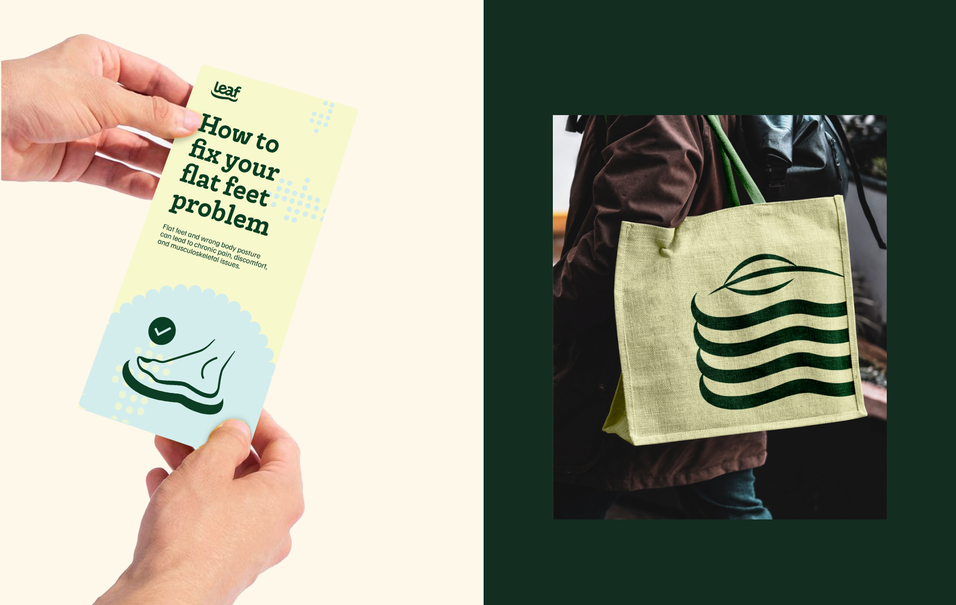
Leaf initially positioned itself as a fashion-forward footwear brand that happened to make slippers suitable for various foot ailments. We joined the project and recommended that the brand reposition itself as a medical brand, solving for all orthopaedic issues. The brand name couldn’t be changed to reflect its new stance, so we repurposed it to mean the brand’s efforts towards helping people go back to the natural order of things
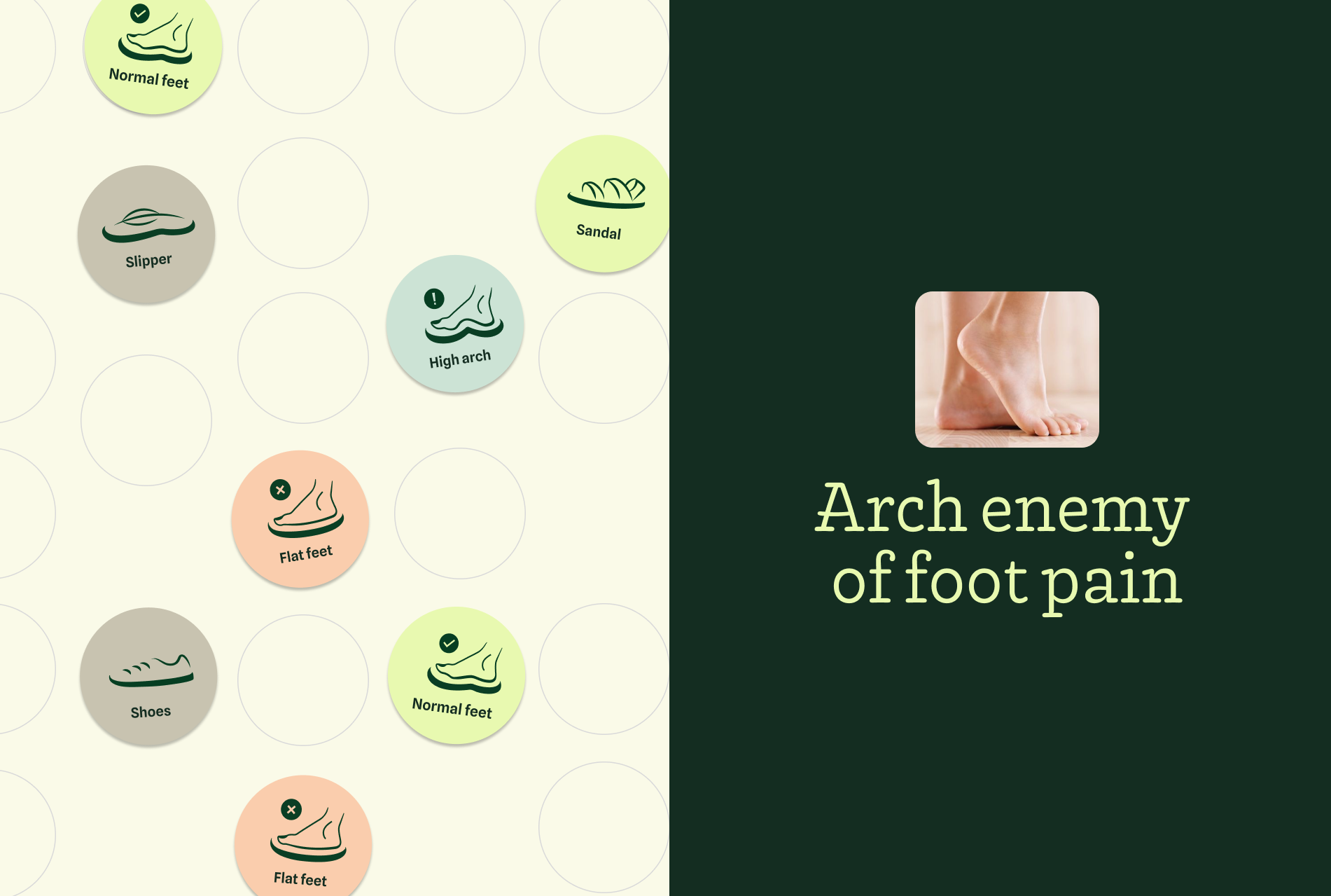
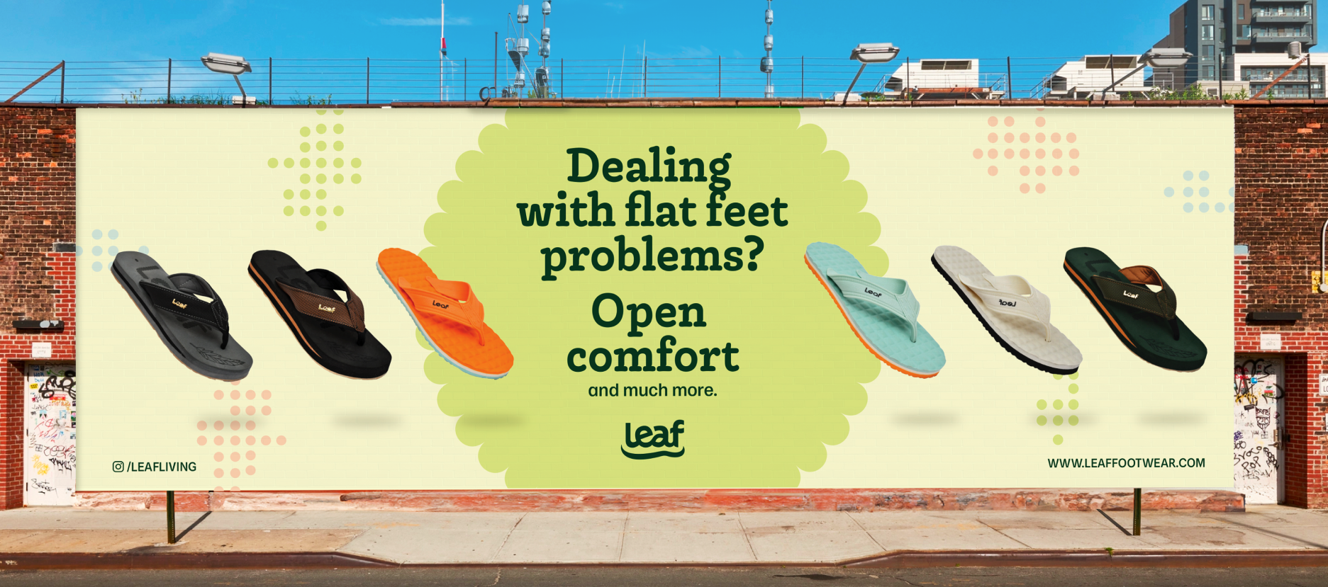
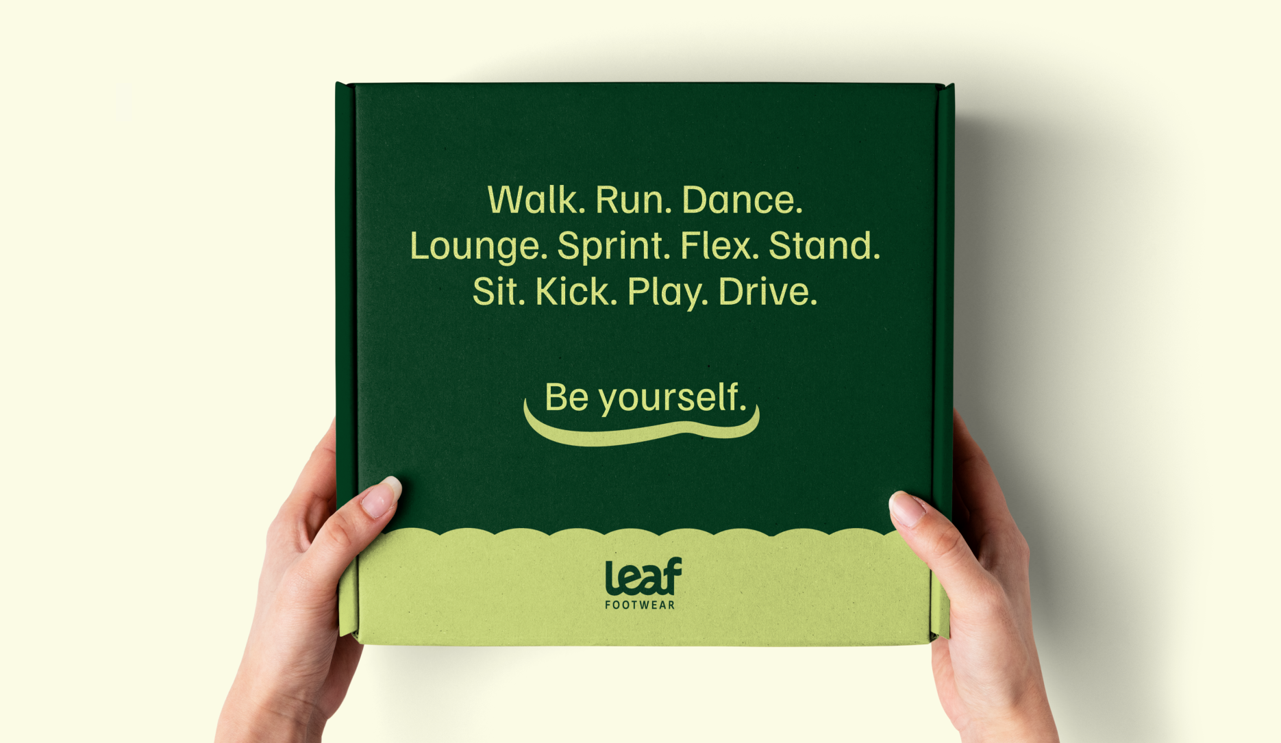
The brand statement ‘Arch Enemy of Foot Pain’ situated Leaf at the intersection of wellness and lifestyle. Foot pain and orthopaedic wellness became the central focus of the brand – with the added bonus of the footwear looking good and wearable, a feature often overlooked in the sector
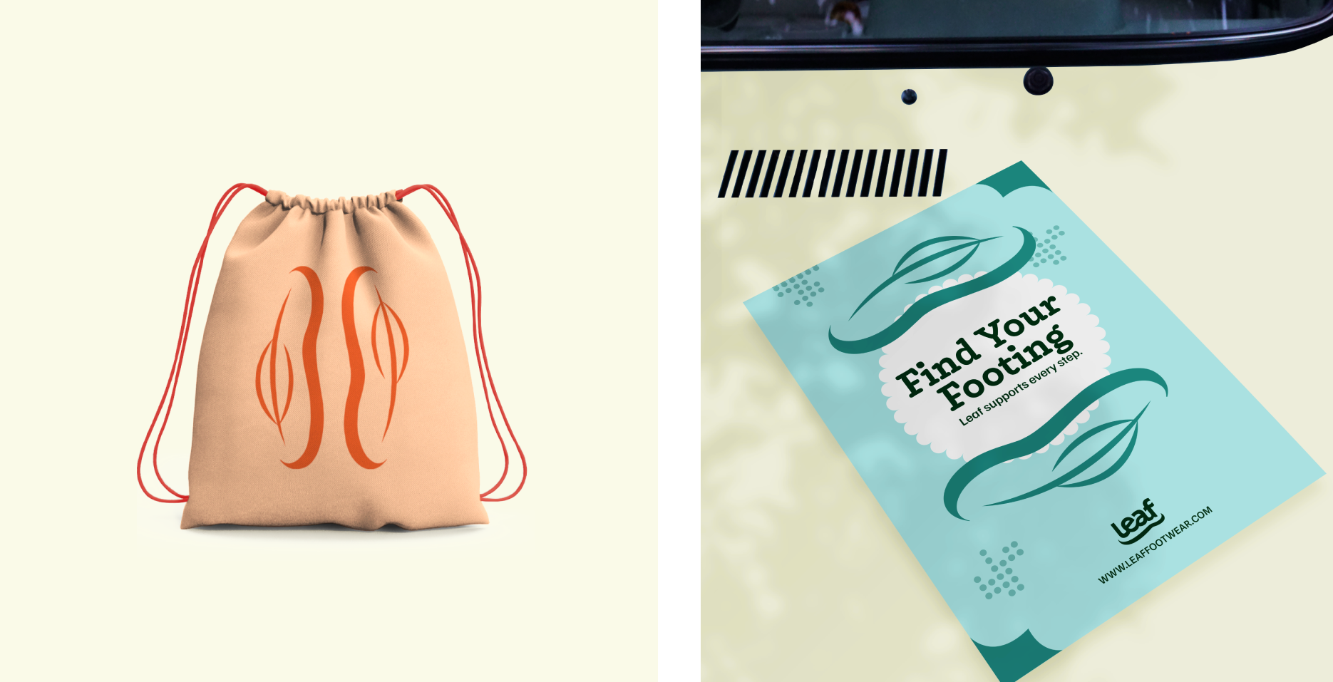
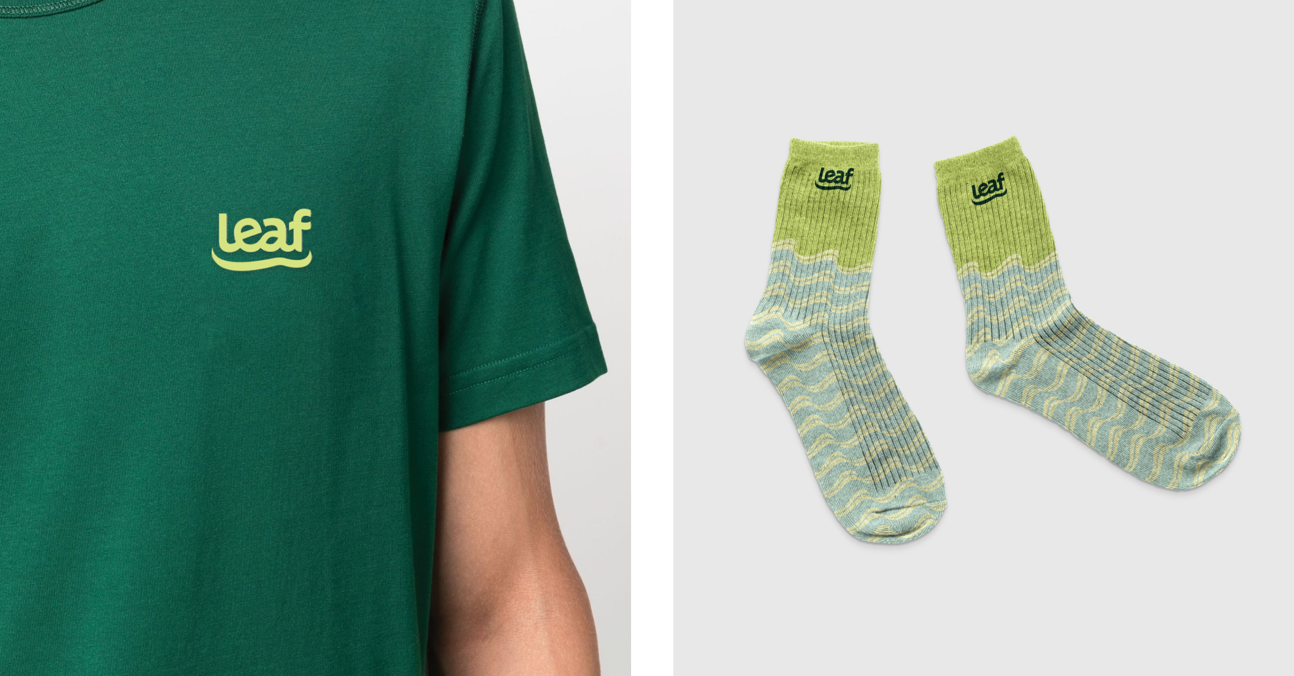
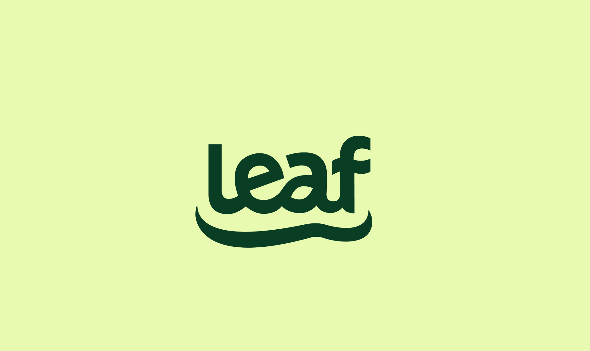
The Leaf ‘arch’ became the central visual element of the brand. It acted as an infographic and a symbol to depict and relay various foot issues in the brand’s website, merchandise, and elsewhere. Muted tones from the footwear were used as brand colours, with the soothing element being a nod to the pharmaceutical sector. In addition, the stickers and labels depicted cushioned textures and rounded containers, inspired by the product range.