THE SECRET SAUCE
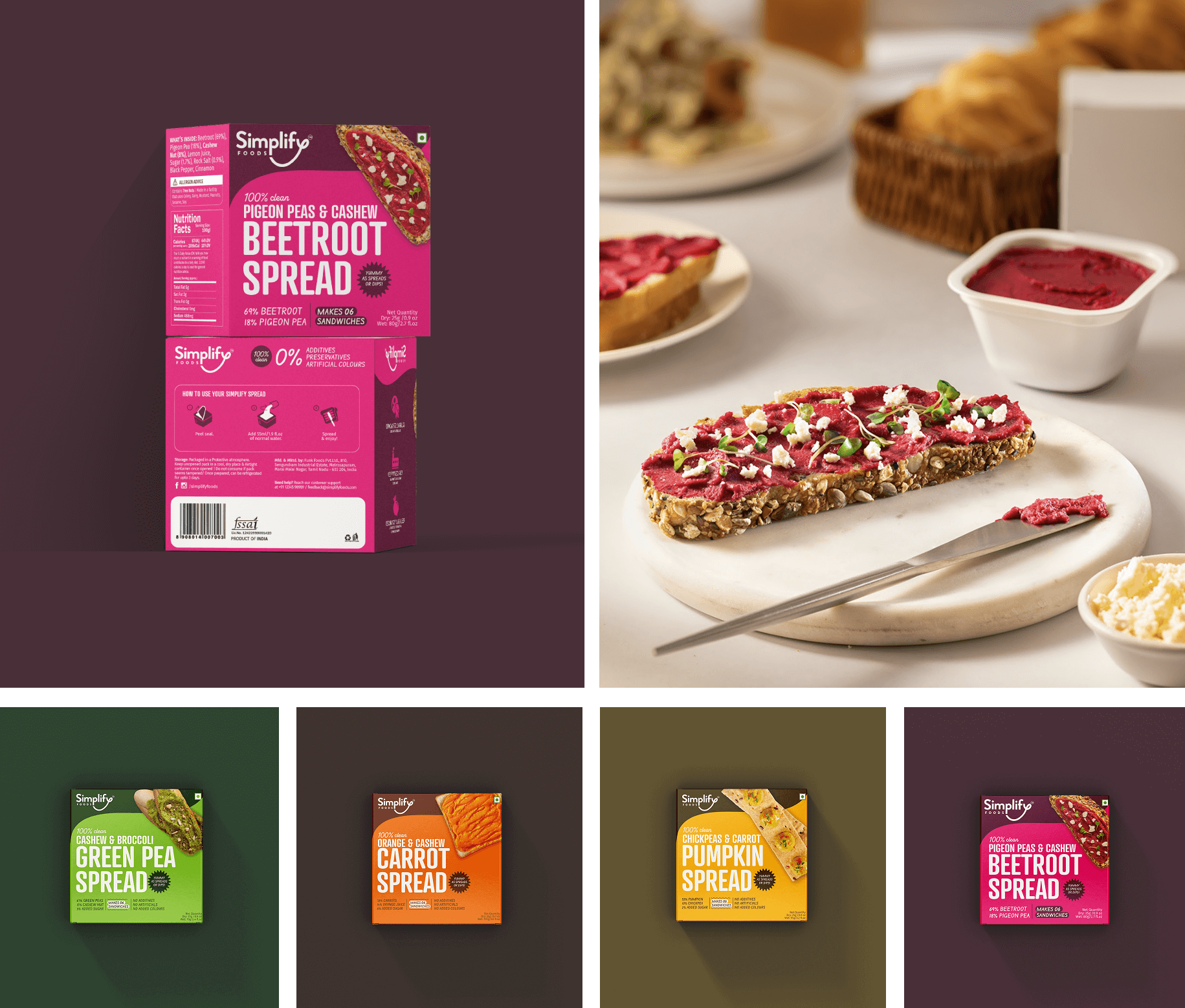
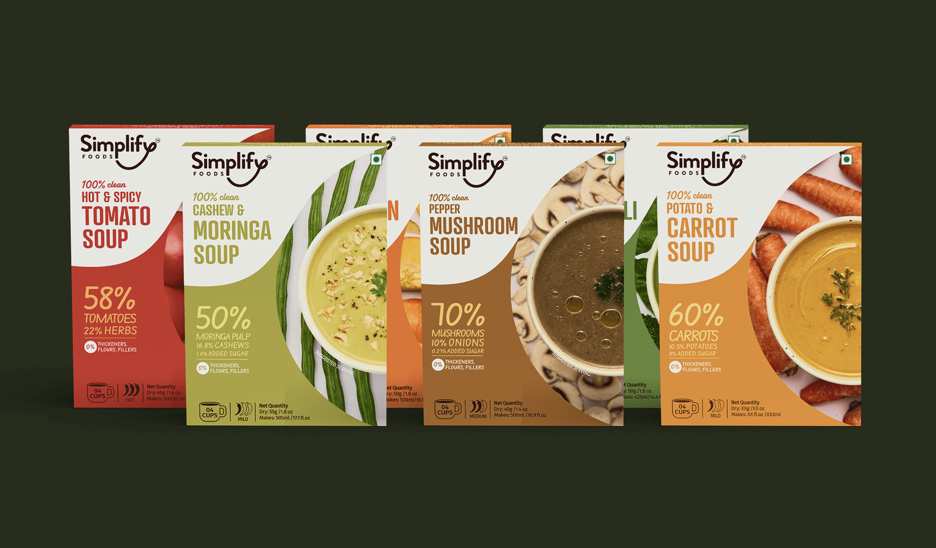
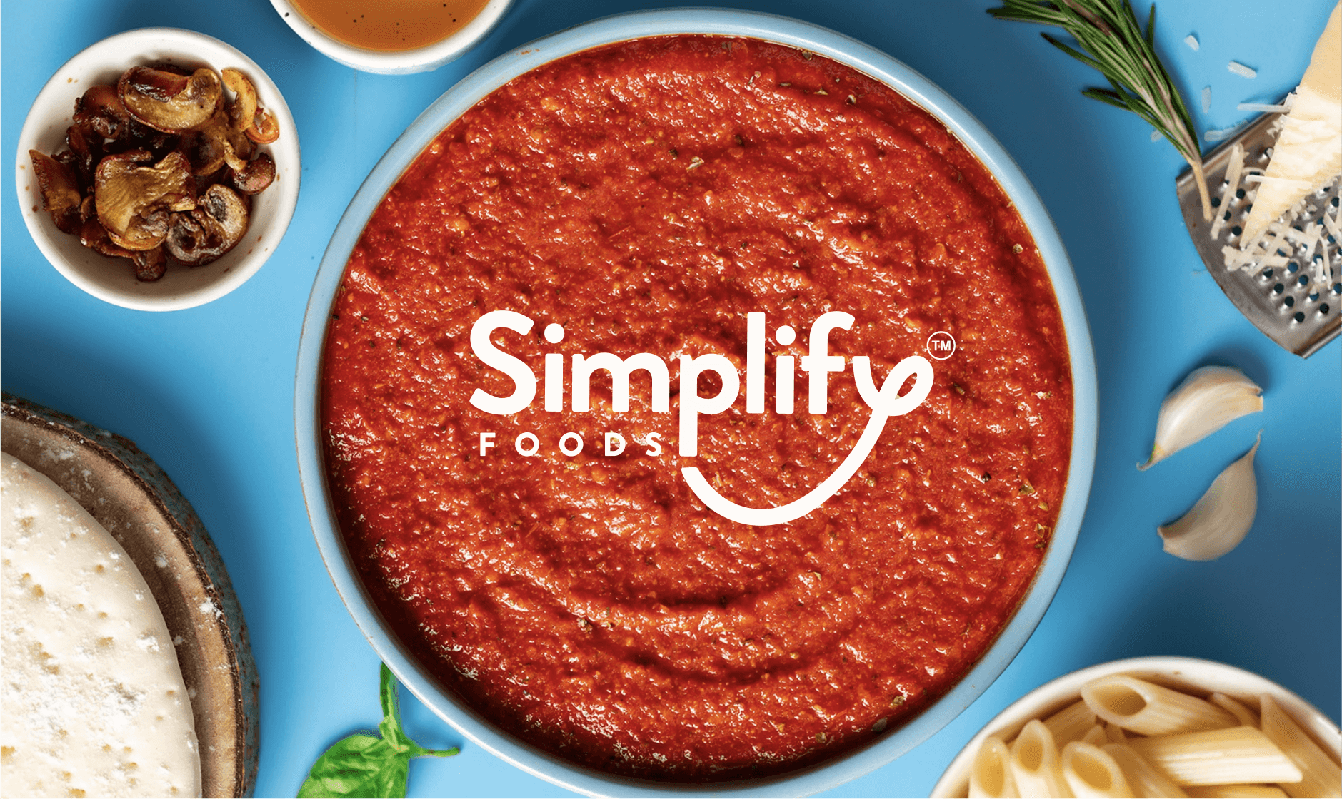
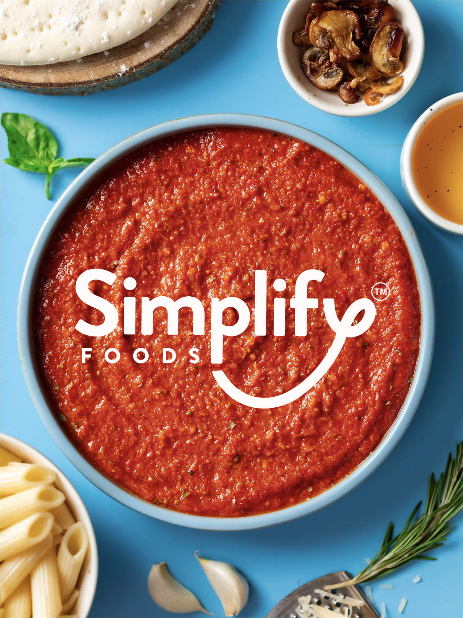
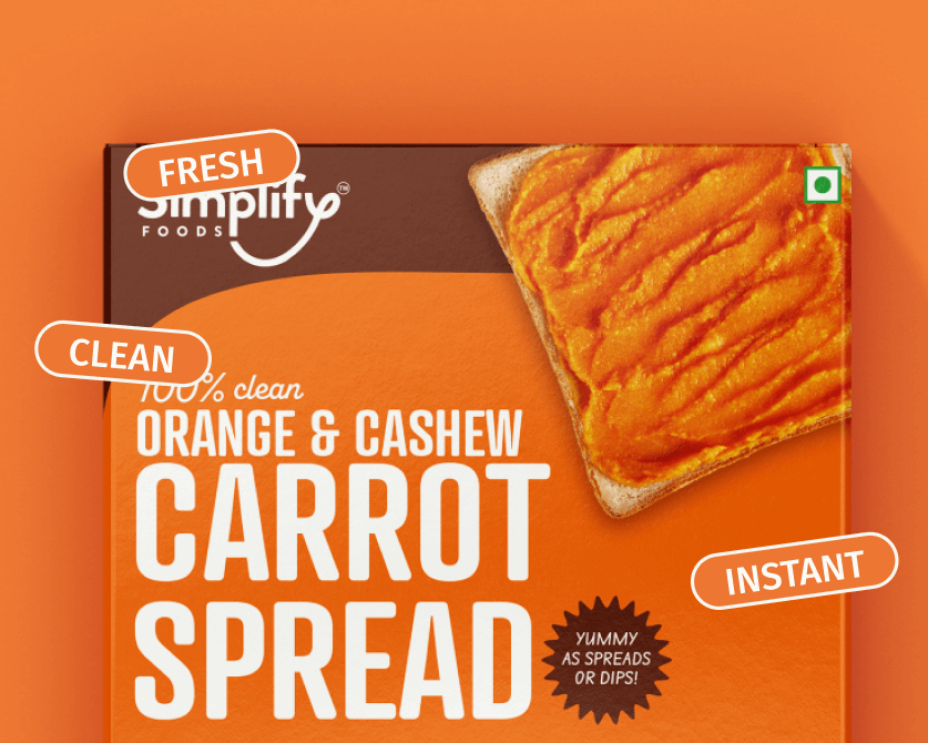
Only real food photos on the packaging
Only real food photos on the packaging
Simplify started as a dream project. A new venture from the makers of Chutnefy, they came to us with a clear brand vision, concise feedback, and expert market insights. A ready-to-make line of products without any synthetic ingredients, the brand catered to young, urban audiences who rarely have time to cook nutritious meals.
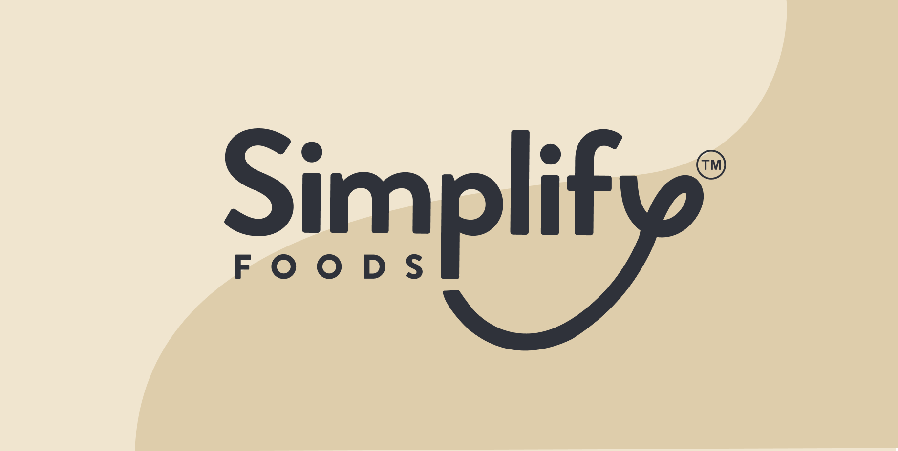
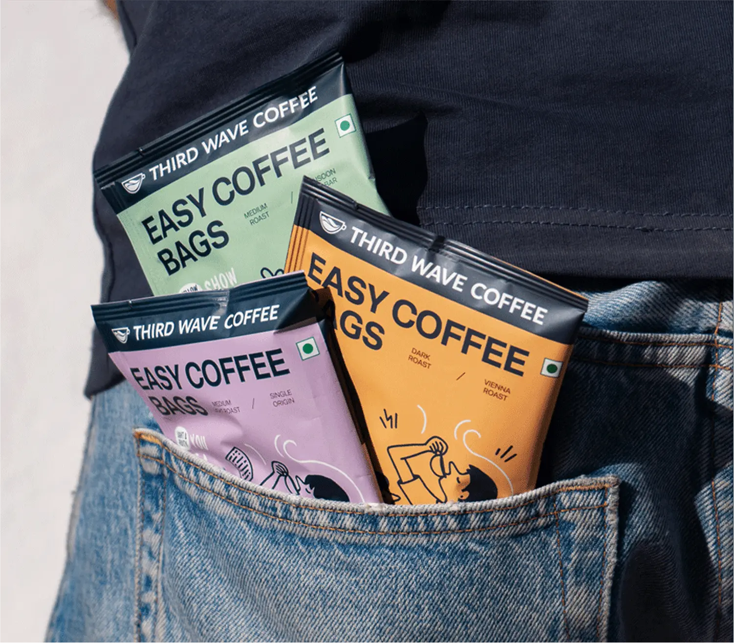
We partnered with them to do their branding and packaging, separate from the recognisable Chutnefy branding. After multiple iterations, we landed on a characteristic logo, bright packaging, real photos of the food, which all tied together to create an identity that was as clean as their ingredients, without being boring.
Simplify set out to create a line of
easy-to-make, ready-to-cook line of foods without any harmful ingredients., for urban audiences with little time on their hands.
Following the footsteps of Chutnefy, known for its branding and high-quality products, Simplify had to establish itself as its own entity, while retaining the trust that its predecessor had built up.
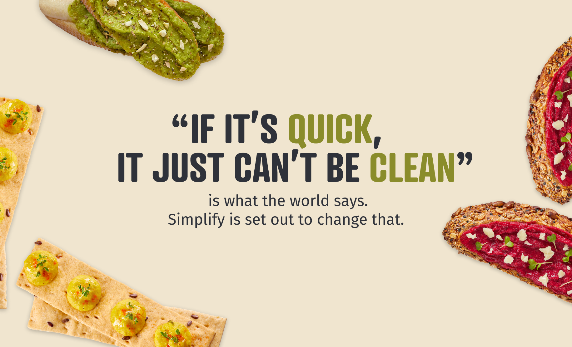
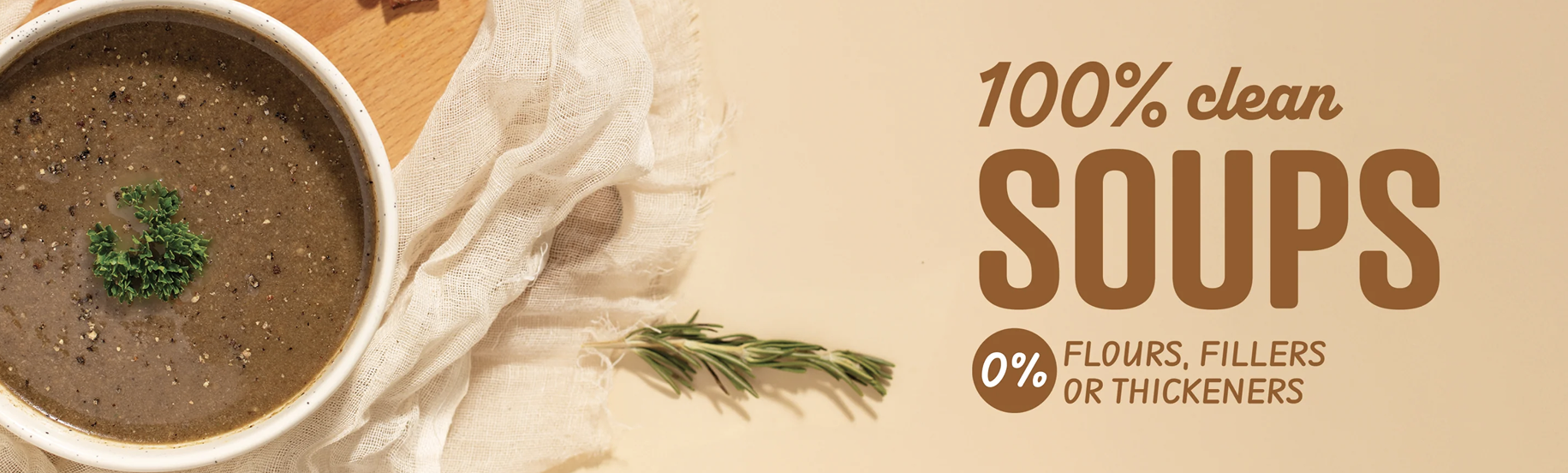
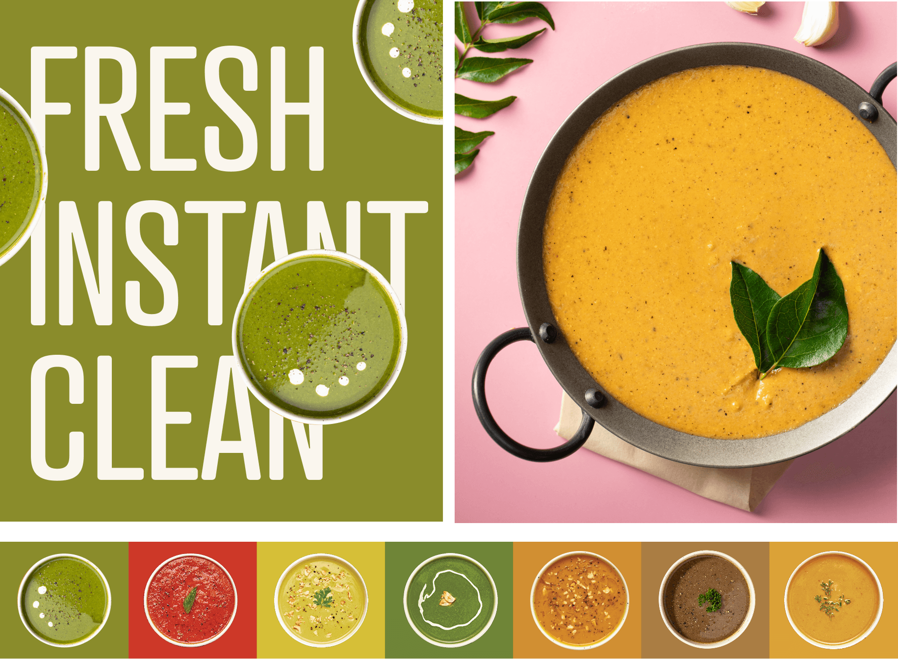
A category plagued with mistrust, our job was to make ready-to-eat is look appetising, natural and real.
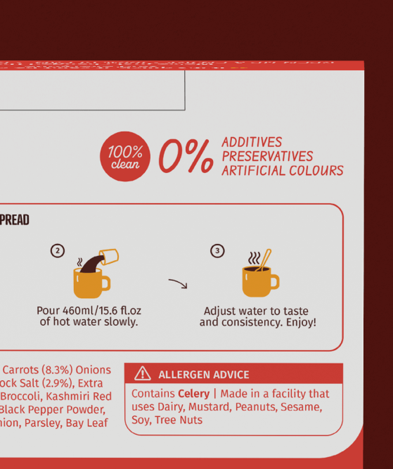
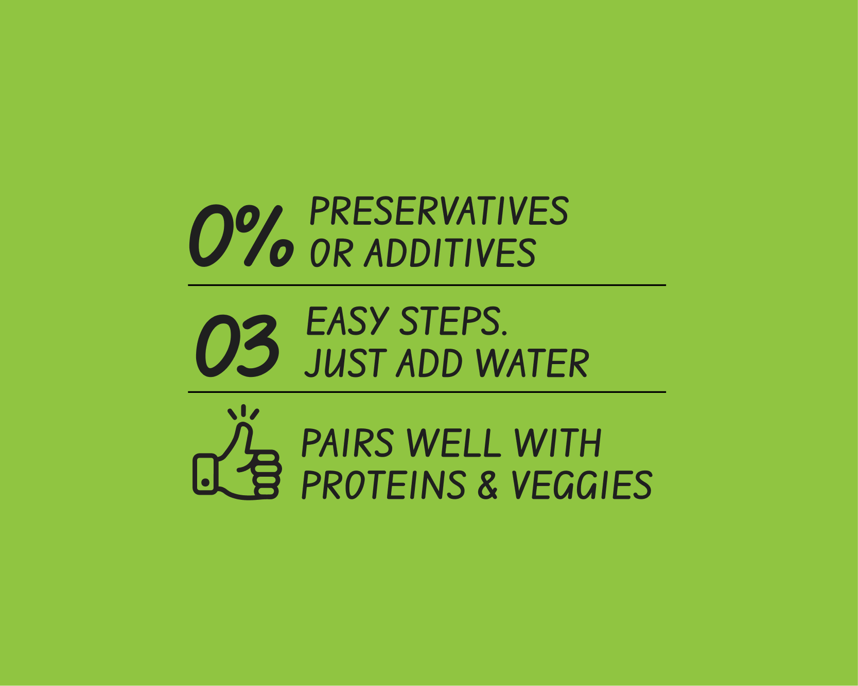
The challenge was not only to make the foods look good but also to gain trust of the audience. The solution? Total transparency. Multiple use cases of each product were highlighted, and their natural ingredients were made the hero.
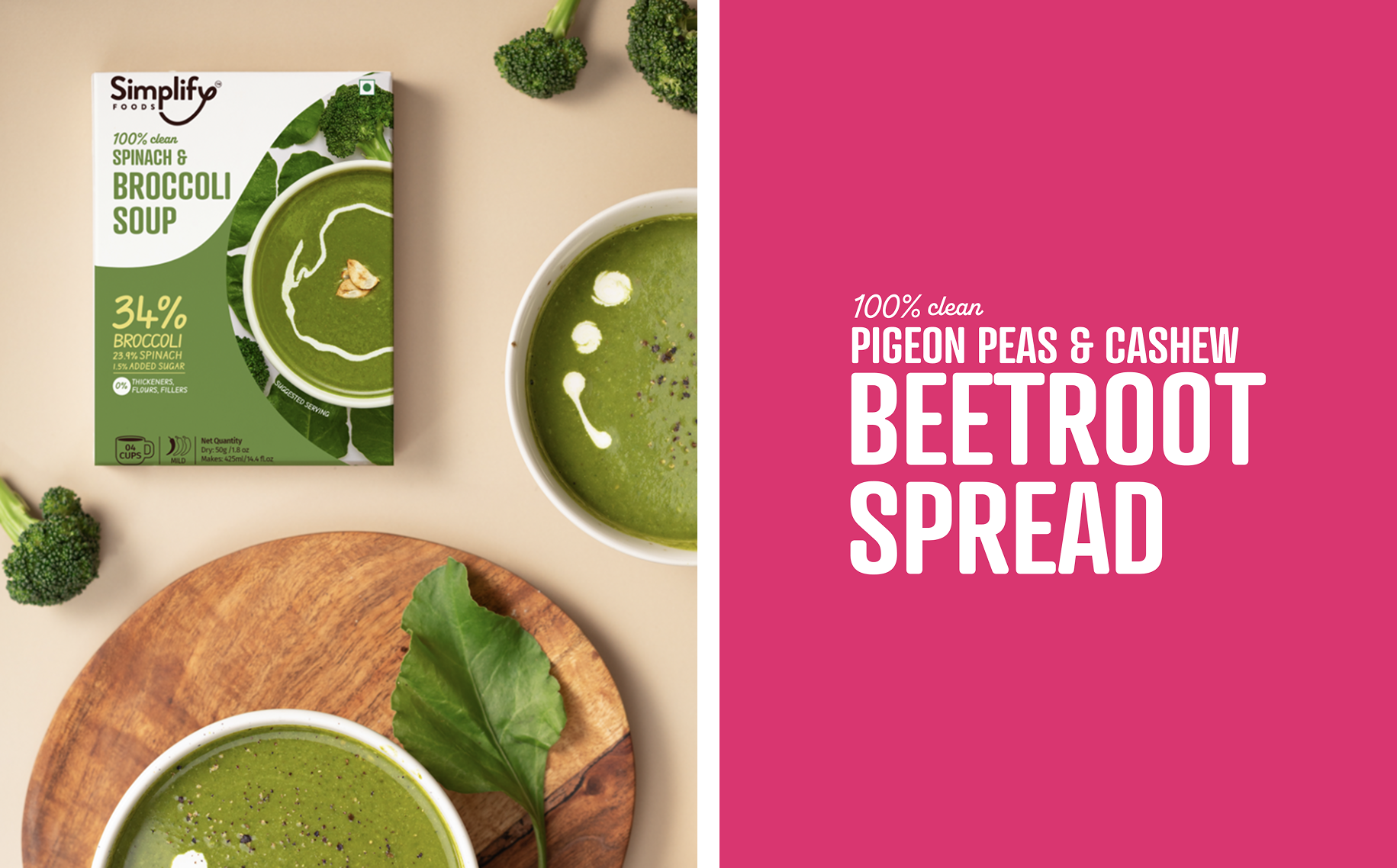
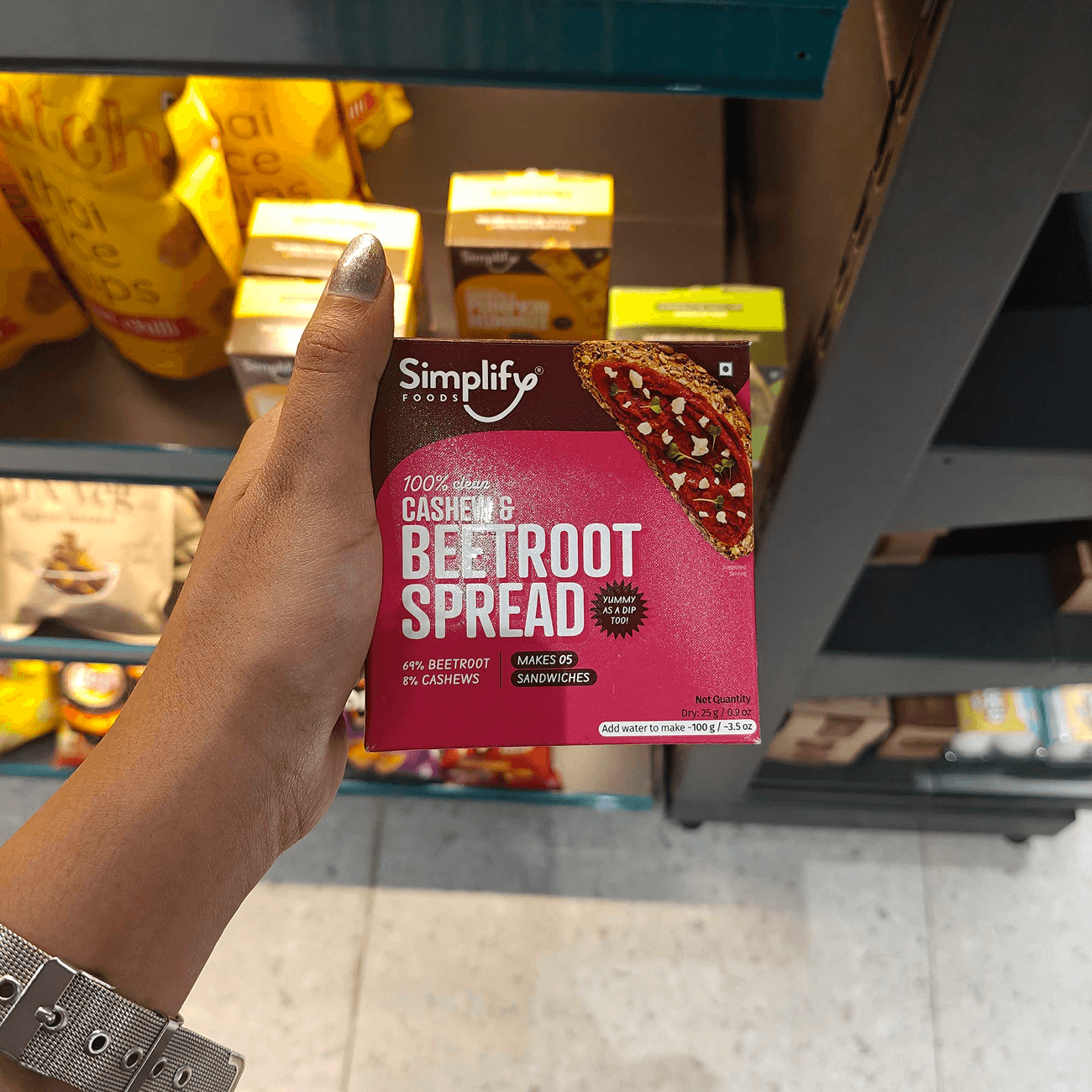
We decided to show what’s inside the packaging on the outside. i.e. Food photography to showcase that these could be as healthy as home-cooked meals.
An infographic system put the ingredients front and centre to gain trust and show the usage of NO artificial colours and preservatives. And a flexible layout system inspired by cultures the food came from.
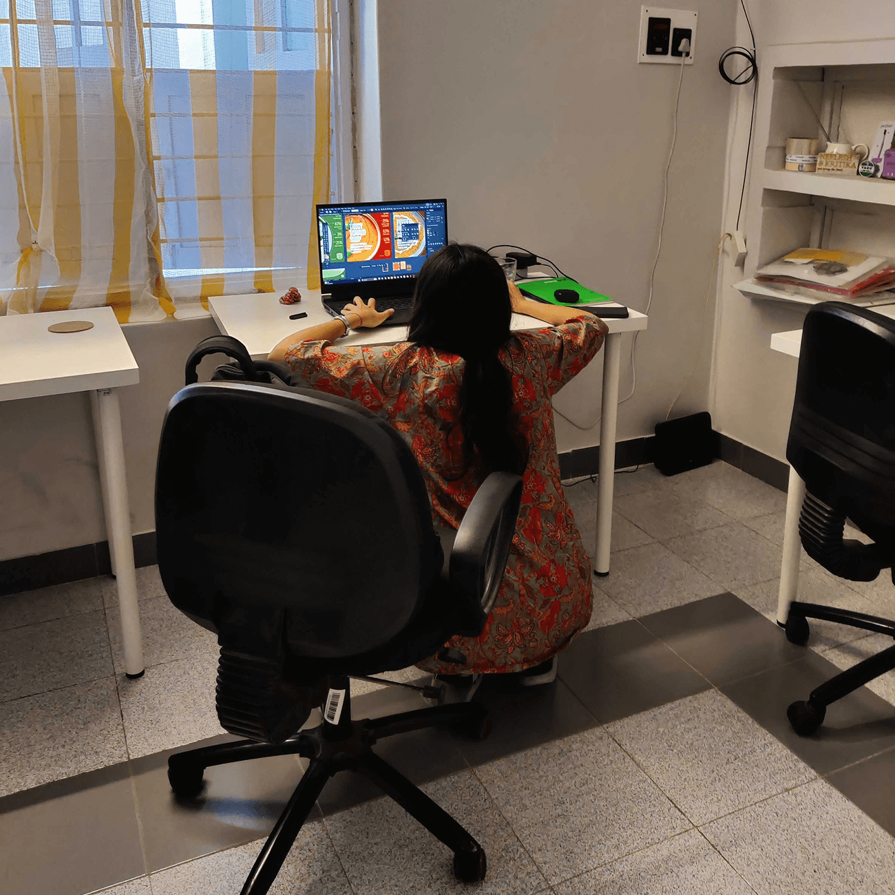
Our intern working very hard as you can see
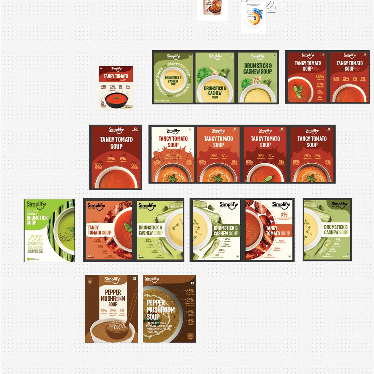
Too many soups, too less time
Shiny packaging on the shelves