THE SECRET SAUCE
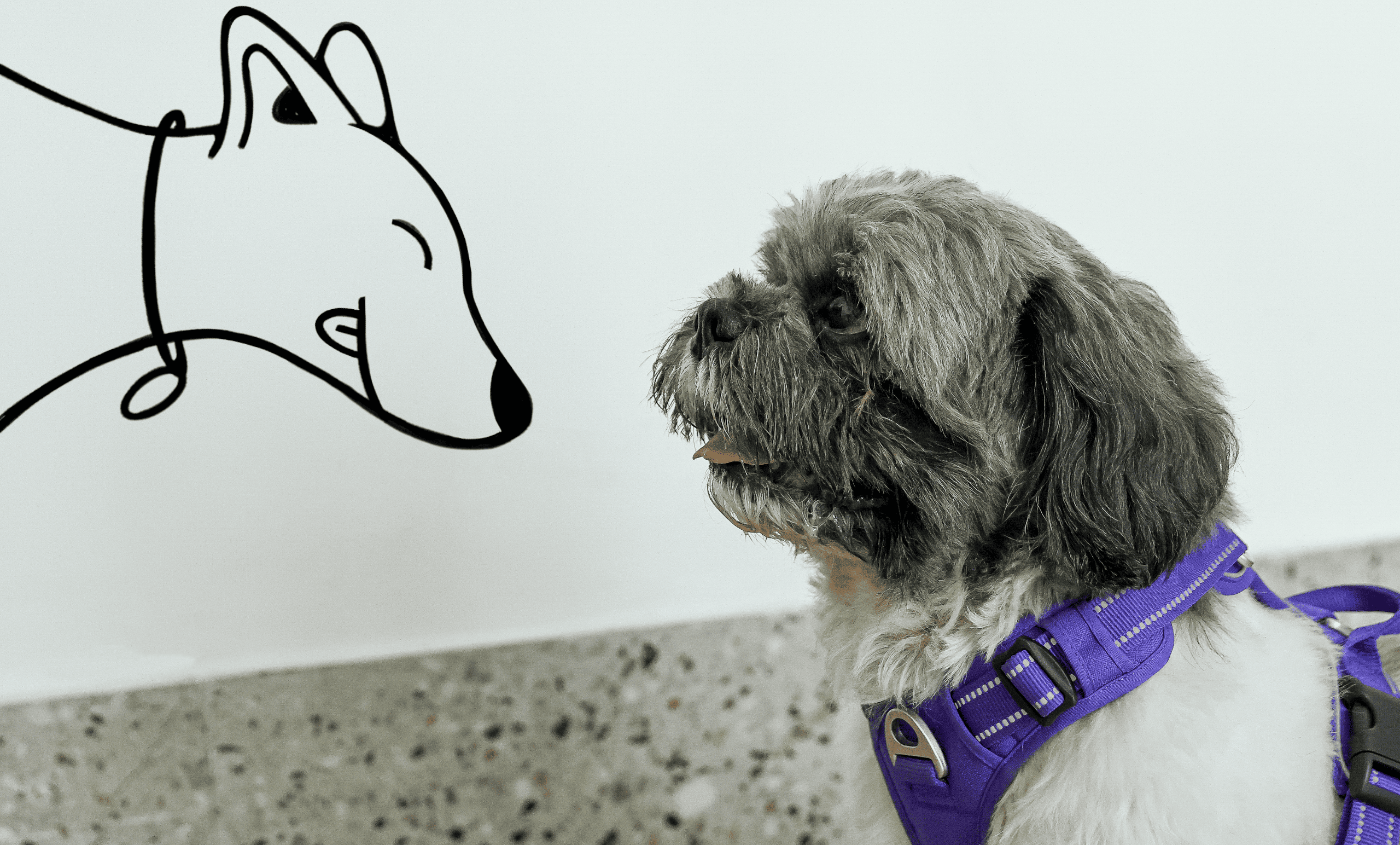
The dogs you see in the logo are Anu's actual dogs, and Zoya, an indie adopted on site during the project.
The dogs you see in the logo are Anu's actual dogs, and Zoya, an indie adopted on site during the project.
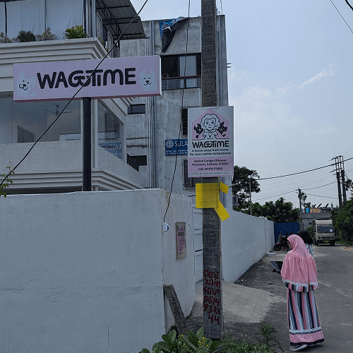
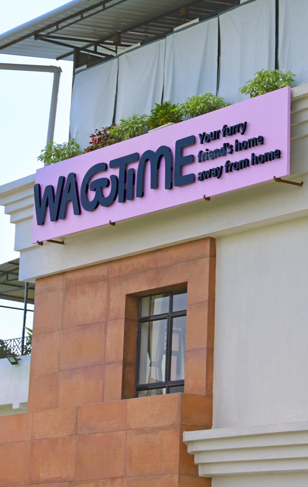
Nestled in the wide, greener suburbs of Kolkata, India, Wagtime is a pet creche and recreation centre, where pet parents and their doggos play, train, and swim together. Run by Anugruhita “Anu” Bardhan, a certified dog behaviour expert and trainer, this is a first-of-its-kind haven open to every pup in the city.
The world of pets is playful, cute, and fun – all of which we leaned into when we came on board as design partners for Wagtime. The project spanned across identity, space graphics, illustration, print posters, and a system that would allow them to grow by leaps and bounds. We centred Anu’s story and focussed on how every part of Wagtime felt like a delightful second home.
Wagtime was an ambitious project by a solo founder in a city where pet centres are often looked at with disdain. The space had many things going for it—an adult size pool for pets and their parents, dedicated 24×7 nap area, a grooming salon, a sensory garden, and even a café. It was envisioned as that elusive third space where pets and owners could both go to unwind.
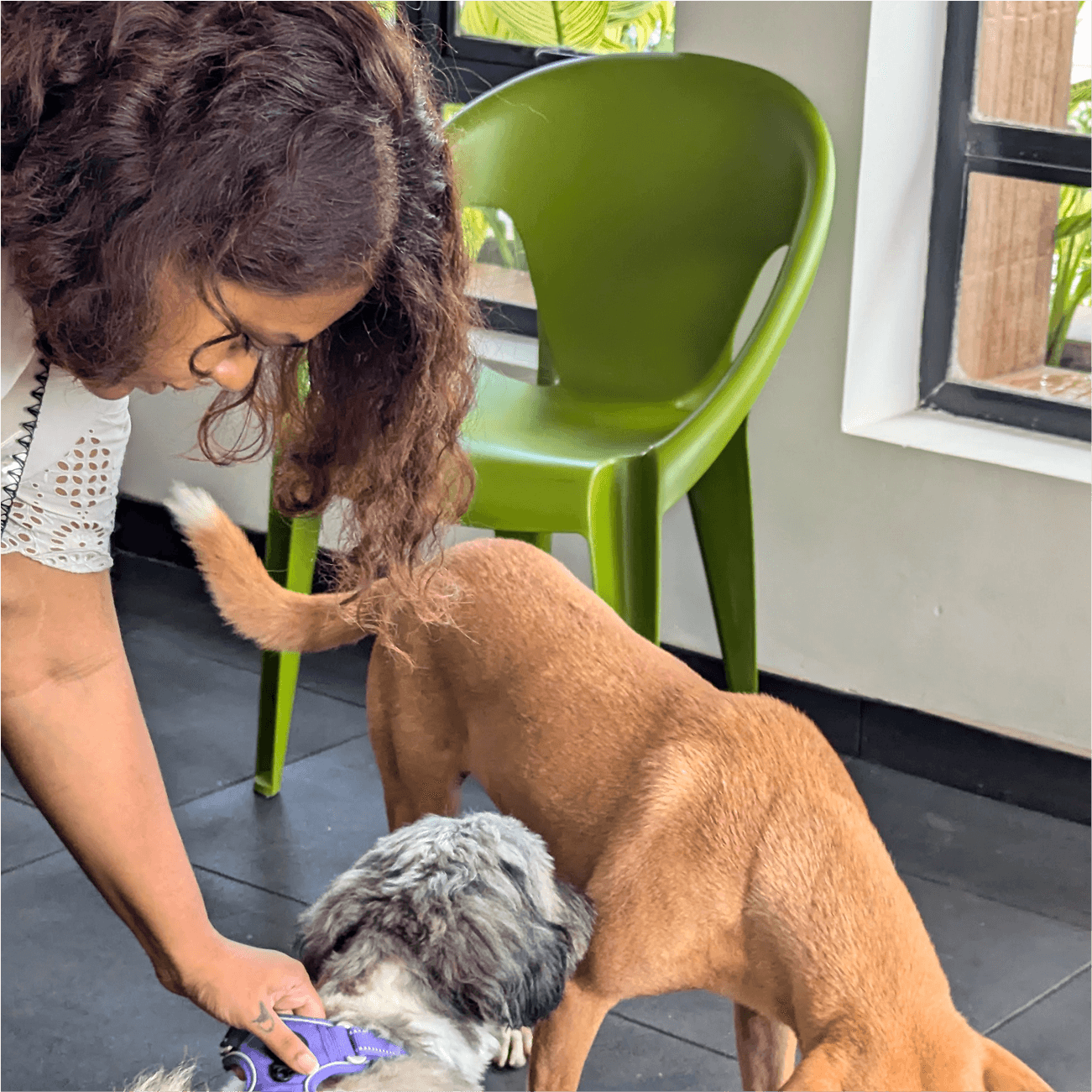
More than the facilities, however, it was Anu (the founder, who was the driving force) behind the space. As a pet parent, it can be difficult to trust another person with a beloved doggo. But Anu, with her specialised education in dog behaviour, truly was an expert who could be depended upon to train and understand furry friends while keeping them safe and happy.
It is human nature to trust another human being over a brand name and flashy amenities. It was important for us to make the audience aware that the person behind the brand was equipped to handle their pet, train them, and more importantly, was raising three dogs herself.
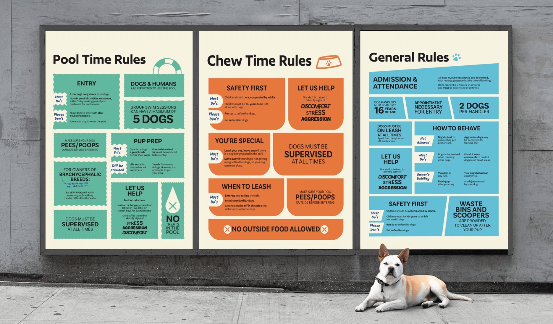
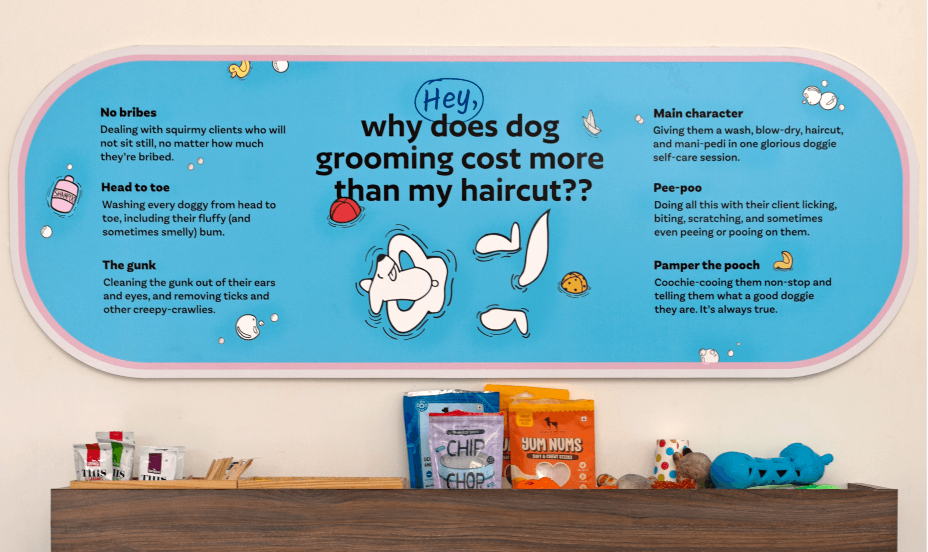
We decided to make Anu & her dogs (quite literally) the face of the brand. With each space dedicated to different activities, a naming system with the word time was assigned to each area (playtime/naptime/coachtime). Anu’s voice in the form of a handwriting font was incorporated throughout the brand as small notes, much like a coach’s pointers, also informing clients of the ‘whys’ of what they were doing.
After establishing Anu & the dogs as the face of the logo, the logotype developed a subtle nod to the pups even further with the ‘G’ doubling as a snout.
The illustrations depicted Anu & her 3 dogs in different scenarios, all within house-shaped containers that were extracted from a building’s blueprint. Each space within Wagtime got its own designated identity, with individual iconography, colours, illustrations and print signage. The colour system worked in isolation as well as in a larger system when they came together, like that of a kindergarten, but for pups. The aim with each collateral in Wagtime was to keep it fun, while also sounding informative and reliable—an essential part of the communication.
A fresh peel
Anu with her kids
A funny coincidence of colors